Justin Harder

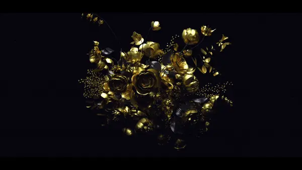
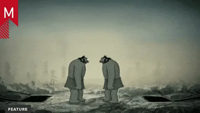
This may be old news to some, I’m not really sure when it went live, but Justin Harder has graced the internet with a home for all of his notable work, seemingly from his entire career thus far. In addition, he’s indulged his fans with extra tid bits of info including process and styleframes for many of those projects as well. A wonderful insight into, dare I say it, one of the forefathers of contemporary motion graphic design. I’m sure that’s debatable, but at the very least, it’s true for me. Love him or hate him, it’s hard to deny that he paved the way for many things we now know of and admire with our industry. Rewind to 2002 to the ‘Lets Make Some Shapes‘ demo reel, watch, and tell me you aren’t still impressed by Justin’s ‘Sequence Design’. It happened then, and never again because of the painstaking care that it took to create animation like that. I know I’ll always look back at his 2003 reel, and remember the times early in my career, sitting at my computer at 2am, watching in overwhelmed amazement, and think, ‘those were the days’. Thanks for the little peak into your world, Justin.

5 Comments

finn mckenty

good post ted. here’s what i posted about the site on my blog:

Justin Harder is without a doubt the biggest influence on me as a designer. When I first saw his work back in 2002 or whatever, it completely knocked me on my ass. You know how with music, you hear a certain kind of music in your head, only it doesn’t exist in reality, but then you hear a song from some new, innovative band, and you’re like “YES! That’s the shit I’ve been hearing my head for all these years!” That’s how I felt when I saw Justin’s work for the first time. Be sure to read the interview I did with him in 2002 or 2003 for Pixelsurgeon, and check out his new studio LAMBO.

His style combines the modular typography and neon palette of The Designers Republic and a Dada-like sense of collaged absurdity, with the enthusiasm and fun of the West Coast action sports/punk rock scene, all wrapped up in a totally unique style of animation that Justin calls “sequence design.”

In any case, Justin just put up a new site that collects alllllllllll of his work over the last 5 years or so, which is a ton of output. It even includes some stuff never before seen like stills, motion tests, and random pictures. I could literally go on forever about almost every single one of the pieces, but here are my favorites:

LMSS
This is what really did it for me. I must have watched this a few hundred times… absolutely jaw-dropping “sequence design.” It’s all so simple but so, so rad. Still great.

What The Hell
Another trademark JH piece, this time showing off his incredible transitions. Also love the simple, restrained compositions and sophisticated color palette.

Fuel X-Dance
This is prime JH to me. It takes everything he did with his earlier stuff but adds photographic and textural elements to it that make it feel a little warmer, more inviting, and organic. Once again, incredible transitions.

Marc B.

What’s so original about ripping off the designers republic so blatantly and some other trends going on at that time, like the obvious gmunk flashy style? And claiming it as his own original work while praising his ego in the reels like it was the mount everest.

I really don’t understand how some aspiring designers can look up to him. If anything it should be a very bad example.

At least his stuff is passe now. And i assume this post was created to remind us of his 5 minutes of fame he had many years ago while ripping off tdr/ gmunk so blatantly.

Raytunn

I like his work.^^

OBOMBA

It’s a known thing that Justin takes credit for alot of work done by others, and I don’t think that’s a quality of a “forefather”

jonnyplum

That is a difficult reputation to live up to, a forefather.

At the end of the day, the guy has worked pretty hard

Comments are closed.