It’s a Plastic World

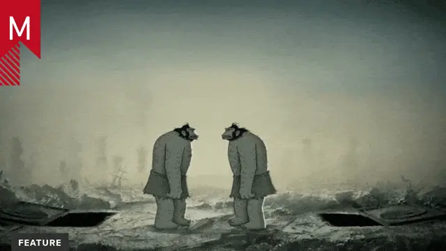
This depressing but educational visual essay explains the ubiquity of plastic in our oceans using an interesting low-poly microverse contained in a cube.

After you’ve watched the film, take 5 minutes to answer this survey.

From itsaplasticworld.com:

It took weeks collecting facts, writing a story and draw a storyboard. After four months production time the movie is finished. With two excellent speakers and a nice music, made by Alexander Rösch, I’m very proud to present you “It’s a plastic world”. Many NGO’s like Greenpeace, WWF or PlasticOceans endorsed the movie and spread it too.

Credits

Producer/Creator: Andreas Tanner
Art Director: Andreas Tanner
Music and Sound Design: Alexander Rösch
English Voice: Thomas Lüthi
Webdesign: Malte Vollmerhausen

Tags: , , , , , , , ,

About the author

Justin Cone

/ justincone.com
Together with Carlos El Asmar, Justin co-founded Motionographer, F5 and The Motion Awards. He currently lives in Austin, Texas with is wife, son and fluffball of a dog. Before taking on Motionographer full-time, Justin worked in various capacities at Psyop, NBC-Universal, Apple, Adobe and SCAD.

6 Comments

Ronny Schmidt (@rosch3000)

What a shameless and bad copy … incredible

Lena

If you say it is a bad copy you didn´t understand what this movie is about! it´s not about copying some video…

I think the creator of this movie only wanted to let us think about an important topic and nothing else…

Ronny Schmidt (@rosch3000)

No worries, trust me I did understand the message and if this here would be an environmental website/blog I would not give a fuck how the animation looks, but since it is motionographer it’s about look/animation/direction …

… and in this particular case the whole film is just a super bold ripoff of the environmental animated films “Let’s talk about Soil” and “Ending Overfishing”. The whole direction is basically copied, a lot of shots/animations are pretty much exactly the same, a lot of visual elements, the text and even the speaker for the German version is the same … I mean come on, but this is just super embaressing.

And of course at some point it’s okay to copy in this kind of craft – we all do it to some point, but I loose all my respect for the creator when it’s copied in a bad way … talking craft here. I mean – look at the video … obviously the creator did not understand the “low poly” look at all – he just took ordinary 3D-models and turned of the phong shading! Way to go!

So again … I am not talking about the message here … totally cool, but I am not cool with such a shameless copy. No creator should be proud of this. Of course it happens in this business that you get a briefing like “oh yeah – you know this animation – please take this as a reference. we want this style/look … blabla”. Fine with me – we all know this, but in that case you try to push it at least slightly in a different direction, remix it with other influences, whatsoever. And if the client/agency insists on a direct copy … you maybe should think about not putting it in your portfolio and claiming credit for it …

And in this case it was a single guy doing a free project as his thesis project with no agency/client whatsoever in front of him … so think again about it.

Margherita Ballarin

I kinda agree.
it doesn’t fit those “innovative-well-crafted- taking-the-concept-in-a-new-direction” criteria you (motiongrapher)guys usually claim……….
:|

Justin Cone

Fair enough. Thanks for the thoughtful criticism in the comments, guys. It’s helpful!

SoilScience

The only comment that truly matters here is this: “Use plastic-free products.”

Comments are closed.