It’s rare that a single project can sum up the possibilities for the convergence of motion design and interactive experiences the way that CenterStage does.
Created in-house by The Barbarian Group, CenterStage is a six-by-eleven foot touch-screen installation designed to showcase Samsung appliances in retail environments. Admittedly, that’s not super interesting on its own. Interactive retail installations have been around for years, fueling a growing niche of interesting shops producing noteworthy work.
What makes CenterStage unique is the high-end production value The Barbarian Group achieved by partnering with Creative Director Lutz Vogel and visual effects powerhouse Method. It’s a blueprint for an emerging model of collaborative production, one that blurs the lines between broadcast and interactive without diluting the potential of either.
A converstation with Andrew Bell and Lutz Vogel
I chatted with Andrew Bell, co-creator of the open-source C++ library Cinder and Technology Research Fellow at The Barbarian Group, and Creative Director Lutz Vogel for nearly two hours about CenterStage and its implications for the industry. Presented below is a distillation of that conversation.
If you’re at all interested in the creative, technical and business challenges of producing high-end installation work for brands, you’ll want to read every word.
Let’s get some context. What is CenterStage?
Andrew I would describe it as a sort of virtual showroom for Samsung appliances.
Appliances?
Andrew In a store, you’re never able to see, say, a refrigerator plugged in. You certainly don’t see it stocked with food. As opposed to a TV or a cell phone, where you can interact with it in a very similar manner to how it would be to own it.
Samsung needed a way to present these appliances in better light than if they had every one physically in the store. Also, to show them at scale and show them in a way that’s indicative of what it might be like stocked with food in their refrigerator — or what running a load of laundry really looks like in the washing machine.
We’re talking about how many different appliances?
Andrew I’ll say there’s about 64 unique appliances, excluding color permutations.
Lutz Over the last 10 to 20 years, customization has become a huge thing. When you look at car manufacturing, for example, people say, “I want leather seats,” or “I want wooden mahogany in the dash board.” The same customization is happening with cell phones. You can individualize the back plate or physically wallpaper your own device.
I think since retail space is expensive, retailers wondered, “Okay, what if a customer would like to see his washing machine in red, or gold, or silver?” Instead of stocking up all of those, we’re able to show them virtually.
Designing the user experience
Can you describe the hardware setup? How many screens comprise CenterStage?
Andrew The primary screen, the touch screen, is 85″ diagonal, and it’s surrounded by eight 46″ screens.
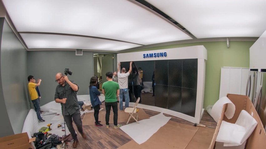
The largest screen is a 85″ touch display. The other 8 screens are passive 46″ displays, all manufactured by Samsung.
How did you guys decide on this form factor?
Andrew This particular form factor was designed with two users in mind: the immediate first person user, who’s touching the touch screen, and then everybody else.
Spectators.
Andrew Right, spectators. Through all of the visual thinking that Lutz and the team did, they would pause and ask, “What does the first person use? What do the “third” people, so to speak, use or see?”
A lot of content for the touch screen user is only in their periphery, but for everybody who’s walking past, they’re seeing content that’s relevant and attractive. The large scale content on the secondary displays is meant to catch your eye.
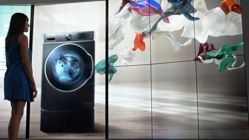
“A lot of content for the touch screen user is only in their periphery, but for everybody who’s walking past, they’re seeing content that’s relevant and attractive.”
One of the problems I’ve seen with large scale touch screen installations in airports and train stations is that users can feel like they’re in the spotlight. The suddenly find themselves “on stage,” and they might get nervous and walk away.
Was that something that was in the back of your minds?
Lutz Yeah, at all times. We’re aware that there’s some level of intimidation. If one person walks in front of CenterStage, all others are spectators. You don’t want to fail.
First of all, the person might be thinking: Is that screen really touchable? You might touch a big wall that’s not interactive, because you can’t clearly tell. We actually had to give explicit directions — here’s what you can do with the device. You don’t want to see people going over to the right-most screens, which are not interactive.
Andrew Another layer to the UX: it’s very common for a Best Buy or a Home Depot employee to guide somebody through it.
A docent, in other words, to get them going?
Andrew Exactly, yeah. It’s designed for both instances. We have both an expert level user (the employee of the store), who has used it a million times and knows his way around it; and then you have a novice user, which is yet another layer to the UX. How do you cater to both of those?
Has CenterStage been successful?
Andrew Yeah. We have some great anecdotal evidence. The first CenterStage sale was a moment where a Best Buy Employee was walking somebody through some washing machines. At the end, the customer was impressed, and felt like he’d found a good model for him to buy, except his wife would kill him if he didn’t buy a white washer.
In that exact moment, the Best Buy employee just said, “Oh, let me show you what white looks like.” He hits a button that’s on the UI, and immediately the washing machine turns white. The customer says, “I’ll take it.”
I imagine there other definitions of success that have to do with interacting with a brand in a compelling and innovative way. That may not lead to a direct sale for another year, but it’s still valuable.
Andrew Particularly with a technology brand. For Samsung to reinforce that they’re doing cutting edge things — even in the pure act of retail they’re doing things somebody else isn’t. That’s valuable for them.
Technical challenges and apocryphal knowledge
So, back to the hardware side of things: There must be some beastly computers running everything in real-time, right?
Andrew Yeah. In fact, one. That was one of the technical challenges: distilling the hardware into the bare requirements. The hope is for there to be literally thousands of these CenterStage setups out in the world. Cost is important.
We went with a professional GPU, an NVIDIA Quadro. Most of the hardware is not exotic. You could build a comparable gamer PC for probably four grand.
Let’s talk about software development. I always assumed that as the co-creator of Cinder, you would automatically build everything in Cinder. But that wasn’t the case, was it?
Andrew No. There were multiple prototypes built in Flash. Flash has fallen out of favor, but it still has a lot of use in the world. Getting working mock ups of the user interface is most easily done in Flash, so we did that.
For a lot of these kinds of projects, people get fixated on a certain kind of tool, and it’s very hard to compare the tools, because you would rarely build something twice. There becomes this kind of apocryphal knowledge of what tools are good for.
Unique to this project, we actually did get to make a pretty objective comparison between Flash and Cinder. We hired some really talented Flash guys to build a prototype. Through no fault of their own, they hit walls that are technical limitations of Flash, but Cinder was able to get through them.
If you see the two versions side by side, it’s a really striking difference. Especially with respect to frame rate. A lay person can absolutely see the difference between 10 frames per second and 60 frames per second.
What was the resolution you guys were working with?
Andrew 7,008 by 3,840. That’s 12 times high definition.
Flash wasn’t ever really engineered for that.
Andrew Yeah. No one had dreamed of that at the time, when Flash was being really actively developed.
I really respect that you did your due diligence, though. You didn’t just write off Flash because it’s passé. It’s great for a lot of things. I feel that we rushed into certain aspects of HTML5. It really can’t handle video the way Flash can handle video, especially alpha channels. It’s all very hacky.
Andrew I think that’s a great point. It shows you that even the technical world can be led by emotions. Once the sentiment towards Flash changed, we started to make some irrational dismissals of it.
Shifting focus to the visual experience, perhaps the most striking elements are the pre-rendered, photo-real scenes.
This stuff is poetic, in its way. It’s magical. How did you come up with this concept, and how hard was that to sell through?
Lutz If you look how most places sell their washing machines, you see walls and walls of products with fluorescent lighting above them. They are just not really presented in a nice way.
To contrast that: What would be the most poetic, mesmerizing, magical thing you could see?
You really thought in terms of the retail space. You’re were thinking, “How can we make that space magical?”
Lutz Yeah. That’s why you see the overall arc through the whole concept is that they are all in rooms. It’s not too far from what you’d see in a home, but it’s abstract enough — It’s not really defined.
What was the design process like?
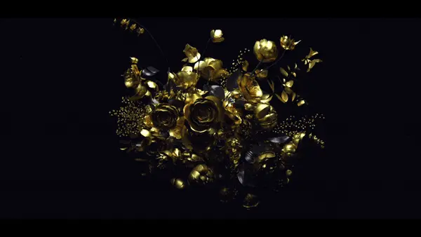
Lutz I started by designing surreal moments around these household appliances – clothes tumbling in mid air, gigantic bubbles bursting – to create these little magical moments of surprise and wonder. Connected with the space and the physical appliances, it looked oddly familiar yet surreal — reality with a twist.
It was a requirement to show the appliances in life size and on screen at all times. We had limitations as to what these devices could do. Flying washing machines was out of the question. Besides the technical challenges (3D render times), it just pushes things too far.
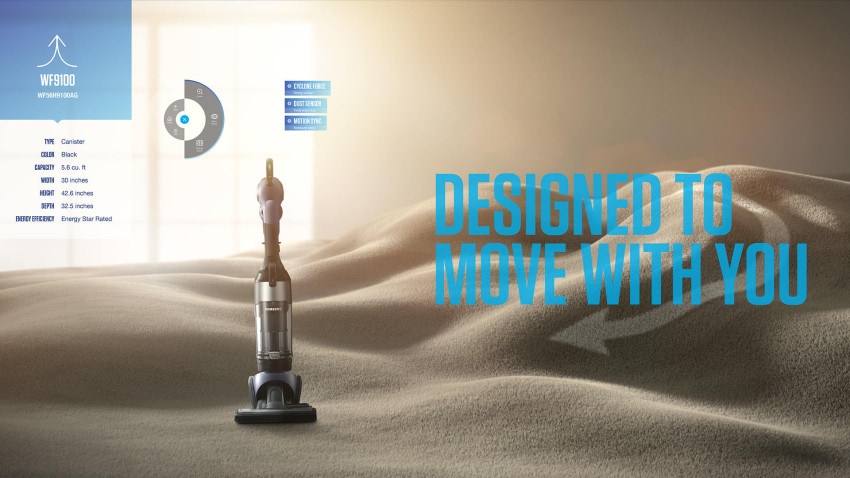
“So instead I looked into how things could happen around these devices and how the environment reacts to them.”
So instead, I looked into how things could happen around these devices and how the environment reacts to them. The carpet that turns into the mountainous terrain is a good example for that.
On another note, the real estate of the screens really allowed room for these surprising moments. You’re looking at a wall, not just a small TV screen.
So bit by bit, I continued to look for metaphors that applied to each product category, while keeping in mind a holistic look and feel that kept everything together.
How well did you need to understand the products you were working with? I mean, isn’t a vacuum just a vacuum?
Pairing visuals with features of a product was possibly the most challenging process as I had to understand exactly how these products work. This was surprisingly important. I learned the differences in stronger, short-term versus long-term suction in vacuums. The difference, as it turns out, would mean that I couldn’t use a certain metaphor; it wouldn’t portray the feature correctly.
Finding the right balance was key. You didn’t want to be too abstract — or too literal.
Method handled all of the visual effects work, right? But they came in later, after you’d already nailed down the concept and the look?
Lutz Yeah.
Andrew I got to observe a fun dynamic, because at a place like Method, it would be unusual for their clients to know their business as thoroughly as Lutz does.


I remember Method’s head of CG stopping us as we were going through these frames, and he said, “Who made these boards?” Because they typically don’t see that quality.
I was like, “Your client made these boards: Lutz.” That actually was a really positive dynamic that’s so rare. There’s a mutual respect that’s unique to a practitioner being the client.
Let’s talk about the user interface layer. How did you come up with the radial menu idea?
Andrew I think part of the motivation was making sure people understood this was not just a website. It’s a UI that works for touch, that would be less typical of a website.
Having said that, there are things that look like buttons, but then in the same context or screen, I can swipe as well. You’re straddling these two languages, as most users are, I suppose, when they approach the screen.
Andrew That’s a good example of a phenomenon we were thinking about earlier, where you have both a novice and an expert. The expert is going to swipe, because it’s more fun.
But there’s also a button that’s an obvious mechanism for the same effect. There are a number of interactions like that where there are two approaches available.
If I’m swiping between, say, washing machine models, there’s a lot of fidelity in the movement. I can drag, and there’s a nice motion blur. Are these just stills with real-time effects, courtesy of Cinder?
Andrew Yeah. Heavily retouched by Lutz’s team to make them feel a little hyper real. A lot of the art of this is blurring the lines between what’s real-time and what’s not real-time.
When you do visual effects work, you talk a lot about what’s in camera and what’s done in post. A skillful visual effects execution blurs those lines to where even an expert can’t quite distinguish them. That’s what we set out to do.
Lutz From the design point of view, the compositing and lighting challenges questions were the most interesting for me. What makes this scene a home?
One thing that everyone has experienced are those tingly moments in the morning when you wake up, and the sun is shining into the room. To me, that’s just happiness. I think I can speak for everyone — well, maybe not coders, because their blinds are down.
Andrew [Shaking fist] My old nemesis, the sun.
Zooming out: Where are we headed next?
It’s really hard to sell through large-scale interactive work to brands. Do you see installations as a real growth area for studios, or is this type of work just something that helps promote a studio without being its core business?
Andrew What I’ve seen, in the time that I’ve been trying to sell this work, is it actually is getting easier.
In part because we have clients that have become more educated around what it really takes to do a high-end experience. But also, the costs on the hardware side have come down substantially. In the year or so this rig has been sitting in here, the cost has come down 30%. This rig over here [pointing to a slimmer CenterStage setup nearby] is newer, better, and cheaper by 30% compared to this one.


Is this just a project underwritten by its novelty? I can say with certainty that’s not how Samsung thinks about it.
This is absolutely a key move for them in the future of retail. That’s why there’s a real CMS behind this that allows them to roll out new models of products — because they’re really invested in this being important.
What you’re talking about is reinventing retail. You’re not talking about advertising.
Andrew Right.
You could almost distill it down to the difference between a traditional display and a touch display. A traditional display is an effective piece of advertising. It does not change retail. When we introduce the touch layer, we have the opportunity to really shape what the retail experience is.
I think everybody’s aware that retail’s biggest enemy is the internet. Part of our mandate was to build something that — even with infinite bandwidth — the internet would not be able to provide resolution like this, speed like this, interactivity like this. Let’s build something that really justifies the customer coming into the store.
Do you think designers need to learn to code?
Lutz No, I don’t think so. If you would like to move into that space, it certainly helps to have experience in UI. But what is UI? You see UI everywhere. You see it at the ATM machine.
I think motion designers already tend to have a sense of timing and space. That’s why, even though it’s an interactive experience, we storyboard art. There is always a sense of, “Okay, what has to come after?”
At the end of a TV commercial, I want to leave a message. I want the viewer to aspire, or have whatever feeling I want to give. The same applies here.
Andrew, you and I have talked about the natural specialization that occurs as a field matures. That’s happening now for experiential work, isn’t it?
Andrew Yeah. If you look at a project like this, you’ll see participants that occupied the full spectrum, from purely technical to purely design. For a number of the Method artists working on this, the fact that we were creating an interactive touch screen was something they knew, but were not particularly concerned with.
It didn’t effect their day-to-day work.
Andrew They fired up Houdini and did their thing, and we’re all the better for it.
We brought in a traditional motion designer to create the look of the UI under Lutz’s direction. He was somebody who was called upon to think a little more technically than say, the Houdini artists, but was not meant to be a programmer.
Lutz This is why it’s important that you have a good UX team. You have to define first: What do I have to solve? Where do I want to get?
Motion design is perfect in that regard, because you can design the experience on a timeline, which you can’t really gain from just looking at stills. How does it feel? How do I perfect it? You can run all these tests before you actually program it.
On collaboration and finding true balance
Andrew I think a kind of a litmus test for how a team operates is: is there a dominant technical or design force, or do you really regard each other as peers? Everyone, of course knows that the right answer is “peers,” but in practice, it’s a really rare dynamic.
If you’re at a visual shop, inevitably the design dominates, and the technical people are called upon to be the implementers of somebody else’s vision. If you’re at a primarily technical shop, your language is like, “Oh, these artists will generate assets.” That’s a very hard dynamic to defeat.
Creative coding and the future
Andrew The way creative coding is thought of right now really emphasizes the auteur theory. I kind of reject that.
I had that beaten out of me when I was a TD working in visual effects. I realized what a real artist brings is at a different level than what I can bring. I might have my own aesthetic sensibilities, and I am able to use the tools in a way that’s unique, but fundamentally, you’re never going to out-design a designer. His Malcolm Gladwell 10,000 hours went to a different thing than mine did. That should be celebrated.
I’m hoping that the creative coding world progresses past this moment right now, which is a product in part of the fact that we’re holding the tools hostage. We’ve got the new tools, and because they’re so technical to use, it requires a level of mastery that a typical designer is not going to have the time to pursue.
If you look at the history of computer graphics, you saw exactly the same phenomenon. The first particle system in Wrath of Khan was done by programmers on a command line. Now, if you look at what a great particles artist can do with their tools is so far beyond what we were able to do when that tool was held hostage by the programmers.
A priesthood of programmers.
Andrew Exactly. The one man band is sort of all that’s on the radio right now.
That’s what I feel proud about with this project. We really defied that phenomenon. We had specialists on the technical side and specialists on the visual side. They had interactions that I really believe were made possible by a mutual respect. You could actually see that in the result.
I know, unambiguously, that Lutz is a better designer than me, and I love seeing the new frames that have come out of Photoshop from him. I love hearing his feedback on something that we’ve implemented.
That’s a rare and wonderful thing, when you can breathe a sigh of relief and say, “I’m glad I’m not doing that part.”


