Imagining a better After Effects with Sander van Dijk

Sander van Dijk loves After Effects. Which is exactly why he wants to change it.

After working with the program for over 10 years at places like Buck, King & Country, Giant Ant and IDEO, he’s amassed dozens of ideas for improvements — some big, some small — that would collectively bring the application into our current era of animation production, one increasingly concerned with interactivity and real-time experiences.

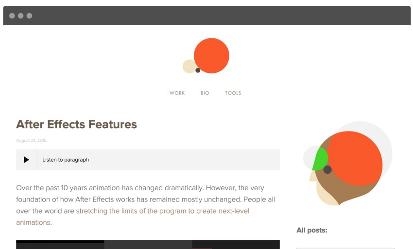
Sander van Dijk spent over a month working on "After Effects Features"

Sander van Dijk spent over a month working on “After Effects Features”

But instead of ranting on an Adobe support board, Sander did what he does best: He used motion design to bring his ideas to life. He wrote an article tying everything together and included a voting system so that other people can support and suggest features as well.

Q&A with Sander van Dijk

Most people probably know who you are, but for those that don’t, can you give us a very brief bio? 

I’m a motion graphics designer, and my interest lies in making things with meaning. I’ve begun expanding outside the confines of traditional motion graphics and exploring how animation can be more interactive.

I also take my own workflows and turn them into tools for After Effects like Ouroboros and Ray Dynamic Color.

Why did you create this article?

I wanted to bring people that use After Effects closer to the people who build After Effects.

The experience motion designers get when making animation is essential to the growth of animation tools. As a motion designer, I have a unique perspective into what are useful tools and how we can evolve animation techniques. Collaborating with other great motion designers, I realized that I was not the only one that had ideas on how to help animation evolve.

This is an extensive summary of all of those ideas.
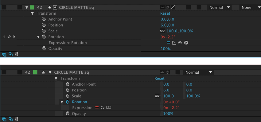
One proposed feature from the article is to simply rethink the alignment of properties in the timeline. (Top: original UI.)

One proposed feature from the article is to simply rethink the alignment of properties in the timeline. (Top: original UI.)

How long did it take to write the article and create all the supporting assets?

I looked at this as just another animation project. The proposed features have been in my thoughts for years, and I had to share them. I spent about a month creating the article—but once I started formatting the article, even more ideas came up.

But if I look at it in perspective, a month of my time is the least I can give back to a program that has given me so much.

What is the best possible outcome from sharing this article?

That people start to share how they work, so we can all understand how to make better tools.

I can only take it so far, so I need others to bring their perspective into it. Ideas feed other ideas. This will help create clarity of how best these future features may work and which ones are most important.

Sketch is undoubtedly eroding some of Illustrator’s market share. Affinity Photo is an attractive alternative to Photoshop. Do you think that someone might create an After Effects alternative?

I think you make a very prescient observation.

Sketch came out to serve the vector workflow needs of the UI/UX field. If the Illustrator team had understood those UI/UX needs, they could have adapted and allowed them onto their platform, giving the opportunity to access the powerful features they already had developed over years of experience.

More and more animations are moving to the web and mobile platforms. People want to interact with animation and have it adapt to different data inputs.

As for animation, I think there is definitely a need for a better animation tools to create interactive animation. Look at the amount of prototyping tools that are coming out like PixateFramer and Form — not to mention all the scripts that are trying to hack into After Effects to convert animation to code, like cyclops and bodymovin.

More and more animations are moving to the web and mobile platforms. People want to interact with animation and have it adapt to different data inputs — like the IBM Datagrams project, for example, where motion graphics changed depending on different tennis data.

As I show in my article, if the After Effects team updates the program with a few features, they can start to build a bridge and open doors to more interactive animation. They could then welcome this new era of interactive animation onto their platform.

This will really be a win-win situation. When UI/UX starts to use After Effects, they will undoubtedly bring a whole lot of coding knowledge and innovation to the table. This can result in more scripts and plugins for After Effects, which will ultimately help our modern animation needs.

Lets keep in mind the ultimate point: better animation tools allow us to communicate/visualize ideas faster in more dimensions than words.


Get involved!

Read the article, then vote and suggest features you’d like to see in future versions of After Effects.

Tags: , , ,

About the author

Justin Cone

/ justincone.com
Together with Carlos El Asmar, Justin co-founded Motionographer, F5 and The Motion Awards. He currently lives in Austin, Texas with is wife, son and fluffball of a dog. Before taking on Motionographer full-time, Justin worked in various capacities at Psyop, NBC-Universal, Apple, Adobe and SCAD.

18 Comments

Justin Fines

Holy crap Sander, lots of great ideas! At the end of that video when you were going thru all of it my head was kind of spinning

Sander

Thanks Justin, Did you find a way to make it stop? my head is still spinning!

christopher lopez

Biggest omission I see in the vid but may be listed elsewhere is a fully integrated 3d viewport just like c4d and Nuke. The current 3d viewport is kind of cryptic and hard to comprehend immediately.This has needed an update for the 10+ yrs. Along with this would be more flexible bezier control screen for the keyframing – As in a separate window that can be fully expanded like any other high end 3d app or comp app…

Dom Amatore

Awesome.

Markus Feder

Wow, a lot of nice thinking here!!

Sean Kai Raffety

Wonderful Wonderful Wonderful.

Louis Costa

Awesome! I’m all-for-it! I don’t have Facebook so I can’t go to your website.
Hopefully you’ll see my suggestions here in the comments,

Tapered shape layer strokes would change the AE game indefinitely. We need this, nobody wants to buy 3D stroke JUST to add one style feature to their project. There’s ways around this, but they’re too time-consuming. Just making it native in AE would be the smart way to go.

Adjustable Strokes / brush styles would be an amazing feature too. In AI, there’s the option to hit command+w on a line and that will allow you to adjust your thickness – giving you a lot of control over an illustration. Making custom brushes out of vector shapes is an amazing capability too.

RE: Redesign keyframes and show the connection between them:
A visual Graph editor on top of layer display would make things smoother + faster to work + understand for early users within AE. May even be a clearer solution to a couple of the tweaks you mentioned; just rolled into one.

Another one that would be great (coming from someone who works a lot in Illustrator) – would be the ability to put strokes inside of or outside of shape layers (ie. closed shape layers always have a central stroke – why can’t we just easily place that on the outer edge or the inner edge?) – ran into this problem with a friend and the only solution was put it under a layer and make the stroke thick – doesn’t exactly mean it’s the right way to do this sort of thing, but it worked… if this could have been made into a simple fast click without a plugin, it would be amazing.

They did some amazing updates in CC2015 – rendering + RAM previewing is so much faster at this point and thankfully, things are only improving from here. Let’s hope that as a group of Motion Designers our requests will be met in that future!

Lucas Brooking

Sander, you’re a legend!

Taylor

It would be great to have illustrator text layers to be convertible directly to AE text layers in the same way photoshop text layers are.

Louis Costa

We can currently do that! You can enable that by right-clicking your AI text layer in your AE comp and select ‘Convert to editable text’ :)

Klustre

This actually only works on Photoshop layers.

Louis Costa

Ah yeah, I see what you mean – but you can copy+paste your text between AI and AE and still have your layer styles implemented. The result of live text imports would probably mean the text needs to be on a specific layer because AI layers import flat, until you convert them to editable shapes in AE

asaf

great ideas!
i think that you can add duplicate layer in the timeline that in the same time replicate itself in the library

René

I will definitely read it all carefully on Sander’s website and support the work he put into those propositions. Thanks for doing this. This might be even better than sending feature request to Adobe all the time.

roblesvfx

this definitely needs to go to change.org!

Marcus Szabo

Great work. Hope Adobe really take note on this! I like almost everything you’ve listed on the site.

Zach Christy

I want to cry– all of these things need to happen.

Morgan James Chadwick

Why are timeline folders not a thing? It’s 2015. Get your shit together Adobe ;)

Comments are closed.