CG artist Daniel Ahrens created his short film, “Shell,” as a means of coping with the emotional fallout from his father’s struggle with cancer.
Centering on a nightmarish personification of the disease as it stalks a healthy person, the film’s disturbing tone is offset by a surprising poignancy at its resolution.
We asked Daniel for more details about making the film, and he graciously replied.
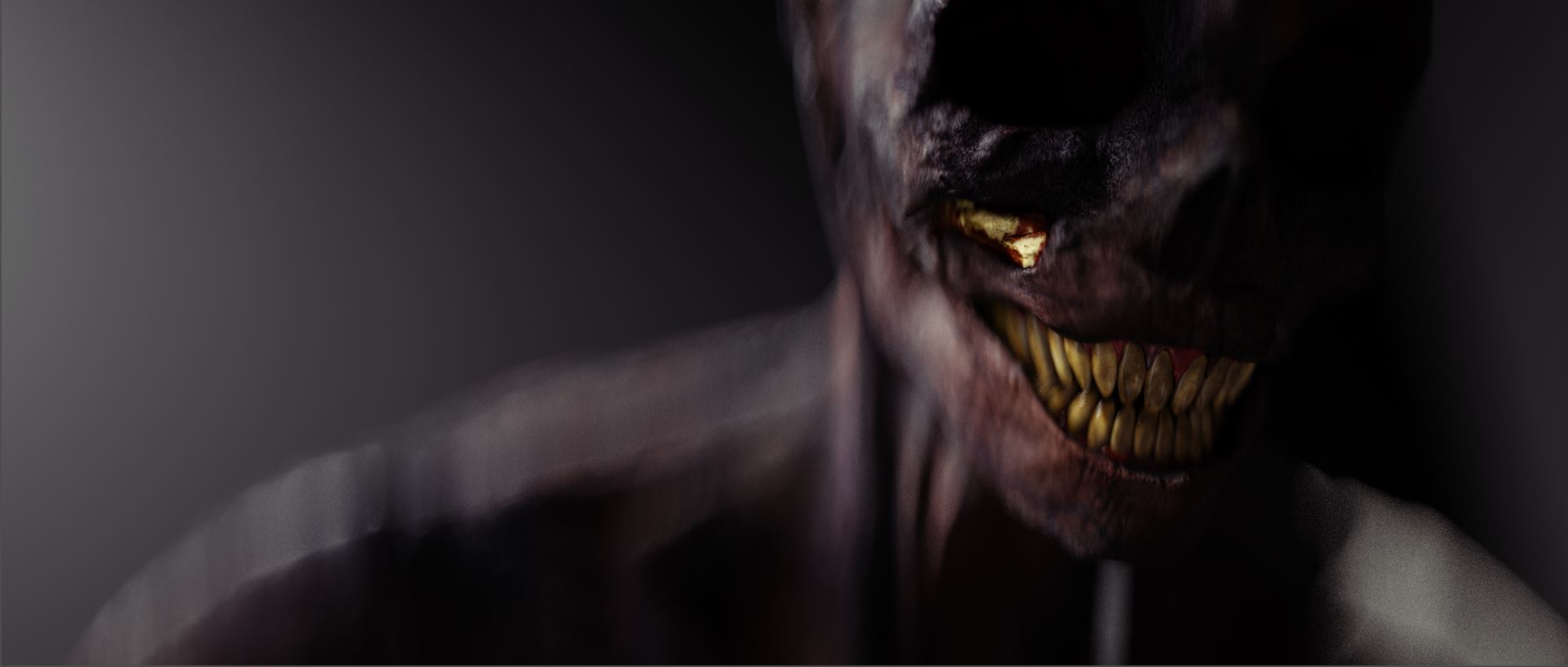
Process breakdown with Daniel Ahrens
Did making the film help you cope with your father’s illness?
Yes, it definitely has helped, and I think it also helped for my parents, in a way.
When I showed them a first draft of the film to ask if they would feel comfortable that I progress with this personal message, my dad told me that it really shows the horrors of the disease and what it was like to spend the weeks inside the hospital. When he received his stem cell transplant, it was a very tough time. It also shows how important my dad’s disease is to me, and I wanted to show him that.
There was also another side to it. Before, I dealt with the disease outside of my work. Now, it suddenly meant really diving into the disease and imagining every aspect as a film, becoming part of my work as well.
The film is loaded with symbolic imagery. The primary figure represents cancer, correct? What is the significance of the gun? Why did the character shoot himself instead of the woman?
Exactly, the primary figure represents cancer, while the female character symbolizes the innocent patient.
At the beginning of the film, the disease is sleeping, waiting. Cancer is usually an illness that comes up later in life. In the case of my father, it was something genetic that has always been inside of his body. After the disease wakes up, it starts flexing its arms, growing, awakening from a very long sleep.
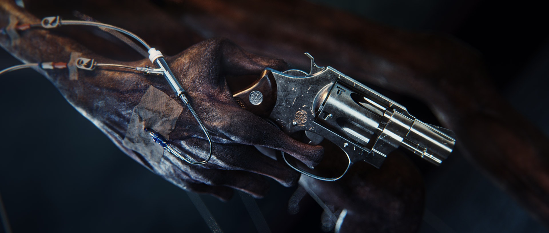
The gun is there to build suspense and introduce the twist. I wanted to make the spectator think that the disease is walking up to the woman to shoot and kill her, not expecting that it will pull the gun on itself.
With this turn, I wanted to show that the disease is in control no matter what you do to it. It would be easy to just shoot the woman, but the disease knows it will progress and maybe even win in the end, so it is mocking the patient by shooting itself.
No matter how much medication and poison you throw at it, the disease is so sure of itself that it’s lending you a helping hand while smiling knowingly.
After the blood transfusion, the cancer figure seems to be masturbating. Can you explain the thinking behind that?
Since uploading the film, this part has been the most controversial one.
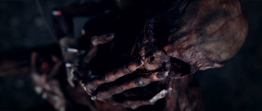
Some people have expressed that it is unnecessarily shocking or too graphic, but I feel like it describes best how utterly disturbing the disease is.
Cancer enjoys being a disease. Everything it does — causing more and more pain — is a turn on. There is no rush. It has all the time in the world and grows inside you when you least expect it.
So the perversion is an expression of this. At the same time, the sexuality of what he is doing usually represents pleasure and life, the exact opposite of what it represents in the film. The disease enjoys being utterly disturbing to life, and it shows it.
There isn't really a warning when you first walk into a cancer ward at the hospital and see death, hope and despair.
Most importantly, the film needed to shock a little. There isn’t really a warning when you first walk into a cancer ward at the hospital and see death, hope and despair.
No warning when visiting and the patient you talked to last week died or another one was sent home to do the same. No warning for how quickly cancer can return after remission or for the allergic shock from chemo, the nausea.
This lack of warning is also told in the film with the female always having her back to the disease. She never sees it coming.
Does the woman represent a cell before it becomes cancerous?
The woman not only represents a cell but also the whole patient.
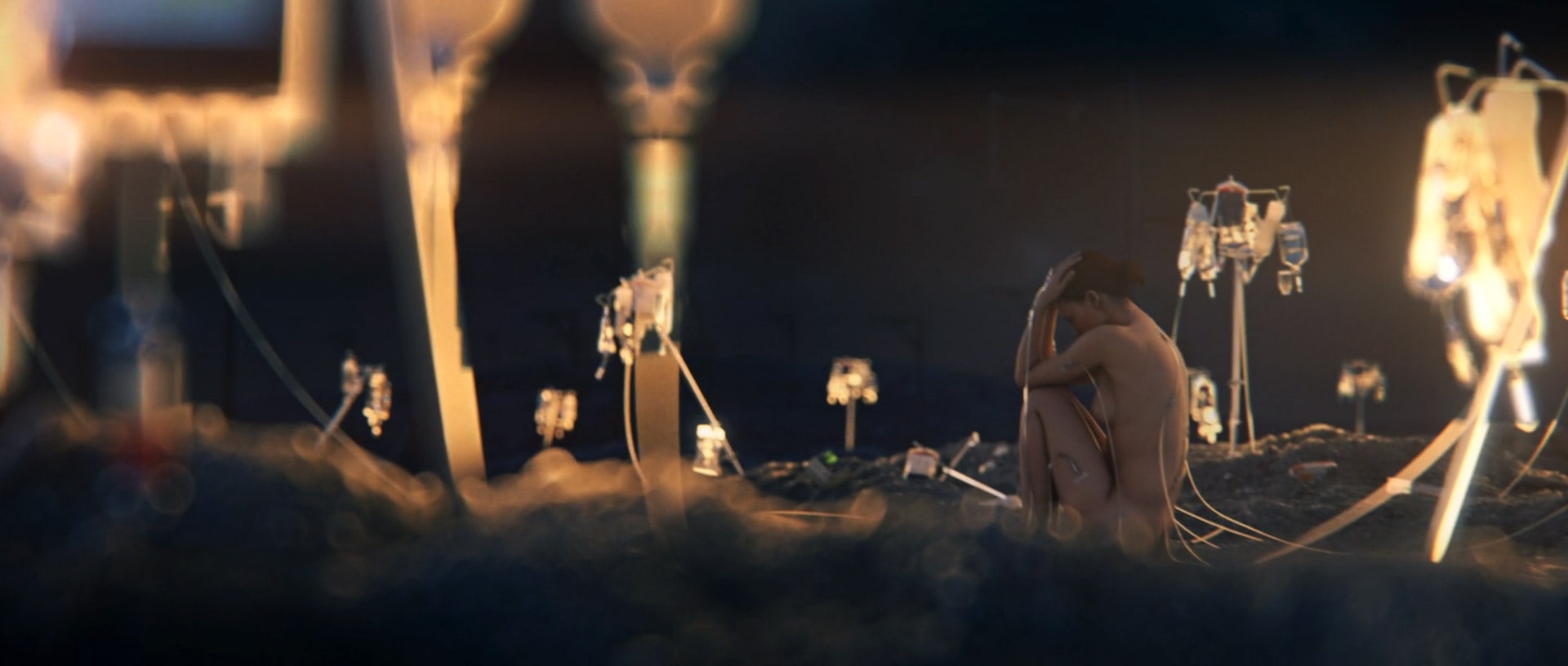
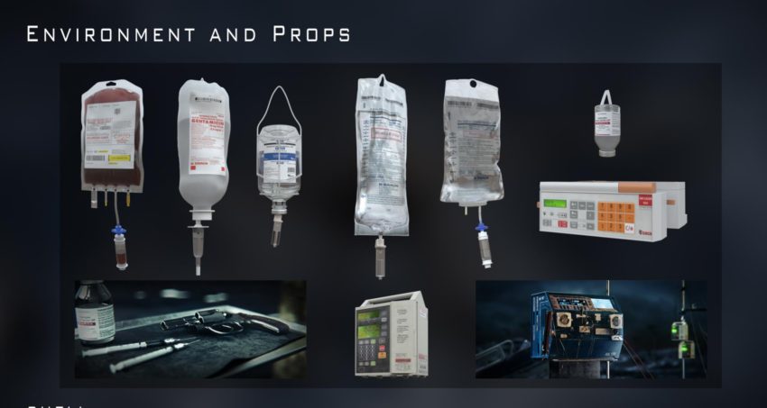
Around her are the glowing IV bags. I called them “lanterns” during production. These symbolize hope and medication, the belief that there is a cure and that, for example, chemotherapy will help, that there is a light at the end of the dark tunnel.
That is also why, in the last shot, they slowly lose their luminance as the disease is spreading and taking over the inside of the patient.
There is also a kind of beauty and innocence associated with the female model that makes the film much more emotional and relatable. The two characters feel closely related, sharing the medical equipment on their body.
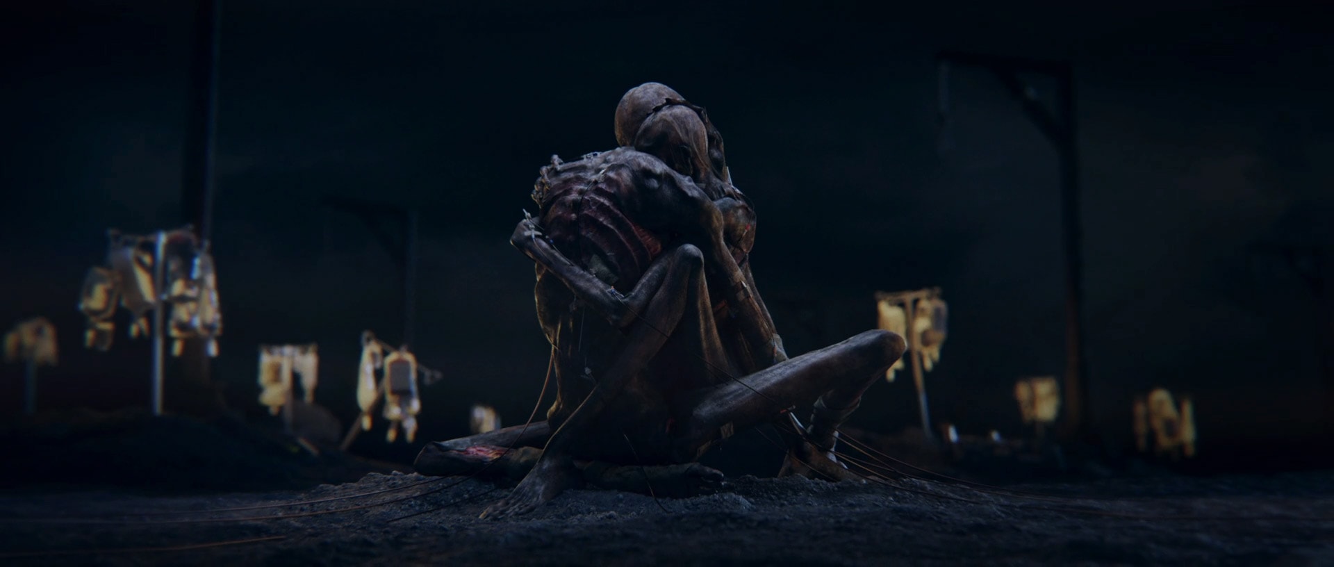
The last shot of the two skeletal forms embracing was surprisingly moving. I felt a kind of sympathy for these figures that I didn’t expect. Was that your intention?
The last shot and pose of the characters was inspired by a painting by Zdzisław Beksiński, like many other aspects of the film.
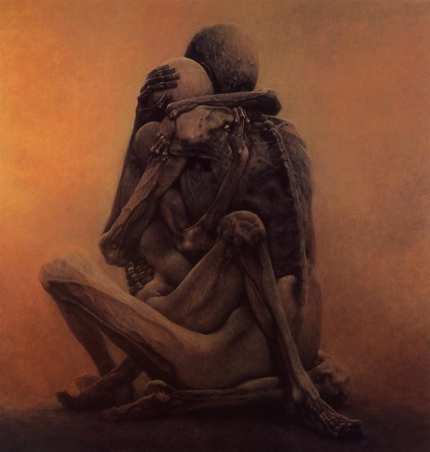
Untitled by Zdzislaw Beksinski (1984)
I also feel sadness and empathy towards the characters in this scene. It changes from the hostility before. It was important to me that the film offers the possibility to be interpreted in a lot of different ways for a lot of different diseases or life situations.
Telling the spectator how the last shot is meant to fit in the film would kind of take away from that. Much like you, I am hoping viewers will feel something — maybe something completely different, something personal to them.
Production and Technical Aspects
How long did it take you to create this film?
The first script and sketches were done in September last year (2015). The film was completely different back then, as with any project, really.
Production started towards the end of the year and progressed until the beginning of June. So including breaks, about six months.
How did you assemble the team that worked on this with you?
There wasn’t really a team for the film. I mostly asked friends and colleagues to support with smaller tasks that they specialized in.
Without their help, it would have been a lot more difficult, and I owe a lot of favors now!
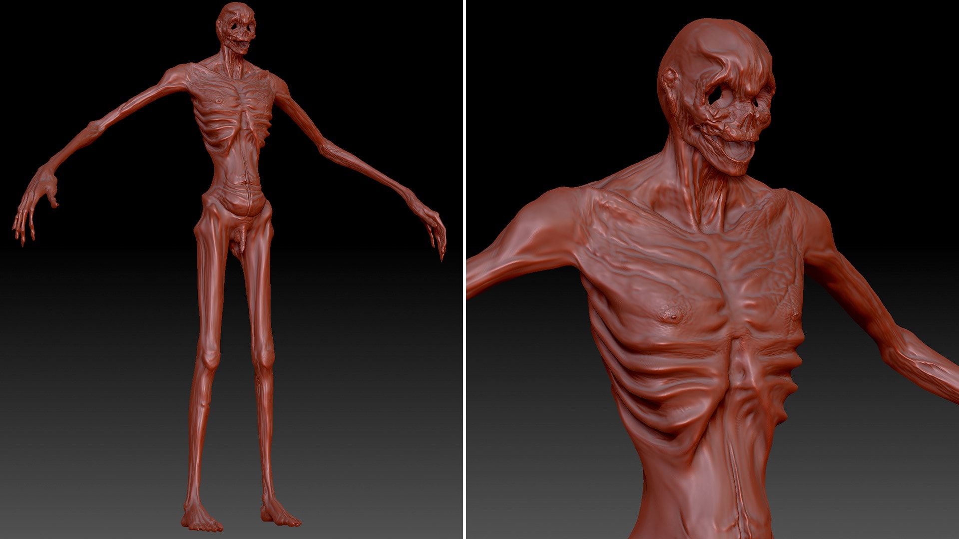
A huge help was my girlfriend Julia Merkschien. She modeled the disease and supported me the whole way through the film.
Other than that, except for the character modeling and animation of six shots by Johannes Helm, it was mostly a one-man show regarding the visuals.
The Marmelade, a big post-production company with three locations in Germany, supported the film by letting me work from their office in Frankfurt, Germany and always giving me feedback/support and help.
Last but not least, Niklas Ihm spent many nights, especially towards the end of the project, on the sound editing and design, as well as mixing the audio. A huge moment during the production was reached when we received permission to use the main music for the film.
How much pre-production work did you do? Did you create storyboards and style frames to guide you along the way?
Except for a script that came before the film, there was not any pre-production, storyboarding or previz. For the most part, I had a clear vision of how I wanted to make the film, the tempo of it and what the key visuals looked like.
If you are working as a team or have enough time, I highly recommend a lot of pre-production and creating an animatic. It really helps.
In this case, it worked out. In the end I “only” created three shots that did not make it into the final film and proved to be unnecessary work.
What was the character design process like?
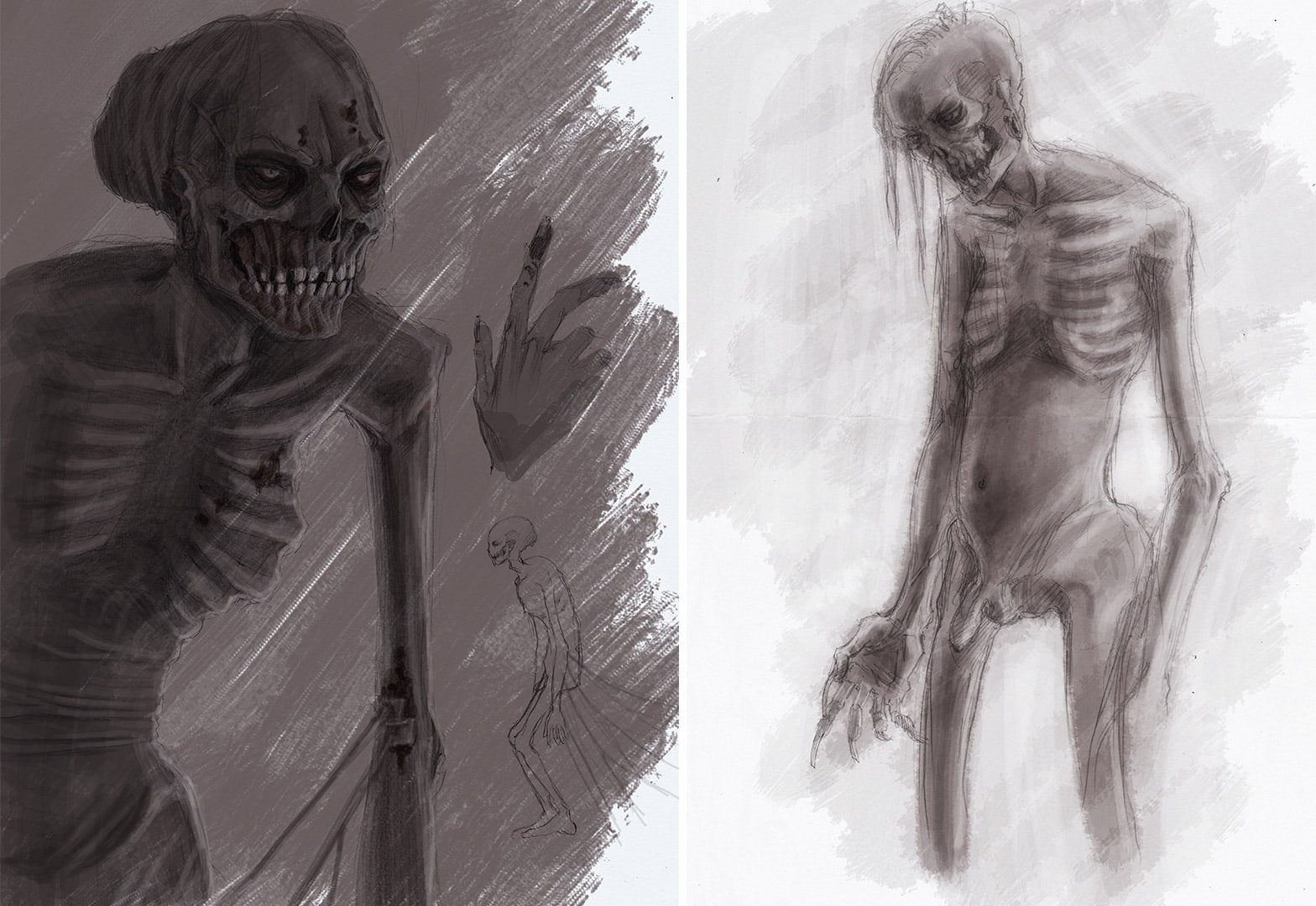
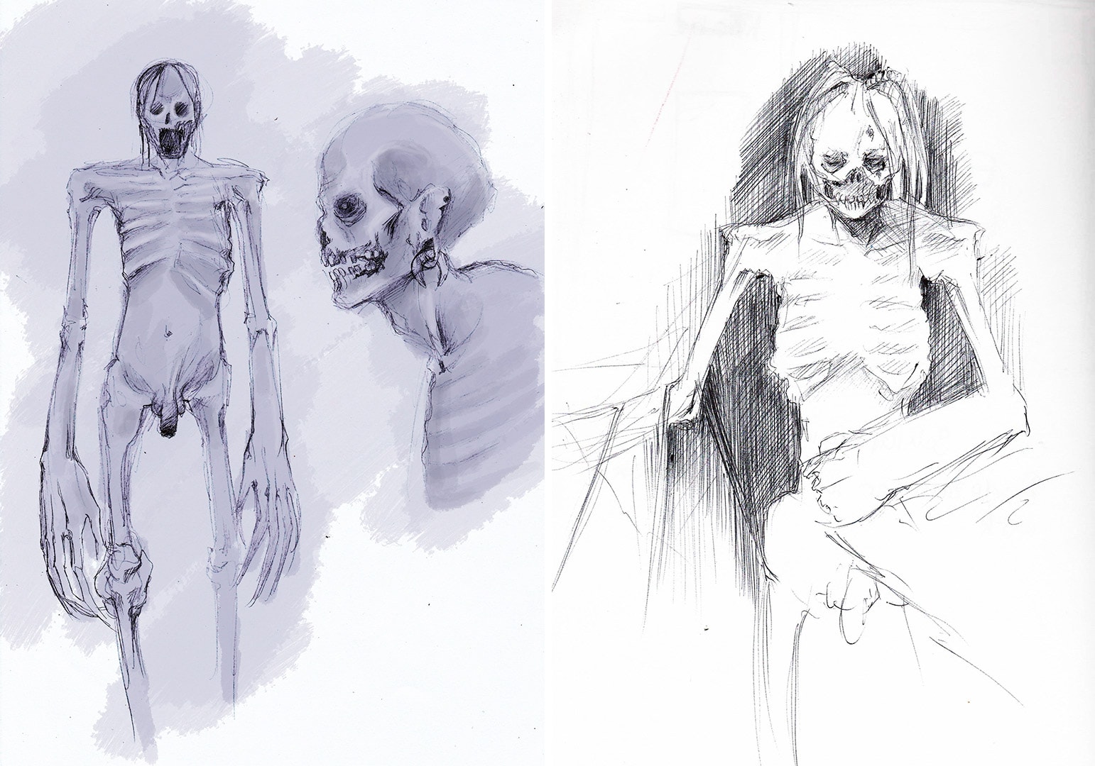
It was really important to me that the character did not look like a typical zombie or what you would immediately associate with something like “The Walking Dead.”
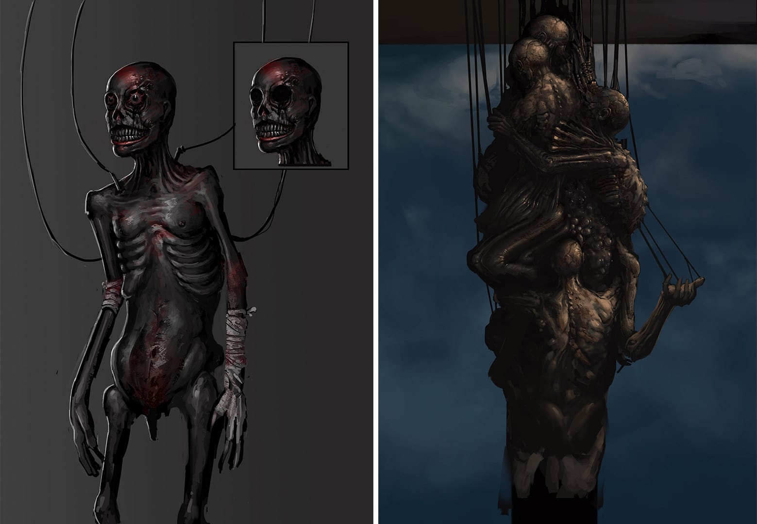
I received some help with character concept sketches from Daniel Knoblich and Karoline Breitkreuz, who established a base for the character.
My girlfriend and I also did a lot of concepting during the sculpting process and often changed things around to see how it would fit the silhouette.
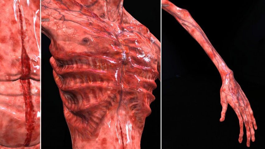
Going into the texturing, I created two layers: a fleshy subdermal base with all the veins and wounds and on top of that, the skin layer. These two layers were then blended on top of each other, which gave a lot of creative freedom to get the desired look.
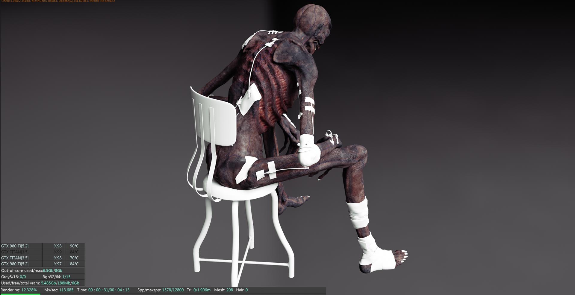
I wanted the character to look dry, like he has been sitting there for a long time, but still “alive and well” enough to represent the disease and not the undead.
Please explain your choice of software.
Besides the main character, the modeling and UV layout for all the assets were done in Modo. For me, it still feels like the fastest way to create and prepare assets. You just use so many fewer clicks and steps compared to other packages for these areas of 3D.
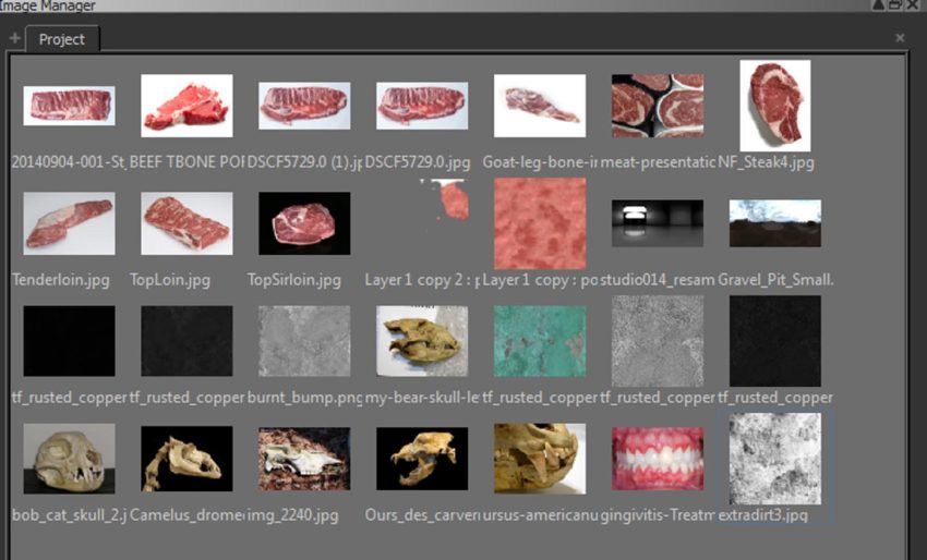
The disease was textured in Mari with a lot of real world texture reference of meat, burned flesh, skin diseases and bone. The character has 7 UDIMS with a resolution of 8k each, so performance while painting was essential. Mari worked great with the assets, and there wasn’t any slowdown, no matter how many layers or resolution.

Cinema 4D was used for animation, rigging, shading, lighting and rendering. I have not rigged or animated a character before. The tools and simplicity C4D offers helped immensely with those tasks. Furthermore, the software offers a great community with tutorials and help for everything.
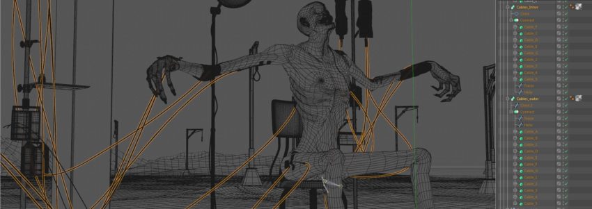
Each of the around 45 full CGI shots were comped in After Effects, which worked great with the Cinema 4D link.
The whole short was rendered with Octane for Cinema 4D on my own machine. For an independent artist like me who does not have a render farm or the budget to rent one, using just one machine with multiple GPUs really enables you to create and realize projects that were not possible for me before.
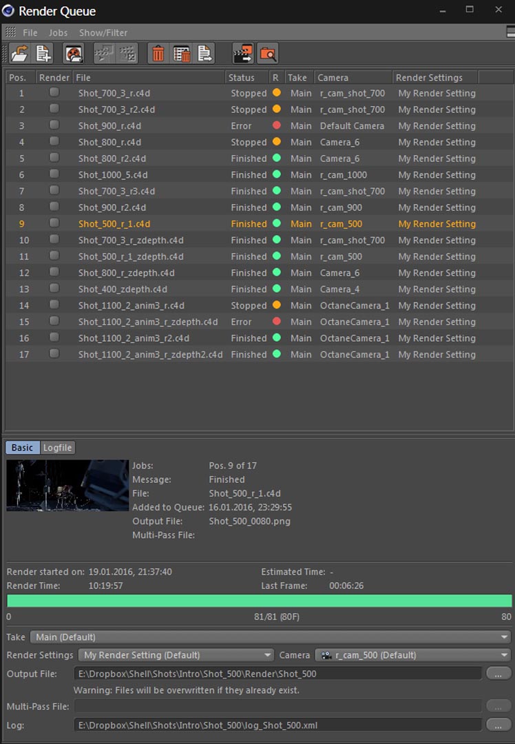
Without the speed of Octane and its interactivity, I doubt I could have done the film. A lot of credit also goes to Ahmet Oktar (“aoktar”), the developer of the plug-in, who really did a great job integrating it into Cinema 4D.
Was the female figure photo-scanned? How did you create her?
It is a photo scan, indeed. I purchased the model from a company called Ten24, who do amazing scans of humans. The pose was perfect for the film, offering great detail and a high-resolution texture that was good enough for close ups.
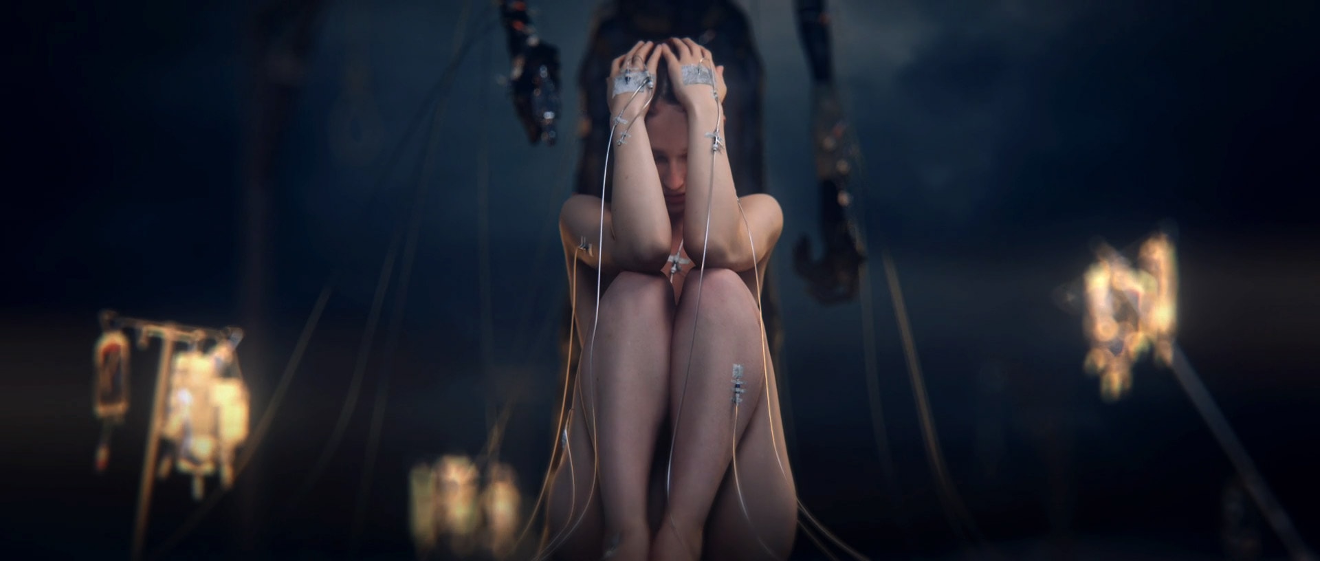
I did some clean up, which was only necessary for this film, adjusted the texture and spent a lot of work with the shader setup.
To save render time for some shots, the character received fake SSS that was painted on the texture. For it being such a cheap solution, I think it works well.
In the credits, you mention the Frischluft Plugin Suite. How did you use it exactly?
Compared to the built in After Effects Camera Lens Blur, Frischluft Lens Care offers much more control on how the bokeh behaves, resulting in realistic depth of field. It also lets you boost and select a specific range of bokeh highlights, which supported the desired look of the world around the female character.
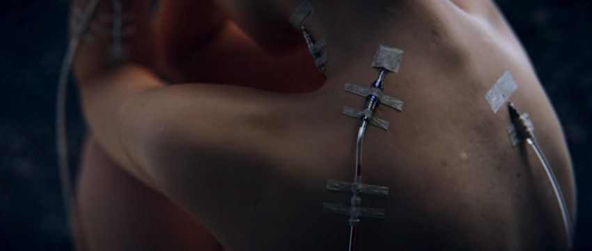
For a lot of the close-ups, I just rendered the foreground with a lot of samples and then made really quick and noisy renders for the background, which were then extremely blurred with Frischluft. A huge and fun time saver!
Frischluft Glow was used throughout the film, especially for the lanterns. Its benefits are similar to the Frischluft Lens blur, giving you more control over the desired look.
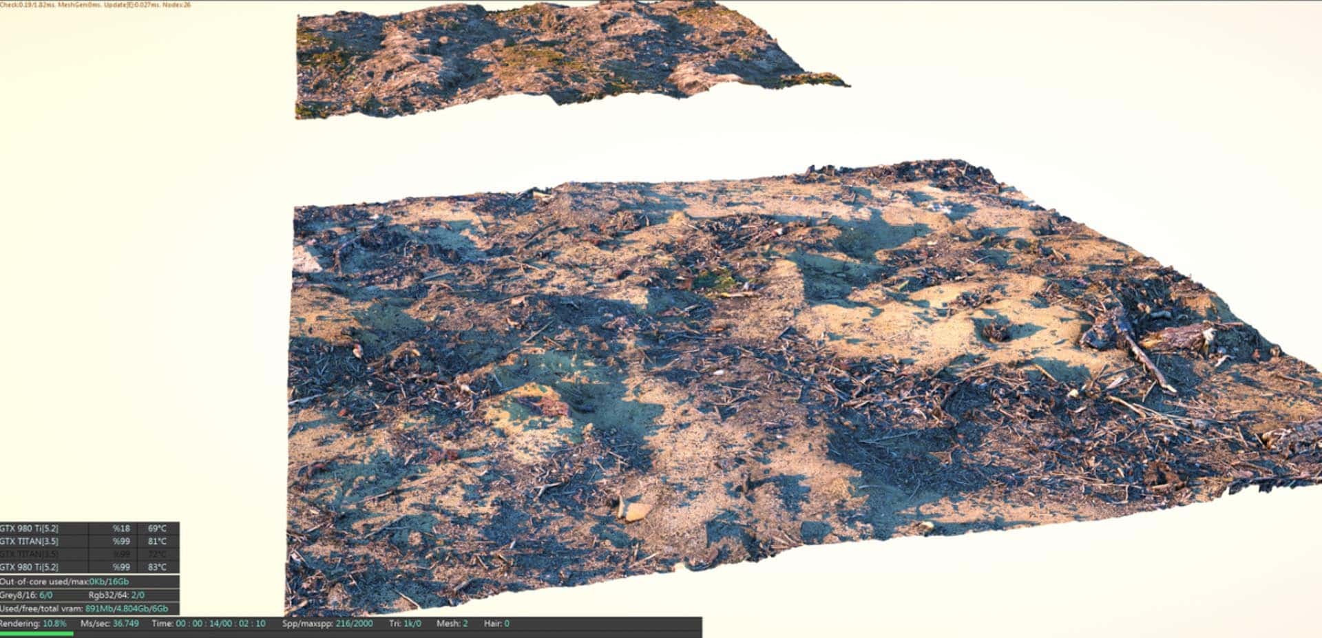
Real-Displacement-Textures, created by Christop Schindelar, also proved to be essential for the film. He offers scanned textures from the real world with an incredible amount of detail and flexibility. The textures were used throughout the film for the ground, hills and mountains.
Were there any particularly challenging parts?
The biggest challenge for me was the character workflow because I have not done it before.
There were days while texturing where I looked up rotting arms of heroin users, burned animals and flesh wounds as painting references just before breakfast or going to bed. Let me tell you, your coffee does not taste as good in the morning after that.
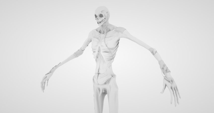
In general, since I have only worked with hard surface models in the past, creating something organic that can move, needs to be animated and look like it is alive, was something very new to me. Luckily, the design of the character had no eyes, so it was a good learning curve for a more complex character coming up in future projects.
What did you learn from this project?
I think I mostly improved in telling a story, especially such an abstract one, combined with the camera work. While making the film, I put a lot of effort into the framing. There are certain camera moves which are referencing each other to tell the story.
For example, the disease is always shown from the left, the female character always from the right, until the disease comes close and takes over, when the camera travels over the axis to the left.
The disease and the female character are introduced with the same camera move. Together with the camera going down the IV bags and then again out of his body following the blood, just reversed. There are many more examples to have subtle consistency that I think makes it easier for the spectator to follow the story.
What advice would you give to anyone setting out to make their first CG short film?
Push through it. I think there comes a time with every long project, especially when you work alone, when there is no energy or creative inspiration left. At that point, you just have to trust in yourself and in your work to finish the film.
Call to action (from Daniel Ahrens)
Please consider getting registered as a stem cell donor, or help fund cancer research with a donation. Getting registered as a stem cell donor takes seconds and saves lives. Every 15 minutes, a person gets diagnosed with blood cancer and often the only cure is a stem cell transplant.
Please Google your local stem cell database. Each country has their own, and it just takes minutes to be registered. You can find out more on how it works in this video:


