Apple is no stranger when it comes to good content. While the news of their new hardware may be underwhelming at best there is one area where they’re still on top of their game: marketing. In this case, they tasked the ever talented Johnny Kelly to take on the challenge of creating five films to showcase Apple’s new and improved Health App.
The following is a Q&A with Johnny about what it was like making a series of five films for the world’s biggest client.
Q&A with Johnny Kelly
First, wonderful job on your new collaboration with Apple. The series turned out great! Can you tell us a bit about how this project came about?
Thanks a million! As you can imagine it was a major team assault to put these together, I was one small pernickety part of it. It first started when Apple got in touch with Nexus to see if we would be up for making a film to help launch their re-designed Health app. Then it became five. They had written some really thoughtful scripts and were open to a free interpretation. I jumped in with both feet. I’ve been using Apple computers since they were beige boxes so it was a delight to peek behind the curtain.
Making five films is no small feat, especially for a brand like Apple! Can you tell us a bit about the production schedule for this project?
We had just under four months in all, although this doesn’t include the final stage when Apple translated the films into a million languages. I had never properly worked with them so was a little intimidated at first, but they were really nice! They were also heavily involved in the production – in a good way – with lots of ideas. It was clear they were pretty passionate about the themes behind these films.
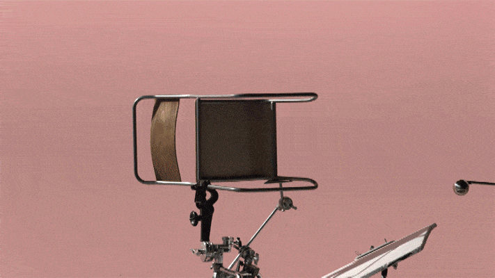
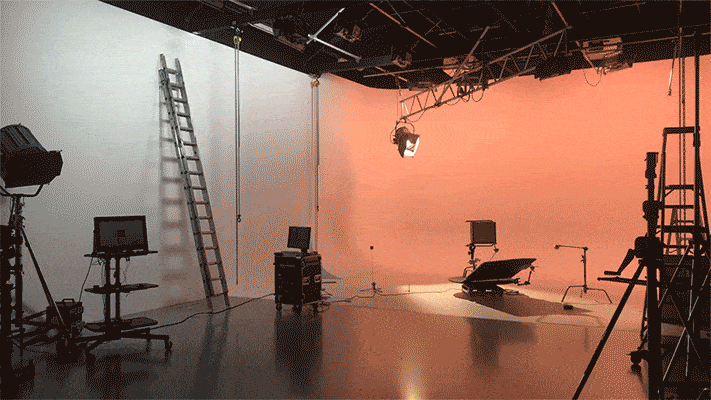
The look and layout were essential – so early on I roped in illustration wizard Jamie Jones to help come up with the 2D look for the films while I started storyboarding. We then had our two-week live action shoot roughly halfway through the production. We used long lenses so the objects had the same almost-orthographic feel as the 2D designs. This was the biggest challenge – making two diametrically opposed techniques play together nicely. And as you can see in the films, we were continually jumping back and forth. Sometimes the speed of our camera move would be informed by the animation, sometimes the other way around. You couldn’t change the position of one without it impacting the other.
Last we spoke, we discussed your unofficial use of rules in your projects. Were there any rules that you made for this project?
The key idea behind the films was ‘connectedness’. That is, how each aspect of your health joins up. So one example they gave us – if you sleep badly, you’re less likely to eat well the next day. And if you look at your wellbeing from every angle (like the app :->) you’ll have a more rounded idea of your health overall.
I thought the simplest approach (maybe not in hindsight) would be to literally interpret this. So we look at things like sitting, eating, running etc. from different angles, and show how one connects to the next. It’s an easy idea to write down, but having wall-to-wall transition reveals felt like it could get disorientating, or just tiring. So to answer your question the rule of sorts, in order to keep things clear, was that our camera/viewpoint would move just one rotation at a time.
We then introduced 2D as a way to add something unexpected and to allow us to show moments that wouldn’t have been possible without the use of animation.
I particularly enjoyed how you seamlessly segue between mediums in this series. How much of this was done in camera, or was it accomplished predominantly through computer wizardry?
It was almost all shot in camera. From the start Apple was keen on doing it this way – not arbitrarily, they wanted to ensure the films felt grounded in reality. So when we are spinning around all those objects, nine times out of ten that is actually a camera twirling through space. And although we tried to do it as smoothly and cleanly as possible, inevitably you get unexpected results – camera bumps, lighting kicks, a director touching something he shouldn’t – all give you the sort of things you’d never dream of adding in CG. For me these imperfections make it a little more engaging to watch and prevent it feeling overly clinical.
Which of the five films is your favorite?
Hmm by the end of a project like this it is sometimes hard to tell what you think! They take on a life of their own when they go out into the world, and you see them through other people’s eyes. A few of people said that watching the ‘Mindfulness’ film makes them feel relaxed, which feels like a nice endorsement. Hopefully, the ‘Sleep’ one doesn’t make you nod off.
Were there any setbacks along the way?
Lots! Don’t try and shoot a forest canopy in the rain. Candy floss melts under studio lights in seconds. And something similar happened with the peonies (flowers) we used on the mindfulness. At 5am they were closed buds, and by the time we were ready to shoot a couple of hours later they had exploded open. One of the art department gurus, Louis, deftly tied them back up into closed buds using pink thread, which he then snipped between shots. When you see them open up on screen, that is them drooping under 4 boiling lights. My wife asked how we animated these – result!
On the other hand, were there any “Ah-Ha” moments where everything just clicked?
One conundrum was the start of the ‘Overview’ film – there’s a camera move where we spin around a collection of sports equipment floating mid-air. All of these props were actual size, which posed a problem when we were doing pre-visualisation – we would have needed an aircraft hanger-sized space in order to rotate a camera around them. Then Elliot Kajdan here at Nexus and Matt Day our DOP, had the diabolical plan of spinning everything BUT the camera. So the light and objects were rotating in tandem. Crucially the shadow doesn’t move – so it gives the impression of a camera move. This meant we could shoot each dumbbell/abdominiser separately and then combine them all in Nuke, using the camera move from our 3D previs.
One aspect that I like about this series is that you’re playing to your strengths in using the variety show approach but at the same time, this series marks a bit of an evolution. Using some of your previous work as an example, you would quickly cut through various mediums creating an almost editorial quality to each film. In this series, you’re still cycling through various mediums but in a more connected way by utilizing transitions. Can you speak to this change?
Like most animators, I love me a transition. Connecting up the shots just felt like the right approach for such flowing one-thing-leads-to-another scripts. However, as many of your readers know I’m sure, transitions they can be a brainwreck when it comes to client work because they are inflexible by nature (transitions that is, not clients). That is, you can’t swap the order of shots or change things without knocking everything either side out. From past experience, I would only recommend this approach with certain clients…
Finally, how does it make you feel that people successfully guessed you were responsible for these films on Twitter before the news was officially released haha?
Haha ?