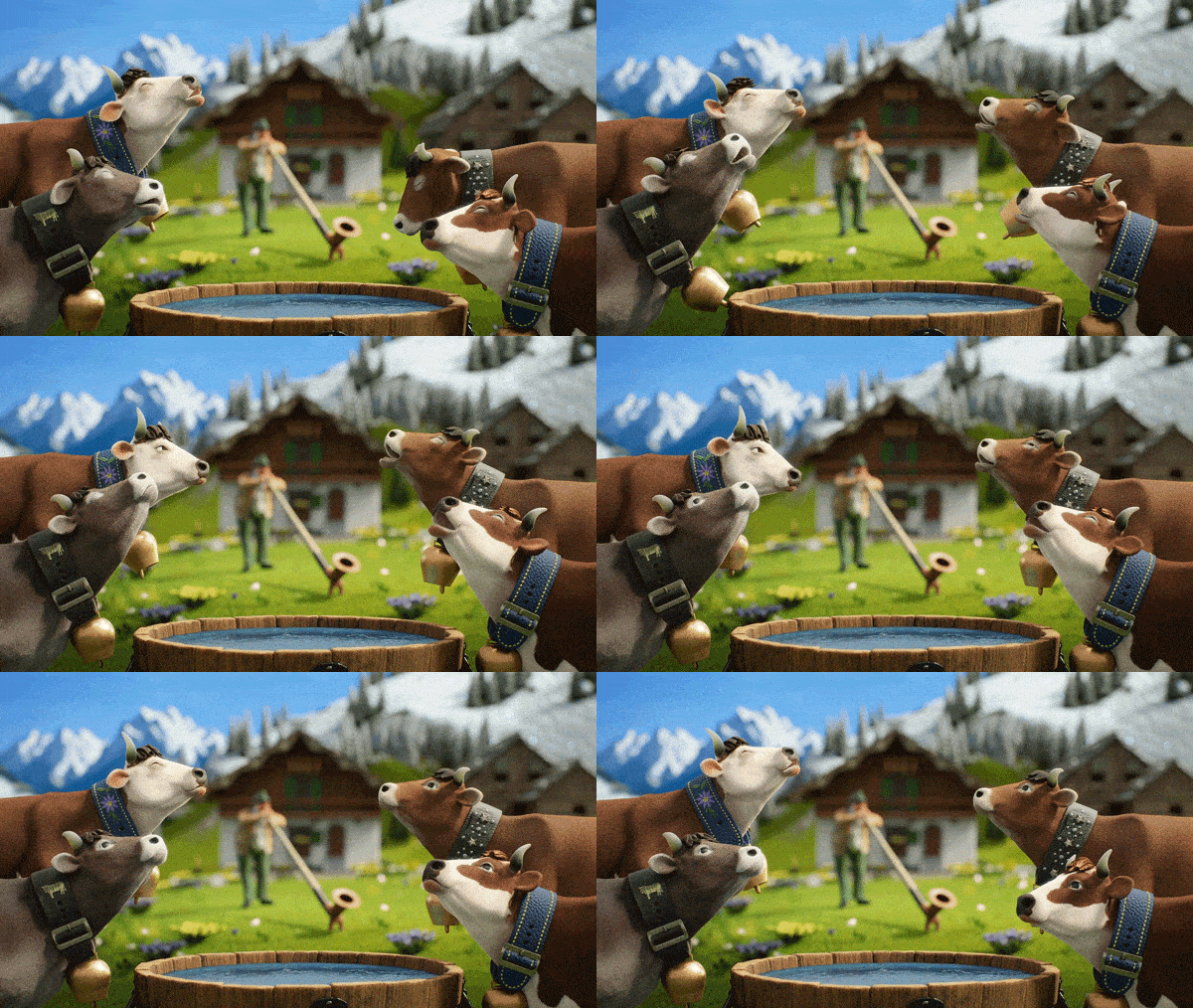
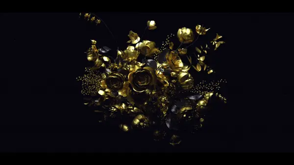
Stop-motion dates back to the late 1800s, with the first iconic animation being Willis O’Brien’s King Kong. We all respect this animation technique for its laborious process of moving miniature objects by hand, frame by frame, creating a unique energy and charm. Computer Graphics have long tried to emulate this enchanting art form, only to fall flat as it lacks that handmade touch. Goodness, a spot for Milka Chocolate directed by Sam Southward, defies this perception by digitally mimicking the human flaws that give stop-motion its spirit. Sam chats the methods used to replicate the charisma of stop-motion, with the flexibility of CG.
Q&A with Sam Southward
Can you give a brief history of your directing career?
My journey into animation possibly wasn’t as direct as other people’s. I’ve always loved animation and the escapism of creating characters and worlds but I was actually quite reluctant to get into it as in my mind I thought it would involve endlessly redrawing the same thing over and over. Just as I left school the internet got a lot better and suddenly you could download professional 3D packages on home computers. I had a real eureka moment when experimenting with an early 3D package, the absolute freedom to create anything you wanted from scratch and bring it to life. After uni I got a job as an animator, but still always wanted to direct and make my own films. I saved up and went to film school where I had the resources and team to make the kind of ambitious film I had always wanted to. Off the back of this film I joined Nexus Studios’ roster of directors, which was a dream come true. I have now been with them for 5 years.
You have a reputation as a Tech-Savvy director. How did this benefit in the making of Goodness?
I think this links back to my early days making personal stuff. I was very ambitious but had no one to work with so I learnt how to do most things myself. Exploring things that gave me a good base understanding of the different components in an animation production, and subsequently gave me the tools to communicate well with my team. On the Milka project, being well versed with technical knowledge really helped me to work out the best and most budget-friendly ways to achieve certain elements.
As a Director, you mentioned you dissect each scene into its own story as well as implementing an overarching beginning, middle, and end. Can you breakdown this storytelling approach in the making of Goodness?
I often do this when writing and storyboarding to make sure every fragment of the story has its own arc. As a viewer, that’s something I find more satisfying. While working on Milka, and this applies to other projects, we knew the spot would be re-versioned for different platforms (from TV to social media) and therefore it felt particularly important. We had to deliver Milka as a 60” spot and as a 20” coherent cutdown too, so working in a modular way where the shots could be pulled apart and recut to tell the same story was essential. This isn’t always best practice though, it depends on what the job requires. The commercial world is often against the clock and being as concise as possible is equally important.

Can you list the software apps used to make the Milka Goodness spot?
- Production Design: Adobe
- Architectural miniatures: Reference
- Sculpting (Characters/ World/Environment): Zbrush
- Animation, lighting, and layout: Maya
- Texturing: Substance Painter
- Universal Basemesh retopo: ZWrap
- Clothing: Marvellous Designer
How long did the project take from concept to completion?
It was about 12 weeks including pitching.
What were some of the benefits experienced by using digital stop motion as opposed to traditional stop-motion?
We chose to go down the digital stop-motion route as opposed to traditional stop-motion largely because of time and budget limitations. Traditional stop-motion requires a large pre-production process where all the props and assets are crafted before the shoot, but with digital we could create them in tandem with the film, saving a big chunk of time. With digital you can also tweak as much as you want. The truck was really important to the piece and the design evolved a fair bit throughout the production. We could go back and perfect it quite easily, where with traditional stop-motion that simply wouldn’t have been possible. Admittedly, my personal preference also played a part in the choice. I’ve had a lot of experience achieving great results with 3D and comp and I feel more comfortable working with flexibility.
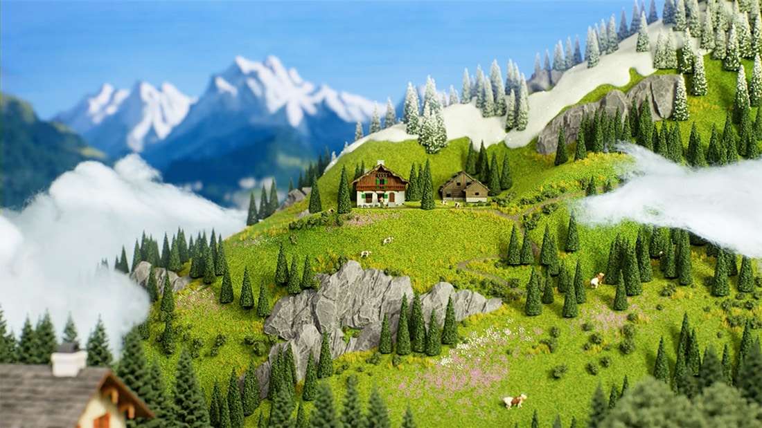
Can you describe the research process in developing the Milka environment in the Alps?
Strangely enough another job had taken me to that part of the world a few months before Milka happened so I got to witness its breathtaking beauty with my own eyes. The landscapes really stayed with me. When it came to researching and planning, I already knew what I wanted to portray in the film.
I liked the idea of treating the environment as a lead character too. We had to develop such an important part of the film in great detail and show how the community happily coexists within this naturally beautiful place. We researched exactly what plants and animals were native to the region, their exact colours and textures.
We came across lots of quaint bits of information that really drove us to invest in the detail. For example, our research also revealed that the people who built the trains in that area, were incredibly detail-oriented and almost obsessive about quality. So we applied the same level of care to our rendition.
What was the ideation to completion process like? Did you start with storyboards, then build style frames in 3D, and so on?
I was very lucky on this project as I was brought on quite early and got to help shape the script with the creatives at W&K Amsterdam which I loved. It was a really organic way of working and I enjoyed the process of bouncing ideas off each other. After each session, I would go away and thumbnail sequences before working with a storyboard artist to polish them. We would then cut them into an animatic and review. Pretty early on we knew that some elements were going to be essential to the piece so we began design on these; the chocolate factory, cows and the hero farmer were key. Once the story was locked down and we finalised designs, we moved onto producing style frames and detailed character designs. When those got approved we moved onto modelling in 3D before animating, texturing and finally rendering.
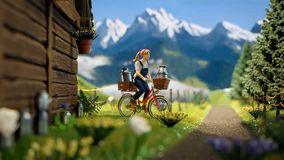
What tricks and techniques did you borrow from traditional Stop-Motion?
We really wanted to convey the same look and feel of a traditional stop-frame piece so we took as much inspiration from that world as possible. We embarked on a long journey of discovery to make everything feel warmer and tactile. It took a little while to get right but we then mastered it! When we were working on the first lighting tests, we were going for a warm summer morning so we put in a natural sun and an HDRI sky. It looked good but not quite right. It then dawned on us that we actually weren’t trying to recreate the lighting from a real summer’s day but how you would approach it with a physical lighting rig on a miniature controlled set. This way of thinking fed into every aspect of the production.
To emulate real-world stop-motion techniques, the team used glue-guns, cotton balls, and resin to create the environment, how did you incorporate this into the 3D software?
From the beginning of the project, we knew we wanted to bring in as much of the tactile detail that you get from traditional stop-frame. Our amazing technical director Andy Spence and I spent quite some time researching stop-motion model making techniques and knew we wanted to include as much of this in our film as we could, but again we wanted to do it in the most budget efficient way. The majority of these effects were done by photographing textures and mapping them in 3D, then enhancing them in the comp stage.
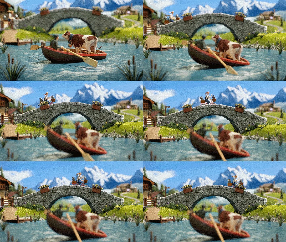
We talked about “dirtying up” the 3D so it looks more like stop-motion. Can you talk about this process and what methods were used to recreate the imperfections of stop motion digitally?
A lot of this work was done in our textures by the amazing texture artists we had on the team. We would start clean and then build up layers of dirt and imperfections, which all added to the charm. Again these same principles were applied to the other stages of our pipeline. With some scripting, we also added slight imperfections into our lights to stop the constant feeling of digital light. In comp, we added more layers of richness to each shot and put some very subtle wobbles on the camera moves. The big challenge was to land this just right and to not go overboard with all of the effects, we still wanted it to be clean.
How did you approach cameras and frame rates?
Our whole film was shot at 25, but in the animation stage, we would deliberately add holds and drop frames to add to the overall charm of the piece.
What was the biggest challenge in creating Goodness?
I feel like the biggest challenge in any project is always time. And being up against a deadline. The whole team was so passionate about creating such a beautiful and intricate world. We could’ve spent forever crafting the details!
What is a juicy tidbit a Motionographer would want to know about the making of Goodness?
We wrote a little script to produce the random patterns for the patches in the cow’s fur, we then also reused this same principle to control some aspects of the displacement maps, randomising the silhouette of the cows as well.
