


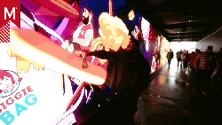


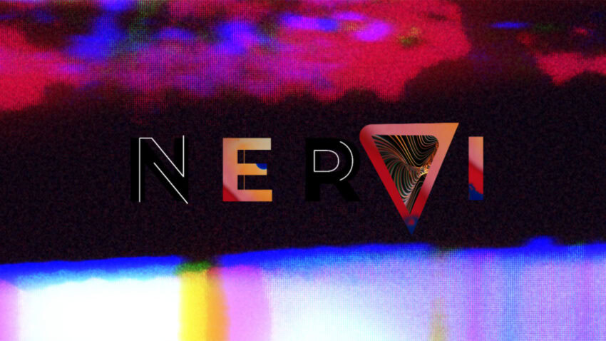
‘Nervi’ Wins The Motion Awards Trophy 2024 for TV/Streaming >> Show Graphics Package.
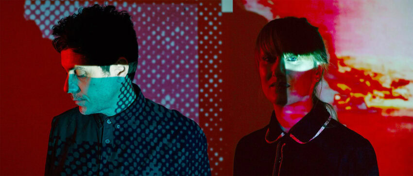
ABOUT DEDO CIEGO
How would you describe the working environment at Dedo Ciego? What keeps you motivated with each new project?
We are a small studio formed by Ana Gale and Joaquín Urbina and occasional collaborators, depending on the project. Sometimes we team up with other directors from our reps Blackbox and Brut.
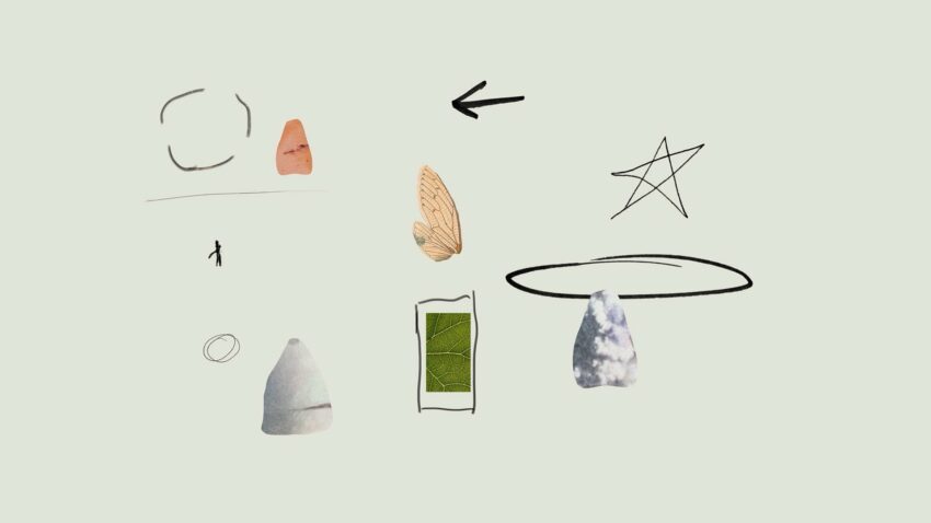
Our motivation is based on selecting projects where we know we can contribute. We specialise in rhythm oriented audiovisuals, mixed-media collage and stop-frame animation.
What excites you the most when you start developing a visual identity for a client?
The experimentation part. We believe in intuition and love to experiment with different techniques. For that reason each project is like a new adventure. Our motivation grows during the process. The first weeks are always dedicated to finding new tools and expressions, combining things we dominate with stuff we know nothing about and that always makes it exiting.
Is there a particular project you’ve especially enjoyed, either because of the challenges or the final outcome?
We are really fond of all our projects. If we had to pick, the opening titles for the documentary series of the writer Terenci Moix. It was a great challenge to synthesise both narratively and visually, through the use of mixed media animation, the universe of this multifaceted character, considered the Spanish Truman Capote. Based on a great music track from Hidrogenesse, we developed the script ourselves, incorporated various in-house animation techniques and make use of the vast universe of Terenci’s “memorabilia”.
How do you handle collaboration with clients and within the team to keep things fresh and original?
Our clients are quite versatile, varying from small poetry festivals and local musicians to national and international tv networks, banks and sporting organisations. We teach experimental animation in several MA programs. And most of the projects we do are directed, designed and animated by the two of us. So with all the switching around between different roles, formats and medias it’s actually quite easy to keep things fresh.
Lastly, is there anything else you’d like to share or think would be important to include?
Yes, that in the core we are artisans. We work digitally but we explore moving images analogically.
FROM CONCEPT TO SCREEN: THE WORK BEHIND…
What was the most fun part of creating the visual identity for NERVI?
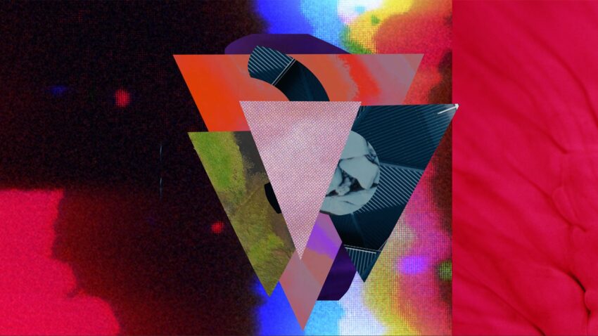
The best part was creating the polyrhythmic visual system. We combined organic 2D animation with fluid forms and crowded textures to shape colourful living ecosystems that were in constant movement.
Were there any unexpected moments or spontaneous ideas that became key to the project?
Yes, there were a lot of them. Unexpected moments, spontaneous ideas and errors are present in the core of our workflow. We really like when they happen and consider them vital parts of the creative processes. They are always incorporated into the narrative.
How did you decide on the colours and visual rhythm to capture the essence of the show?
First of all we wanted a miscellaneous look that would capture the multifaceted interests of the program. And secondly we understood that the visual rhythm was essential for illustrating the nervous system and its movement. Therefore we crafted a universe of organic forms constantly morphing, de-fragmenting and evolving. Their environment is also in constant change and the two of them together form a saturated yet symbiotic amoebic entirety.
Is there a particular piece or detail of the design that was especially difficult but that you’re proud of?
Some ideas for ‘Nervi’ were recycled from a project that we did couple of years ago and were really fond of, but was rejected almost entirely. Part of the rests made it to the ‘Nervi’ ecosystem and fit perfectly.
Is there anything else you’d like to share or discuss that we haven’t covered?
Thank you for having us and letting us share our thoughts with you and the Motionographer® community.
We would love to tell more about our work, but probably the format is too short. We invite you to visit our website or get in touch!
PROJECT OVERVIEW
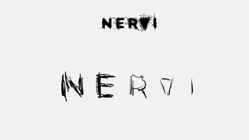
The Catalonian Television TV3 – 3CAT commissioned us the visual identity for its new cultural program called ‘Nervi’ (meaning “nerve”), oriented to young adults (30-45 years) and covering a great variety of cultural themes like music, arts, theater, dance, film and literature.
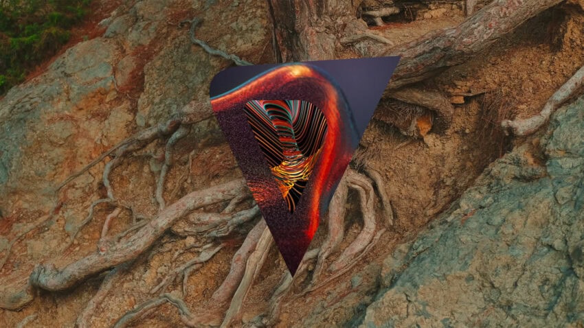
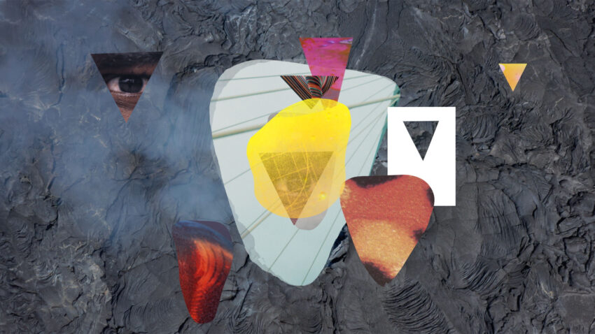
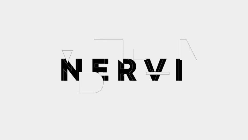
We wanted to explore how a nerve can be interpreted visually and rhythmically. Technically, we processed live footage and image sequences in combination with organic 2D animation. And formally, we parted from a very simple idea of a triangle (originated in the TV3 and 3Cat logo) and constructed a neural system, always vibrating and interconnected, around that basic shape.
Creative Process
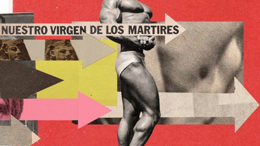
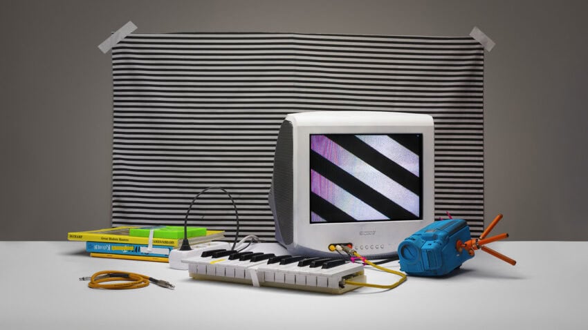
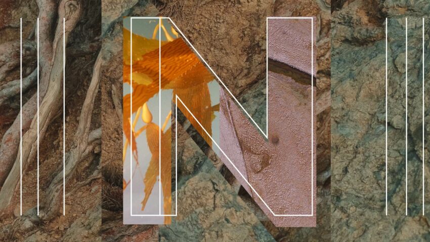
We used mainly 2D animation, above all for typography animations and compositing. Several collages and textures are animated with stop-frame animation using hi-res scans from old encyclopedias, others from processed Super 8 home movies. Some footage went through data bending and a few of them were made in Processing. We also used water colours, but treated and put in motion they gained a very digital look.
Cinematography & Visual Style
It was clear from the beginning that we were going for a saturated-full-coloured look with rich textures and great variety of medias. On the contrary we wanted the animation of the logo and the typography to be clean and minimalistic.
This part we didn’t manage to achieve due to client getting so passionate about collage part we ended creating a whole universe of logos implemented with colours and textures. Of course we loved it too.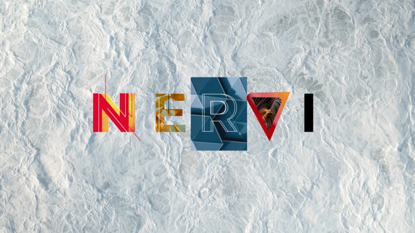
Editing & Rhythm
The rhythm was pivotal for illustrating the nervous system through shapes, textures and typography. We used stop-frame sequences for vibrant pulsation and real footage for more fluid movements. And the whole is dictated by the pace of the music.
Sound & Music
The music was made by the Spanish composer Raquel Sanchez. We normally propose the musician with whom we work hand in hand from scratch. This time it wasn’t the case, the composer delivered the music to which we had to adapt the animations.
Challenges & Solutions
The main challenge was to create a dynamic and adaptable system of graphic modules therefore we crafted different versions for each of the audiovisual pieces. Multiple variations of logo design and animated isotypes, several opening and dividers, modulated agenda, lower thirds, doodles system and also various prints for set design.
‘Adios Amigo’
We are really happy with the result. It was an extremely nice project to work on, with lots of positive interaction and inputs from the client and that is something we appreciate greatly.