Huesca Motion Graphics Review last call for entries May 12th
Huesca Motion Graphics Review last call for entries May 12th
Boca Ceravolo • 18 years ago
simple clean design & motion by DEVA.la
simple clean design & motion by DEVA.la (via Feed)
Babe Baker • 18 years ago
Diego Maclean
If you are on the prowl for some fine inspiration today look no further then Diego Maclean. Diego’s work is refreshingly different and experimental. He…
Read more
Jon Saunders • 18 years ago
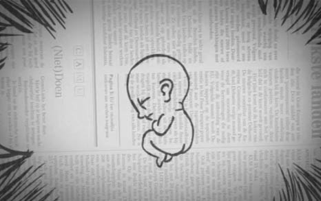
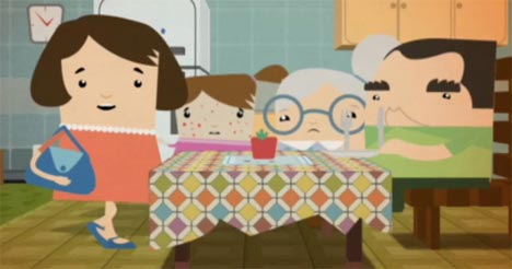
Orgesticulanismus
It’s rare to me to find a piece of work in our industry that seems to have true meaning to someone beyond just creative expression.…
Read more
Tread • 18 years ago
Nice post on the Fairlight CVI over at Create Digital Music
Nice post on the Fairlight CVI over at Create Digital Music
Justin Cone • 18 years ago
Toon In!…to the World of Animation has interviews with some of the biggest names in animation
Toon In! …to the World of Animation has interviews with some of the biggest names in animation
Justin Cone • 18 years ago
Chad Pugh: Science Machine
This time-lapse vector illustration video from Chad Pugh functions as both a high-speed tour through Chad’s creative process and as a music video. Watching Chad…
Read more
Justin Cone • 18 years ago
Naked Cie Helps Mika Relax
Paris-based Naked Cie (not to be confused with Nakd) developed some interesting concert visuals for Mika’s performance at the NRJ Music Awards (kind of like…
Read more
Justin Cone • 18 years ago
More Brazilian Action: Vitor Cervi
While you’re waiting for the recently posted Dogday site to recover from its bandwidth woes, check out Vitor Cervi. There’s some overlap between the two:…
Read more
Justin Cone • 18 years ago
£10k grand prize in the Motorola DirectorME contest
£10k grand prize in the Motorola DirectorME contest
Justin Cone • 18 years ago
Beautiful Illustrative and Graphic Design Work from UK based ILOVEDUST
Beautiful Illustrative and Graphic Design Work from UK based ILOVEDUST
Boca Ceravolo • 18 years ago
Culver City SALT updates
Culver City SALT updates
Boca Ceravolo • 18 years ago
Bitfilm Festival starts May 1st in Stuttgart
Bitfilm Festival starts May 1st in Stuttgart
Justin Cone • 18 years ago
Take It To The Next Level
This isn’t really a motion graphic spot, but I was thoroughly entertained by this ad for Nike directed by Guy Ritchie for agency 72andSunny. This…
Read more
Jon Saunders • 18 years ago
DOGDAY – Daniel Bruson Moretti
A funny thought struck me the other day whilst I was strolling through the extensive grounds of Motionographer Heights, I don’t think I’ve seen any…
Read more
Simon Robson • 18 years ago
SMASHING MAGAZINE Celebration Of Vintage and Retro Design (Thanks, Ryan U!)
SMASHING MAGAZINE Celebration Of Vintage and Retro Design (Thanks, Ryan U!)
Boca Ceravolo • 18 years ago
Ben Ducroz New Showreel 08
Ben Ducroz updates with a stopmotion-tastic new showreel!
James Wignall • 18 years ago
Tomorrow’s World BBC titles 1978
There has been a few postings recently taking a trip down memory lane with the more practical approach of yester-year, so here’s one more! This…
Read more
James Wignall • 18 years ago
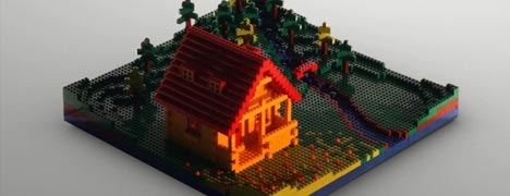
Bran Dougherty-Johnson: GEL Conference 2008
Watching this :50 open for GEL Conference 2008 reminds me of the wooden blocks of my youth and the childlike playfulness of Paul Klee’s paintings.…
Read more
Boca Ceravolo • 18 years ago
:weareom: Alpha Bank
The lads at Romanian studio :weareom: put in some long, tedious hours working on this spot for Alpha Bank. With only a few exceptions (the…
Read more
Justin Cone • 18 years ago
The Font Game. My personal best: a lousy 29/34. (Thanks, Damien!)
The Font Game. My personal best: a lousy 29/34. (Thanks, Damien!)
Justin Cone • 18 years ago
“Title Safe?” keeps the Priceless campaign going (Thanks, Erik!)
“Title Safe?” keeps the Priceless campaign going (Thanks, Erik!)
Justin Cone • 18 years ago
New Frankenstyles
New Frankenstyles
Bran Dougherty-Johnson • 18 years ago
Need a break? Blow up some plushies.
Need a break? Blow up some plushies.
Boca Ceravolo • 18 years ago