


What is originality? Does it even exist? If so, how can we be original?
Those are the questions that haunted Toronto-based designer Andrew Vucko as set about to create “Original,” a fluidly animated short film that epitomizes the flat design movement.


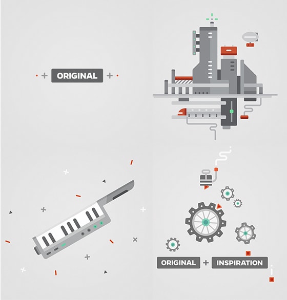
Drawn from the thoughts of people like Pablo Picasso, Jim Jarmusch, Woodrow, Wilson, Lincoln Steffens, Dieter Rams, Jean Luc Godard and others, the film is a meditation on novelty and perfection that ends with some succinct advice.
Andrew gave us a little more info about the creation of this self-initiated project.
Making “Original”: Q&A with Andrew Vucko
Why did you create “Original”?
For a long time, I wanted to develop a piece that I could fully immerse myself in, but I had trouble finding a unique enough idea that I could commit to. There were so many different styles and avenues I was inspired by that it became really difficult to choose one specific direction.

Animation test for the “illusion” sequence
Eventually, I took a step back and chose to build something on the very topic that was plaguing me — the theme of originality. From there, I searched for references and inspiration, coming across all of these interesting quotes on the subject. While at first each quote felt like a separate idea, as I continued to read, I realized that they could be combined into a single narrative.

An animation test for the introductory sequence
That’s when I connected the dots and began adapting a script.
The project seems to have drawn from the flat design movement in web design. Was that something you consciously pursued?
Yeah, definitely. This might be a common inspiration, but I was really intrigued when I came across the Google Visual Assets Guidelines. They created all these rules and this very minimal world that interested me.
“I felt that since I was covering all these creative industries (like fashion, cooking, and music), I didn’t want to adhere to a certain style. In the end, it had to be universal and simple.”
At the beginning stages, I decided to stay minimal with the design and color. I felt that since I was covering all these creative industries (like fashion, cooking, and music), I didn’t want to adhere to a certain style. In the end, it had to be universal and simple. Eventually, it just turned into its own thing!
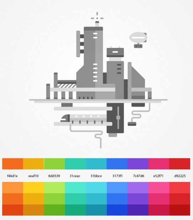
An early color study
When did you get John Black/Cypher Audio involved? How did his involvement impact your process?
John came into the project when the design phase was completed. We had worked on many projects together through studios, so it was a great thing to finally collaborate outside of that.

Animation test for sundial sequence
We bounced around a few ideas before animation so it could feel more unified at the end — referencing what Trent Reznor did for The Social Network. He gently built up the instruments over the two minutes to instill motivation, but kept the sound design lively so it wasn’t too too serious.
What’s next for you?
I’m looking forward to exploring the idea of graphical animated music videos a bit more. I have another small piece I am putting out within the next month. It’s a little more manic than this project and doesn’t take itself so seriously. It’s got raccoons.
Art prints available at Society 6
Andrew Vucko’s portfolio: vucko.tv
Credits
Direction/Design/Animation: Andrew Vucko
Sound Design & Music : CypherAudio
Production/Direction/Mix : John Black
Composers : Tobias Norberg, John Black
Sound Design : Jeff Moberg, John Black
Voiceover: Chris Kalhoon
Thank you: Ryan Dadoun, Nicolas Girard, Luis Campos, Chris Bahry