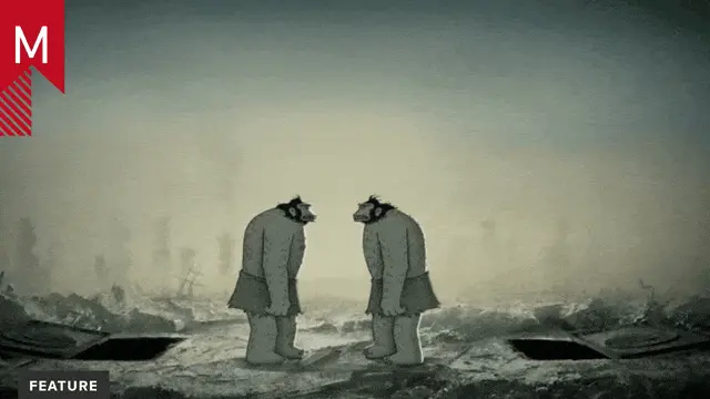
National Television channeled modernist aesthetics of yesteryear in “Dots” and “Pattern,” two new spots for British lending agency Fair & Square.
“Dots” really does it for me. The narrative element bolsters the voiceover’s message without ever departing from the campaign’s minimalist look.
What’s funny is that without the jazz soundtrack, posterized time effect and flickering luminescence, these spots wouldn’t feel as retro as they do. I’m not complaining; I’m just wondering if that was a conscious decision on the part of the agency to target a different audience, or if the idea of flat, full frame rate vector graphics is simply out of vogue.
What better to accompany our previous post about cookies than a post about milk? Way back in 2007, we posted a Quickie for Head Gear Animation's fantastic 5-second spots for the Dairy Farmers of Canada and agency Due North. Well, Head Gear's added to their collection since then, and it's…
Nation Television have uploaded a batch of new projects for public viewing, along with a couple of teasers for Nick at Night, Miss America 2006 and Fox sports - all of which look pretty interesting. That said, I'm somewhat ambivalent about this latest round of work from National. In times…
I'm not sure how old this Hyundai spot is, but I just stumbled onto it yesterday. Agency Goodby, Silverstein & Partners worked with studio National Television to create an entertaining ride full of whimsical detail. Great character design and animation are strung together with simple but effective transitions that stay…