


When Google introduced its Material Design visual language in the summer of 2014, it felt like a train I’d been expecting for years was finally pulling into the station.
What is Material Design?
Material Design is Google’s user experience (UX) design philosophy for Android and a broadening range of apps and services. It’s their attempt to “[c]reate a visual language that synthesizes classic principles of good design with the innovation and possibility of technology and science.”
Material Design made its public debut with Android 5.0 Lollipop, which started shipping on select phones and tablets near the end of 2014. Now, Material Design is making its way to more apps and devices — even on iOS, via the Google Maps app.
Why should you care?
Material Design is the fist time I’ve seen a clearly written treatise on the interdependency of animation and UX design. Tech companies have long relied on smart motion design — Apple’s iOS owes much of its success to the way that motion reinforces a sense of responsiveness and clarity.
But Google is the first major tech company to organize and publicly share its philosophy in the form of a living spec. It signals a mainstream acknowledgement that animation’s value isn’t additive, it’s transformative.
As the Material Design website explains:
Motion provides meaning
Motion respects and reinforces the user as the prime mover. Primary user actions are inflection points that initiate motion, transforming the whole design.
All action takes place in a single environment. Objects are presented to the user without breaking the continuity of experience even as they transform and reorganize.
Motion is meaningful and appropriate, serving to focus attention and maintain continuity. Feedback is subtle yet clear. Transitions are efficient yet coherent.
Practically speaking
Material Design’s animation principles stem from the goal of creating “authentic” user experiences. A nuanced balance of real-world physics, shape-shifting objects and lucid transitions combine to create experiences that feel both familiar and delightful.
It’s a decidedly humanistic approach to UI design, and motion is at its core. There are rules, of course, for how this all works. The Material Design spec explains most of them, often with animated examples.
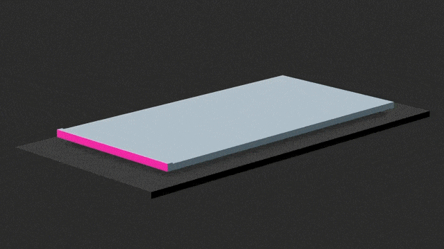
“When split, material can heal. For example, if you remove a portion of material from a sheet of material, the sheet of material will become a whole sheet again.”
Many of the principles could apply to any motion design context, not just operating systems:
Transitioning between two visual states should be clear, smooth and effortless and not confuse the user. A well-designed transition does the heavy lifting and enables the user to clearly understand where their attention should be focused.
“Material design principles” at Google I/O 2014
At Google I/O last June, Matias Duarte (VP of Design at Google) explained how Android came to embrace motion:
Design is continually evolving. Users are getting more sophisticated. The design landscape is more sophisticated. In particular, motion has become incredibly important over the last few years.
We wanted something that was taking the very best of graphic design clarity and the innovations in motion graphics and motion communication but that still tapped into those elements of tangibility, of physicality that industrial designers themselves use.
Later in the same presentation, Visual Designer Christian Robertson described the subliminal power of motion:
So since our eyes are naturally drawn to motion, if something moves, and it’s in our field of view, we’re going to see it. It’s a really strong tool for us to help direct focus.
If, in a music screen, the player controls are the primary interaction, the animation can point that out. Also, even noticing the details, those small things that you might not even notice overtly, like, for example, the small slide on the control slider as it comes in. Wait for it…
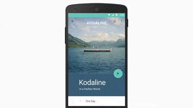
There it is. Even though people might not notice it overly, they see it, and they know how things work without having to think a lot about it.
Shangri-la déjà vu
Back in 2006, about a year before the first iPhone came out, I wrote a post entitled “The New Linga Franca”:
In the next couple decades, every surface we formerly regarded as the domain of static design will increasingly become the playground of motion. This is exceptionally good news for motion graphics designers.
We are positioned to ride a huge wave of growth in the design industry as this paradigm shift becomes a reality in train stations, airports, waiting rooms, living rooms—even on the covers of newspapers and magazines.
And don’t get me started on mobile phones.
Well, it only took 8 years, but I finally get to say, “See, I told you so.”