True Detective Season 2 Main Titles

Director Patrick Clair, Lead Animator/Compositor Raoul Marks and the rest of the team at Elastic strike again for HBO’s True Detective. 

The title sequence for the first season of the critically acclaimed drama won an Emmy for Outstanding Main Title Design in 2014. This new one meets that bar of excellence — possibly exceeding it.

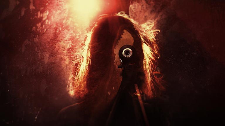
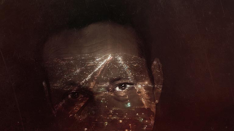
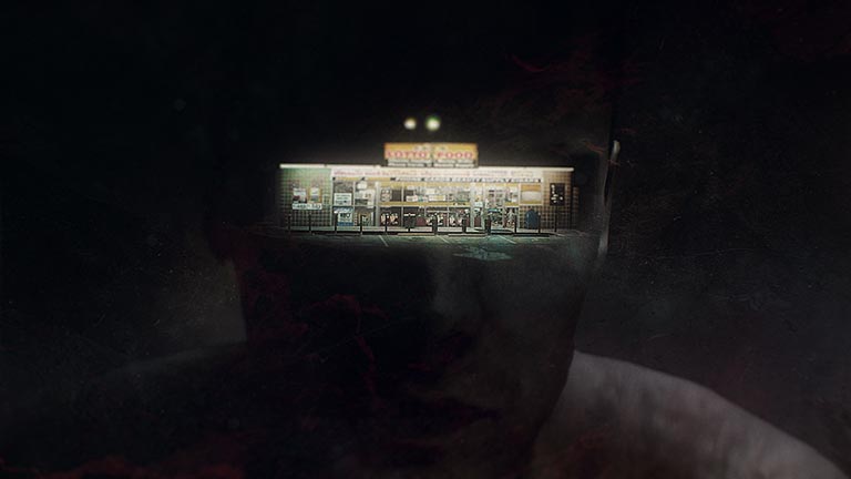
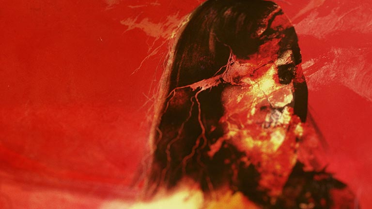
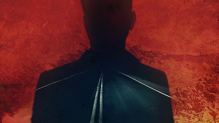
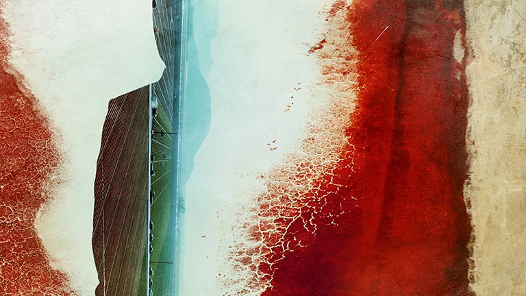
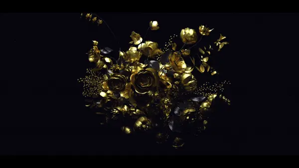
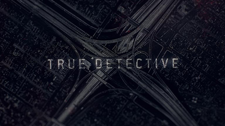
While the first sequence mostly contained desaturated double-exposed imagery within the bounds of silhouetted characters and objects, this new sequence takes a more textural approach, with detailed topographic imagery undulating across the entire frame in brilliant crimsons gradually giving way to black and white vignettes.
OUTLAWS_MT_22_TEXTLESS-(0-01-21-15) OUTLAWS_MT_22_TEXTLESS-(0-01-10-00) OUTLAWS_MT_22_TEXTLESS-(0-01-01-11) OUTLAWS_MT_22_TEXTLESS-(0-00-45-18) OUTLAWS_MT_22_TEXTLESS-(0-00-39-17) OUTLAWS_MT_22_TEXTLESS-(0-00-02-04) OUTLAWS_MT_22_TEXTLESS-(0-00-28-08)

Credits

Produced by:  Elastic
Creative Director: Patrick Clair
Lead Animation and Compositing: Raoul Marks
Animation and Compositing:David Do
Design: Patrick Clair, Paul Kim, Kevin Heo, Jeff Han

Associate Producer: Danny Hirsch
Producer: Carol Collins

Executive Producer: Jennifer Sofio Hall


Tags: , ,

About the author

Justin Cone

/ justincone.com
Together with Carlos El Asmar, Justin co-founded Motionographer, F5 and The Motion Awards. He currently lives in Austin, Texas with is wife, son and fluffball of a dog. Before taking on Motionographer full-time, Justin worked in various capacities at Psyop, NBC-Universal, Apple, Adobe and SCAD.

12 Comments

Sam

It’s beautiful but I’m not sure it if flows as nicely as the first one. The music feels a little forced in with the imagery. Maybe it just needs to just grow on me a bit.

Justin Cone

I have to admit, I’m not a huge fan of the soundtrack. Maybe it makes sense in the context of this season’s setting for the show? I don’t know, but right now, it’s distracting.

Brandon Parvini

It’s one of the few times in recent memory that the audio has actually done a bit of a disservice to the visuals.

Pierce Gibson

A version created with the Lera Lynn song is quietly beautiful:

Justin Cone

Wow, that is so much better. Nice.

Leif Pedersen

This sountrack is much better served for the dramatic pace of the open. The original overpowers it.

motioninspire

I have to say the version above fits nicely, but the original is more experimental. I like how the original cut makes a lot of people uncomfortable.

Pedro Murteira

the more I re-watch it, the more I like it and the music is great , it’s Leonard Cohen after all

Johann Grean

I was expecting something different, not the same techniques hashed out a second time. Is it just me, or does it not seem that the head honchos just said “do that again” rather than trying something new? If the actors and story are different, it’s not like they need the titles to “brand” the show. I think this is a poor imitation of the first season titles.

Tristan

I agree regarding the soundtrack, doesn’t seem to fit at all for me.

Chris

I think that it’s stylistically consistent, colourful and complex. I totally dug it and thought it was cool. I just hope the show is as cool as it was last season.

jack prenc

Awesome work. I imagine it would have been hard to top last seasons titles. I am really looking forward to seeing it in the TV series to see how it flows with the episodes. Thats what I thought was so powerful about season 1.

Comments are closed.