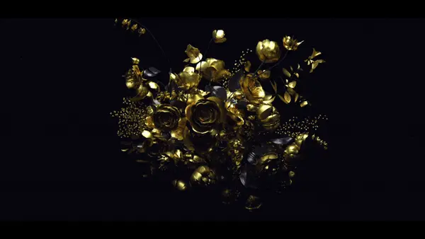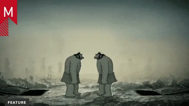
11 of the best showreels from 2015

As the creator of the Shit Showreels Say channel, the popular PQ FUI Toys and a portfolio of slick motion design work, Peter Quinn knows a thing or two about showreels. In this special guest post, he looks back at his favorite reels from 2015.


What makes a perfect showreel? I dunno. Do you?

What I do know is that there’s tons of mind-blowingly delicious work out there, and when it’s condensed into a bite-sized, well-considered montage set to snappy beats, it can become something really special.

Over at the Shit Showreels Say channel, we’re always knee-deep in showreels from agencies and artists all over the internet, and last year seemed better than ever. This is my summary of the reels that made us feel all warm and fuzzy during our last trip around the sun.

In no particular order…

Oliver Sin, UK

Panic, Latvia

Ondrej Zunka, Prague

Clement Morin, Paris

Phil Borst, IL, USA

Twisted Poly, Slovenia

Giant Ant (obviously), Vancouver

We Are Royale, LA & Seattle

Oddfellows, San Francisco

Shabello (Sara Bennett), UK

Kust’, Latvia

And that’s all, folks.


Peter Quinn on Twitter

Tags: , ,

About the author

Justin Cone

/ justincone.com
Together with Carlos El Asmar, Justin co-founded Motionographer, F5 and The Motion Awards. He currently lives in Austin, Texas with is wife, son and fluffball of a dog. Before taking on Motionographer full-time, Justin worked in various capacities at Psyop, NBC-Universal, Apple, Adobe and SCAD.

116 Comments

Steak

These are all beautifully animated and all but don’t you think that it’s all extremely single sided? The majority of them are designed in dated, cutesy styles — that are apparently still rather popular in these circles? Mediocre ideas, wrapped in similar look and feel blankets. Aesthetics that appeal to 5 year olds, middle class account ladies with thunder thighs and creatives that all they wanna do is hang at the pub? Swell! Why are these featured again? In what way exactly are they pushing the envelope further, if not technically, aesthetically or conceptually? I’m sorry if I sound jaded, but barely 10 frames of goodness after watching a whole bunch of reels should make us re-think our industry and how/ where people should be channeling their skills.

brian

Whoa!!!! duuuuuuuuude. positivity my brother, please.

antoine

YES! so true, I agree with Steak 100%

& Chips

I agree with Steak.

& Gravy

I agree with chips

Brandon

Way to say it like it is, fully agree. @Brian, stating your opinion isn’t inherently negative, everything isn’t always awesome.

Julie

Using someone’s economic status/profession/gender/body type as synonymous with someone who is tasteless is pretty negative…

Chris Seibold

I agree Steak. Lots of talent pushed in a wanting direction. Even though @twistedpoly’s stuff is reflective of trends, I still think that it is stand out work with a lot of style. It’s the challenge of art and work for clients. I find the 2 graphic, inertia stuff really, really boring. I’ve gone back to graphic and web design as of 18 months ago due to a lack of imagination from Australia’s creative and production agencies (or maybe it was because I was crap and difficult to work with ;)). Still, as a viewer, motion graphics is very underwhelming at the moment. I think that Gmunk, Ash Thorpe and the people they work with are doing cool stuff but it is a very particular style (geeky/masculine/hip). The industry lacks diversity of styles and ideas. Thanks for being honest, I think that there is a place for critical feedback if it is coming from a genuine place. Playing nicey nice is not doing the industry any favours.

iloveaphextwin

Do you have any examples of showreels that push the boundaries, in the ways you said. I’m having a hard time seeing your point of view? and I would like to understand it.

Remington McElhaney (@i_animate)

Dang. If you can watch the Giant Ant, Phil Borst and Oddfellows reel and not find “10 frames of goodness” (Let alone the other incredible reels) then I’m not sure why we are even wasting time on this debate.

Joey

Come on, positive vibes here man.

And also french fries, cause food.

I like cartoon. Are fun. Feel good to have see them. Watch all them. All feel fun. Who are Steak? Steak, why are not happy? You not liking cartoon? Cartoon too fun for you? You like thing like sticks, and mud? Steak like thing not very fun. Steak like baby, but baby have no arms. That make Steak happy.

Lilian Darmono (@liliandarmono)

Steak, you have a point, and others here have contributed to an amazing discussion, but i find your phrasing of ‘middle aged account ladies with thunder thighs’ highly inappropriate and offensive.

Lea Hernandez

Your point about the sameness is completely undercut by “middle class account ladies with thunder thighs.” What does the age, gender, and shape of a person have to do with anything presented?

And shame on the rest of you for not calling Steak out. Pushing back against thoughtless sexism and ageism changes views and makes the business better for everyone.

Dave Glanz (@daveglanz)

I have to admit to being caught so off-guard by the overall sourness of Steak’s comment that I completely missed this. Inappropriate, but so is assuming that this stuff only appeals to immature and people with no-taste (which I”m assuming “account ladies with thunder thighs” means).

Julie

Design that appeals to “middle class account ladies with thunder thighs”… wha…huh??? Wow. That’s a very unnecessarily sexist and disparaging way to describe a viewer that has absolutely nothing to do with a person’s sense of taste. Jesus Christ, dude. Way to turn the asshole factor up to 11 for no reason.

Steak

Brian, I gots so much positivity it’s coming out my ears man! I assure you this is not a dig. We all gotta make moneys and pay the mortgage. BUT it is indeed an alarm call. When there’s no personality involved in your work you become expendable. Designers and creatives are turning into office supplies because of this ridiculously formulaic way of working. Safe, last minute, quick turnaround etc. You reckon it’s pure coincidence that most agencies work with freelance designers rather than having them on full time staff? I’m sorry but I can’t support something when it’s deeply flawed.

Daniel Savage

Can we see your reel?

ThisIsMyBoomstick

Daniel what does his reel have to do with anything? Would it somehow negate his point? I don’t think so. Honestly after watching the first couple of reels my first thoughts were “Wow these all look the same”.

Honestly though I don’t think it’s a huge deal, we are after-all working in a pretty cool industry, it’s just an analysis and I don’t think it should be taken so personally.

Brian

I totally feel you man. But identifying trends and calling out industry flaws are 2 different convos…. Without the risk of sounding bitter. Too. Or jilted. Make art. Not war. Especially under other cats reels. They might like to enjoy the accolades…. For a second.

Christopher Levin

I want to push the industry forward as well, but I couldn’t agree more with Daniel. Lets see what you got, Steak!

Steak

Good luck pushing it forward one snowman at the time CL. I think comparing reels will make this bitter especially since I’ve called a spade a spade already. I’m afraid we are not on the same page and I have stuff to wrap up. Have a wonderful day gents x

& Chips

Exactly! Nobody has anything else to contribute other than “Show me your reel so we can ridicule you”. That would be pointless.

Drew L

Ok… well maybe we don’t need to see Steak’s reel, but how about pointing to a reel that’s an example of what you / Steak consider exemplary work? I think people are genuinely curious and aren’t interested in just slamming Steak with “well if it’s crap lets see you do better!”

& Chips

See my example in a previous comment.

Bawn Shurns

I’d say AntiBody is a reel/body of work that is pushing boundaries. Not featured though

Justin Cone

I don’t believe Antibody (Patrick Clair) has updated his reel since 2014… so it wouldn’t qualify:

shabello

I shall say here what I said on twitter

‘So thinking about this little debate on the proliferation of the so-called dated-cutesy look, I think this comes down to a classic case of art vs commerce. Companies have budgets and deadlines, so obviously they will gravitate toward an aesthetic that has a proven track record and is cheap and quick. We as designers do push against this as we too feel it limits us creatively, and sometimes it pays off ^^ I am pretty sure that given an infinite amount of time n budget we would be producing much more visually diverse range of works. But… we have to make rent and eat. So it is what we do. We always have our little dream side projects tho ^^’

So in conclusion – Steak you think we aren’t pushing to break new grounds in the industry? You think we are satisfied producing similar feeling works? If there is to be a change it needs to come from the clients, not us. And honestly, sometimes a bit of dated cutesy is just what the doctor ordered ^^

& Chips

Well how will the clients be able to push forward if they don’t know what pushing forward is?! We are the creatives. We need to tell them what they want because they think these styles are all that exists. I think the the change comes from us and not the clients. If our show reels are full of said content then they will ask for said content, these are trends. If we fill out show reels with content that is pushing forward then the clients will ask for that work.

Christopher Levin

So do you have any examples to show? What did you have in mind?

& Chips

If you agree and want to push the industry forward then you need to show the work that you want to receive. Buck shows hardly ANY of their output and what they do decide to show is pushing forward and that’s why are they’re worshiped by the our community. How are we pushing forward by all showing the same style?! (http://www.buck.tv/work_tags/featured)

Daniel further up the comments is also pushing forward, he shows the work that he wants to receive and that has been very successful for him. He’s worked on some huge projects since he decided to push his style, it’s great!

Christopher Levin

Cool. Thanks for giving those examples!

schwarzgrau

EXACTLY! Don’t wait for the clients to come up with an idea about something special and grumble about the lame stuff you have to do. Make some suggestions and show what you can do.

brian

i was just writing about the difference between “creative” work and what is done for money, for a client. it can be a vast chasm. clients are the ones cutting the checks. and im not saying acquiesce. i’m saying facts are facts. as Michael Bierut says “Clients are the difference between design and art….”

& Chips

If you show them what art is. The clients need to be educated. It’s no wonder these styles have been prominent for years if everyone has the attitude that it’s the clients fault.

& Chips

Or the “… clients are blind and don’t live in the world”. They live in world where all they see is the same thing over and over.

Mike Bischoff (@mpbMKE)

I’m blissfully imagining a world where clients are looking for creatives to lead.

ThisIsMyBoomstick

I disagree as a creative, and someone who is actually trained in your craft, it’s your job to convince the clients why your vision is correct. You did study this for hundreds of hours after all.

Blaming the clients is a mistake.

Lilian Darmono (@liliandarmono)

“change needs to come from clients, not from us”: yes and no, because it’s an ouroboros, an endless loop. Clients look at what’s out there that’s striking, most often things that get made out of love, and we, the creatives make those. Then clients ask us to make things that look like those wonderful things out there in the landscape. The cycle goes on.. it’s a bit of both, no? If we’re just talking about style, it doesn’t just happen overnight, at least most of it doesn’t. it’s a bit at a time, slowly slowly, and we as creatives are responsible for nudging and educating and guiding our clients to transition from something that’s popular and already over-done, to something new and fresh. One little battle at a time, one little mograph job at a time. What do you think?

Tim

Bring on the Steak Reel. I’ll love to compare :)

Salih

+1 Bring on the Steak Reel

Leif

Everyone asking Steak for a reel would be more productive coming up with good ideas to debate his point of view. He never compared his work.
Or would you ask a film critic to show you his/her directing reel to compare it to Tarantino’s?

antoine

Yeah this isn’t about comparing work and also, I don’t get the vibe anyone is hating on the reels themselves, its all good stuff, just extremely homogeneous. Theres definitely a place out there the styles in these reels, but those styles are too overrepresented by the industry, by schools, and by blogs like Motionographer, we need to get some fresh air in this here game..

& Streak

Exactly. Thank you.

brian

“and by blogs like Motionographer,” ok then go find other blogs to troll. and quit hating cause your reel isnt up here….

Dean

I was going to comment more but Antoine said it for me.

Also remember that these showreels are picked by Peter and are ‘his favourite reels’. Every individual has there own particular taste. This posting isn’t on ‘most innovative showreels’ so therefore it was an enjoyable watch for me with some outstanding visuals. As for pushing the industry forward, This is something that should start with us the creatives. It’s then up to convincing the clients or agencies to see our perspectives and in turn will make for new areas of motion design.

Salih

I want to see if Steak has any work contrary to what he said above. Something without “Aesthetics that appeal to 5 year olds and middle class account ladies”

Steak if you don’t have a reel, post someone else’s that you actually admire and respect. So we can see where your bar of quality is.

Sven

Why? Steak is not saying his reel is super awesome. He said that the reels who according to motionographer are some of the best of 2015 are not all that great after all. I for one agree with him. His reel has nothing to do with this discussion unless motionographer chooses to feature it too.

artbywaldys

I agree, bring on the Steak or an example of what he considers acceptable… BACK IT UP STEAK! It is one thing to have an opinion and criticize someone/something constructively, it is a very different thing to put down or disrespect someone and their work (which to me they were all amazing). So, if you are going to spit and vomit all that negative crap and insult someone and their work, I say Steak needs to be criticized and examined in the same arena and way he has chosen to express his ideas. Fair is fair!

Jodi Terwilliger

The unfortunate reality, is that clients do not care about your art. They care about what’s popular, because that’s what they see, because they’re not as cool as you. What’s popular sells products. Trends happen for a reason, they’re self fulfilling and it’s impossible to not indulge in them–especially if you want the vast majority of people to like you. And that’s what clients want: to be liked.There’s pop culture, and counter culture. Eventually the counter culture becomes pop culture. You just have to make your money, do your art, and then hopefully you’ll get paid to do your art.

Trust me, those portfolios you all love because they’re different/new/exciting, are also eating shit to pay the bills. It’s the nature of what you have chosen to do for a living. Do you think UVA is making tons of money off of all the brilliant work you see on their site? No. Do you think Buck got paid the big bucks (no pun intended) to do Good Books? No.

Point is, supplement your work so that you can make money to do the stuff you love. Promote the shit out of that work, and only that work (but be prepared to scare off clients, or have to over explain that you can do way more than that style) Then, if you’re LUCKY, you’ll get to paid to do the work you love.

But be warned, doing something new will not make you loved. It will likely make people think you SUCK, and make people feel uncomfortable. They won’t like it. It’ll take a while, but by then, you’ll have said “gotta do new stuff” so many times you’ll have moved on to new styles because you don’t want to be the same as everyone else. But the more you do that, the less likely it is that the style you loved takes hold because it will never have a chance to mature. After a while, when enough seeds of difference have been planted to make this new style comfortable for the larger population to accept it, someone will take it and run with it. When that happens, you’ll go back to being a hater and you’ll say “meh, i was doing that 5 years ago”.

In other words, take a look at how the Memphis Group was largely considered by the design Zeitgeist:

The group’s colorful furniture has been described as “bizarre”, “misunderstood”, “loathed”, and “a shotgun wedding between Bauhaus and Fisher-Price”.

Yet now, you can’t shake a stick at a design portfolio that doesn’t lean HEAVILY on their aesthetic. 30 years later.

And if you still want to get mad at “motion graphics” for following too many trends, allow me to introduce you to: trendlist.org

Finally, to paraphrase Stefan Sagmeister, who was paraphrasing another on the difference between art and design: “Art doesn’t have to work.” but then that’s another can of worms on which you can debate me.

Just go buy this book: http://www.amazon.com/Design-Art-Penguin-Modern-Classics/dp/0141035811 and keep making as much STUFF as you can. One day, maybe you’ll invent a trend good enough for people to steal, and they’ll do a post about it.

STUBBZILLA

ayyyye lemme see your reel though jodi.

& Chips

YEAH! Where’s the reel?! Come on Jodi Terwilliger. I can’t take you seriously if you don’t show us your work.

Daniel Savage

TLDR

(just kidding)

Jodi Terwilliger

hahaha wouldn’t blame you though, dude.

brian

Bless. you nailed. on all fronts. insert praise emoji. hash tag avante garde.
commercial http://goodlookin.tv/ vrs. creative https://www.instagram.com/briancaiazza/

& Chips

This is the perfect summary.

Jodi Terwilliger

Thanks & Chips. It comes from years of hating experience and learning the reality of the game. I’m old now, with age comes perspective. Gotta get something out of the deal!

Jodi Terwilliger

*years of experience as a hater. Which I regret.

Dean

nicely said @jodi

Mike Bischoff (@mpbMKE)

100 emojis all over the place.

Christopher Levin

Bam. Nailed it, Jodi. Mic drop.

ThisIsMyBoomstick

Sure it can get you a few jobs but how does it differentiate you from the sea of other people also able to pull of the same style? For less money?

Pushing the boundaries is where the real money lies, it just takes skill and some luck. Chasing trends is “safe” sure but none of these studios started out by chasing trends.

Chris

Awesome post Jodi

artbywaldys

Perfectly said Jodi!

We are all victims of circumstance. I do not mind someone expressing their opinion or giving their critiques. It is when they cross the line into disrespecting and insulting that I have a problem, and then justice must be had. You expressed the ordeal in a respectful and professional way without dissing or putting anyone down. Hats off to ya!

zachchristy

Oddfellows reel gives me goosebumps.

Chris Kelly

Zach, c’mon, the golden rule – If you don’t have anything negative to say…

<3 thanks dude.

dr.colossus

As someone who is trying to pull himself up through the motion design world as a freelancer, I am torn with a lot of these responses. I do feel there is a lot of work out there that lends itself to styles that are outdated and overdone, but being someone who still feels like he is playing catch-up to the rest of the industry I can’t help but feel somewhat defensive for any who is “just trying to make a living” in this industry. Right now, my reel and my work doesn’t stand up to any of these reels, at least in my opinion. I am a pretty middle of the road freelancer with reasonable rates, I am on time with my projects and from what I have been told by my current and returning clients, I am a good person to work with. I have a pretty good ability to listen to my clients’ ideas, aspirations, and understand what it is they want to try and convey for what ever work I am hired for. I haven’t landed any real big clients or worked with any big agencies, but when I am able to show my reel to any producers or art directors, they usually give positive feedback and restore some hope in my personal pursuit of being a great designer, animator and creator. However, in addition to freelancing I also have a part-time job, because as someone that took the long and expensive road to figure out I wanted to animate and design things for a living, at this point it is a financial necessity. I am writing all of this not to sell myself – even if I was I would be doing a pretty bad job – or ask for sympathy. Rather, I am just trying to make sure we take a good look at what this industry really is. It is made up of people. People that are either like me or people who have been in a situation similar to mine at one point in their life. A person trying to earn a living by creating something within a medium/art form he or she has tremendous respect and admiration for. I agree that the creative community has to continue to push the boundaries of artistic expression, and veer away from the hollow trends of the time, but to think we just do this by saying “make better stuff” or debating if it is the clients’ or creatives’ fault, is not how that gets accomplished. Most of this might be me stating the obvious, but if we really want to raise the bar artistically, we can only do this by properly educating, and supporting the community as a whole at every level. Celebrating and lifting up the best of the industry is not a bad thing, but the reality is that these places are machines, in that work at the highest possible level of efficiency with world class talent. Like I said before, these top agencies and designers are all made up of people that probably at one point in their life in a place of uncertainty, struggle or what have you. Each of us is trying to get better in their own right. Like many others, I am never really completely happy with the work I put out, and I am sometimes my own worst enemy/critic. Along with many other reasons, this happens because like the industry as a whole, I know there is still so much more I need to learn and improve on. There is still something new and inspiring to create. Like it or not though, this is where I am at, right now. That does not mean that I will be here forever. I will continue to grind away, day in and day out, with hopes of reaching my goals. One day I hope I can be the type of person that inspires others, and is able to help raise that bar. For now though all I can promise is that I will try not to lower it with work that isn’t my best, or shitty freelance practices, or not supporting the work of my peers at all levels of personal progress. Honestly, a lot of the work I enjoy to look at is the work of designers and animators who are in the middle of pack, grinding, working two or three jobs, sharing their crappy in-progress reels or stills, because I know that these are the people that despite all the physical, financial, and mental road blocks life throws at them they continue to do what they love. I just hope I can continue to do the same.

PlusDessert

If can add something to this conversation, which no doubt will paint me as the bad guy here.

Peter’s work is okay, sometimes great, but he’s not the dictator of what’s good or not, and he’s not “the best”. And yet because he had a hit with a collection of showreel memes/cliches a few years back, then started a channel on Vimeo, then made some sarcastic animated sliders similar to anything found on Videohive, he’s the “go to” guy for reels now. The gatekeeper of taste, almost. He’s speaking at Adobe events… why? Because he has a channel of reels? Because he called out a trend? More power to him, I wish I had thought of doing what he’s done. Clever bastard. Ride that wave.

In the same way that the people who run Art of The Title have never made a title sequence of any kind, let alone an award-winning one, yet they’re the ones speaking at conferences and handing out awards. They decide who gets to be on the site, which is then considered to be “the best” or “having made it” or being “recognised” or legitimate, or whatever. Sure, they’ve seen a million titles so have some idea of “taste”.

Yep, I’m not on Pete’s channel OR AOTT. Maybe that makes me bitter. But does it make anything I say here less than the truth? Is the film critic bitter because they’ve never made a film?
(Looking at the work collected on those sites, I don’t think my style fits anyway)

The point was made that film critics don’t have to have a directorial reel of their own to critique (not criticize) directors, or to recognise “quality”, and so too can anyone comment on reels or title sequences. Go for it. Put your opinion out there. Make a collection of what you like.

But it’s important to remember that their opinions are opinions. If you let them dictate what is good and what is bad, that’s when you end up with homogenized art. The If you’re making your work look that way because you want to be on Pete’s vimeo list, or because you think that his list is the definition of good work, or you’re not seeking out material to view from different sources, then you’re contributing to the problem. You want know what art is? Look at a million paintings. Don’t just look at one artist.

So I would have preferred to see this article written with contributions from a range of motion graphic artists and VFX peeps with different styles, including Peter Quinn, than solely from his point of view only. Then maybe we would have avoided a lot of the above commentary. “Peter Quinn knows a thing or two about showreels”. Yep. So do we all. But he’s the one with the channel…

PS: I’ve always read it as “Showreels that are shit say this”, not “Some shit that showreels say”. Just linguistics there.

Salih

Send a link to a showreel you admire.

shabello

Ya know what, I’ll bite – it’s true that Peter knows a thing or two about reels, but as you said we all do.
So in the spirit of positivity and sharing I’d like to offer one of my favourite showreels that would easily be in MY top 10.

I love the freshness of the designs and theres a wonderful texture to the feel of it all too.

Let’s keep this chain going – post a showreel that has really inspired you as an artist and wanted you to push in new and uncertain directions <3

James Ramirez

“In the same way that the people who run Art of The Title have never made a title sequence of any kind”

Obviously you haven’t done much homework on that front and throwing dirt around is pretty petty. Art of the Title has Ben Radatz as a contributor and he’s done his fair share of titles. Lola, Ian and Will are have such an amazing wealth of knowledge and pour all of their time and resources into that field and you are just throwing stones.

“Peter’s work is okay, sometimes great, but he’s not the dictator of what’s good or not, and he’s not “the best”. ”

Also super unfair to just throw Peter under a bus and call him out for his work. Peter is a super hard worker and pouring in his time to do something he loves and believes in. Seeing that he curates a channel on reels and has been, that alone means he’s sifted through hundreds of reels and just has an eye and a subjective reaction to what he likes.

The article is simply a guest contributor giving a list of reels he likes and thinks are cool — the title of the article wasn’t THESE ARE THE BEST REELS EVER AND EVERYONE BETTER AGREE OR ELSE! — it’s just a fun nice curated post.

Chill out and show some respect to people in your industry, they are all actually pretty cool and nice ;)

Best
James

PlusDessert

Thanks James, I didn’t think I was throwing anyone under a bus after describing their work as great.

I also don’t count Ben as a part of AOTT as much as he is a guest contributor.
You say they pour all their time an resources into that field? Really? Then why aren’t they making titles of their own? ALL their resources? Into the field of title design? Or the field of title design commentary?

Don’t get me wrong, I love that site and I love titles. I love motion graphics. I love reels. I watch about 5 reels a day on Vimeo, so that’s, say, 1500 a year? Give or take. Whatever. I’m not trying to hate on anyone, like I said in my original comment, Pete’s clearly got his finger on the pulse, found a niche, and owned it. Well done. Wish I thought of something similar.

The majority of comments were about how all the stuff looks the same. I was pointing out why I think that is, and some potential ways around it. I’ve posted a couple of reels I like. I think the things I’ve said are reasonable, as I think your POV is also reasonable.

As Shabello said,
“Let’s keep this chain going – post a showreel that has really inspired you as an artist and wanted you to push in new and uncertain directions”.

HigaFox

On the flipside, here’s Ryan Coogler on the art of criticism.
http://variety.com/video/ryan-cooglers-speech-on-diversity-and-film-criticism/

Un prophète and Creed both inspiring works.

PlusDessert

Thanks Michelle, great read. I’m also a fan of the work from the SVA NY Design Criticism program. “D-Crit” is something I wish more design and art institutions would make mandatory, at least for a semester. Something I think I can be better at too, for that matter. I try to be objective but these types of discussions always stir up a lot of emotion in the community.

Kris Merc

Love this video. It’s one of my favs. Yea he makes some amazing points about the critics being this other side of the equation.

Christian Haberkern

Sorry to take it here but just to put things in perspective, we’re on a rock hurling through space. These people may have a few industry related things to gripe about as well. http://www.npr.org/sections/goatsandsoda/2016/01/20/463600820/todays-slaves-often-work-for-enterprises-that-destroy-the-environment
Does this have anything to do with art or demo reels? idk, maybe it does.

Let’s keep working and making cool things!

PlusDessert

Logical fallacy: there are people starving in Africa so we can’t debate the topic of motion design reels. Hmm. Not all problems are equal, but that doesn’t mean we can’t talk about all problems.

Work hard and make cool stuff? Agree.

Two reels that I recently liked a lot:
Yaniv Fridman:

Guillaume Combeaud:

One is more design based, one if more VFX based. What I like about these is that while they both contain good design, they also have excellent edits with slightly more unusual choice of music (given that a lot of reels these days sound the same). Yaniv’s is more 2D based, there’s a lot of the clean design and explainer-style popular these days, but he pushes this when he can into a really nice 3D place, that is still very clean and graphic. Guillaume’s reel is more VFX, and hard to say if it’s showing off his art direction or just compositing. Both show great attention to detail in composition, timing, lighting, etc. The reels are both cutty, but not so fragmented that I can’t see what’s happening in the shots. The editing here shows off that these guys understand the power of timing, of moments, of emotion, over and above just designing a good frame and chucking some keyframes into it, they understand the power that can come from the combination of design, timing, sound, motion, juxtaposition.

But that’s just what I think. They’ve both got about 12,000 likes on Vimeo, where my last reel didn’t get half of that. So whether people like these reels for the same reason I do, or not, that’s okay.

That said, I don’t hate the reels that Peter has linked to. Some of these I really quite like too. My previous comment was just drawing attention to the fact that we should be wary of crowing someone the arbiter of taste when in reality we all have a pretty good eye in this business.

scrambledpixels

scrambledpixels
Brandon

What makes this industry special is looking at a piece of work and being blown away, thinking “How the fuck did they do that?!” while being simultaneously delighted. That combination of tingly-joy, admiration and curiosity is at the heart of anything that is new and groundbreaking. The lack of that magic is what is being discussed here.

At one time not long ago these techniques being criticized/supported gave people butterflies, and to many who don’t see them regularly, they still do. Which is a reason they proliferate.

As a creator at any level your job is to keep working on something until you give yourself that feeling, or a hint of it. When it has been a long since you’ve done that, that’s a problem. When a compilation is made of work that is masterfully executed, but that lacks much of that magic – then you get a comment from a guy like Steak (with whom I agree), and the rest is the history of this thread.

My advice, if I could presume to offer any, is to stop worrying so much about what people, clients, peers, etc., think of your work and focus on trying to give yourself that magic feeling, in spite of whatever constraints may be placed on you. The rest will fall in place, and everyone’s work will be better for it.

PlusDessert

Best answer to the “problem” I’ve seen in all these comments. +1
Make work that inspires you, don’t stop striving to keep that feeling of wonder going.
But still please draw your inspirations from as wide a pool as possible. There are oceans out there, we need never fish the same stream twice if we so wish.

Jeff Briant

Congrats on the feature, Pete! I love me a good showreel :D

therocketpanda

First time I see people commenting on Motionographer. :)
I like the reels, they may not be the future of motion, but they’re pretty damn good!

Justin

Very happy to see some criticism/debate/discussion on trends/fads/aesthetics. Finally! Much needed.

Tony Geraghty

I have watched the 11 of the best showreels,and I notice that two of these reels contain the same clip.

Does that mean they collaborated on the piece, that they are psychic, or that great minds just tink alike?

Oliver Sin (@oliversin)

Was it Mine and Shabello’s reel? We’ve have worked together ;)

Mark

I noticed that too. It looks like the one is the reel of an individual and the other is a company.

Oliver Sin (@oliversin)

We are both individuals and the project was done with Man Vs Magnet

ConcernedAnimator

These comments are one of the best things I’ve ever read on Motionographer.
Glad to see real people posting real, honest and insightful opinions.

I think there are some really good arguments both from those defending or opposing Peter’s list, and while I’m pretty sure that there’s no right or wrong choice when it comes to something as abstract as taste, it’s impossible to deny the lack of “OMFG how did they do that?” feeling we’re always looking forward to found on such as inspirational website as this one.

Yes, nobody but we ourselves should be the ones to blame for breaking or not the norm within our own works, but as the go-to place for motion graphics, Motionographer should be always trying to push things further.

Cheers everyone.

Justin Cone

There are some wonderful points made in this thread! Thank you all for the thoughtful responses.

It’s worth pointing out that Peter’s showreel round-up is a guest post. In the same way that a guest op-ed piece in the New York Times doesn’t necessarily represent the paper as a whole, Peter’s post doesn’t necessarily represent Motionographer’s purview either. It’s his take on things, and while its inclusion on Motionographer represents a level of approval, taking it further than that really isn’t fair.

(Anyone who saw my talk at Blend knows that I personally would have chosen a very different list of reels. Mine would not have been better or worse or more authoritative. Just different.)

Check out our Inspiration page, for example:

http://motionographer.com/inspiration

The variety of work on that page is undeniable. Every imaginable technique and style is represented, some old, some new. And if you scroll through Motionographer’s homepage, you’ll find the same variety in our deeper coverage of work.

I encourage people to consider this before succumbing to the seductive powers of confirmation bias and believing that Motionographer is somehow narrowly focused on a particular style or trend. A fair review of the site proves that we’re genuinely interested in a huge range of moving images.

Thanks, all!

PlusDessert

“Confirmation Bias” – exactly, that’s the phrase that sums up some of what I was saying, but I wasn’t aware of that term. Perfect description. Especially when the confirmation bias is created by an army of eager, well meaning (often younger) designers who lack the experience and/or desire to really explore some critical thinking and self/industry evaluation. We’ve had similar debates on the homogeneity of design via sites like Dribbble, Ffffound, and those template selling sites.

Back to the topic, I think this has actually been one of the more objective debates seen on motionographer, which is great. Personally I’ve tried to balance my negative comments with positive ones, but I can also see it’s a fine line.
To clarify I’ve never met Peter but I get the impression he’s a good guy, and I can see his passion. I think we’d have a lot to talk about if we ever hung out.

It’s really hard to keep design critique from becoming empty criticism, and it’s also hard to point things we should be aware of as design thinkers, when those things are sometimes going against the (very) popular sentiment of the day.
It’s also difficult for someone to point out an issue when said army of eager, super-positive designers, in the spirit of being super-positive-at-all-costs) see any contrary comment as something to be attacked – without stepping back to actually think about the message.

The response here has generally been good though, and in these comments I can see we’re all stepping back to have a good think, with very few of those kneejerk “you’re wrong get out” responses. And the links people are posting I’ve found to be really good reads.

I’ll be the first to admit that I’m still learning much more about this type of thinking and evaluation for design, and so maybe I could have phrased some things better originally.

Pete, keep up the good work. Hater’s gonna hate! :)
Justin and Motionographer, thanks for publishing all these comments.

PJ

The debate aspect of this thread is amazing and that people are so passionate about what they think is a ‘good’ reel is great to read in these comments. It speaks to a passion not seen much these days but it stoked me the f out. I think a lot of these comments both negative and positive are a little selfish to personal style preference over what ended up being effective for the client, but thats just me.

The thing is, no ones gonna agree, motionographer and this guest editor just took the initiative to share their opinion, which many of us are taking as the one and only opinion ever, wrongly. Its just one persons view (but rad that we got to see a variety of cool stuff in 1 post).

Theres an underlying issue here to me with reels in general though our own included. The concept of a ‘reel’ sells all of us creatives extremely short. Reels give the illusion style technicians instead of thinkers which is rough because every single person, seasoned or new puts a ton of conceptual thought into motion work. To not let a story or branding piece fully play out does injustice to the story we all come up with. The only reel that solved that was Royale, they were smart to weave in information of how they think with visuals.

I get it though, its an easy win to capture employers attention seeking design and animation skills, but deep down i feel like theres some correlation between the format of a reel and the idea that clients don’t get us.

Rip me apart now :)

Oliver Sin (@oliversin)

I completely agree with you and your view on the showreel selling us short. The showreel doesn’t have the same need as it used to these days. Pretty much all my existing clients and ones who have contacted in the past would focus more on final end product videos that they have seen of either mine or others rather than coming across my showreel. Is the reel a dying ‘art’?

Kris Merc

Damn, this thread has mad heads dropping in. Mad fire in this pot.

Peeps is like show that reel, and I’m like:
https://ionetheurbandaily.files.wordpress.com/2014/06/a-capture14.gif?w=300&h=234

Jodi Terwilliger

ahhhh I love you Kris. Forever STAYS real.

Kris Merc

Ok ok, on a serious note, while not completely the case here, I recommend people read The Painted Word by Tom Wolfe. It’s short and relates a bit to what we see here. While It’s more a book about Modern art and and critiques, and often in a humorous and unexpected insightful tone, I can’t help but draw some parallels that maybe add to the conversation.

Here is an excerpt.

“The notion that the public accepts or rejects anything in Modern Art, the notion that the public scorns, ignores, fails to comprehend, allows to wither, crushes the spirit of, or commits any other crime against Art or any individual artist is merely a romantic fiction, a bittersweet Trilby Sentiment. The game is completed and the trophies distributed long before the public knows what has happened. The public that buys books in hardcover and paperback by the millions, the public that buys records by the billions and fills stadiums for concerts, the public that spends $100 million on a single movie- this public affects taste, theory, and artistic outlook in literature, music, and drama, even though courtly elites hang on somewhat desperately in each field. The same has never been true in art. The public whose glorious numbers are recorded in the annual reports of the museums, all those students and bus tours and moms and dads and random intellectuals… are merely tourists, autograph seekers, gawkers, parade watchers, so far as the game of Success in Art is concerned. The public is presented with a fait accompli and the aforementioned printed announcement, usually in the form of a story or a spread of color pictures in the back pages of Time. An announcement, as I say. Not even the most powerful organs of the press, including Time, Newsweek, and The New York Times, can discover a new artist or certify his worth and make it stick. They can only bring you the news, tell you which artist the beau hamlet, Culture-burg, has discovered and certified. They can only bring you the scores.”

Justin Cone

Wow, that’s a thought-provoking quote. And definitely something I felt about the art world while living and working in NYC (in a space owned and operated by the art world).

Thanks, Kris!

Brandon

Rarely do so many words say literally nothing. I may seem like a jackass saying this, but to me the point of art or a creative work is in eliciting a response from an audience. Visceral, real, fun, thoughtful, sexy, emotional, whatever. It’s a means to it’s own end. These intellectually masturbatory critiques and analyses leave the reader bored and confused, and the writer hard – which I have always suspected is the point.

Justin Cone

“These intellectually masturbatory critiques and analyses leave the reader bored and confused”

Speak for yourself.

Tom Wolfe is talking about the art world, the largest unregulated market in the world, where billions of dollars exchange hands each day regardless of the emotional response an artist did or didn’t create. The role of critics, artists and the public is fascinating and might carry some clues to the way things work in other worlds.

If you don’t have interest or an understanding of the art world (or of Tom Wolfe’s “confusing” writing), fine, don’t say anything. But don’t piss on the words of one of the finest cultural critics of the 20th century just because you want to sound superior. That just makes you guilty of the very thing you’re attempting to criticize.

So yeah, it makes you sound like a jackass. ;)

Brandon

It wouldn’t be the first time. Just to get it out there, I have to say that you, your team and what you’ve created in Motionographer have brought a ton of value to this community. I’ve been employed, encouraged and more importantly inspired through the content of this site. The features and articles here are consistently thoughtful and interesting. Just want to say thanks.

juicysauce

Thank you so much, Brandon. That means a lot to me!

Lilian Darmono (@liliandarmono)

Lots of good points here, but what about purpose? Function? This is something we all tend to overlook, but should be one of the most important things to consider in design, the whole ‘form follows function’ tenet.

Design is at its heart, problem solving. Simple, clean, crisp vector style and explainer videos go well together, as this aesthetic is born out of decades of information graphic design. People respond well to it, the simplicity is easy and friendly to digest. When the colours are bright and the characters are heartwarming, your audience will be more receptive to the message, especially useful when the message is ‘dry’ as often they are in explainer videos.

Second thing to consider is the category of motion designers and studios who make reels: they only make up a segment of the wider world of moving-image-based design. People who make short films, for instance, don’t often have reels. In turn, those who do, as mentioned above, cater to a certain type of market, answering a specific niche market, whether it’s UI design for films, or explainer videos, or catchy gifs for online newspapers. The style would be born out of accepted, popular taste, yes, but also out of specific practical constraints, as some of you have pointed out above, such as time and budget. What you have been looking at while you’re making these shortlists, whoever you are, is just ONE particular slice of a much larger pie.

I lament the death of design history and critical theory(what Americans call ‘liberal arts’ perhaps?) as an essential component to any visual design degree / training. If we’re equipped with better critical analysis and thinking skills, perhaps we’ll be better at pushing the industry into a richer, more vibrant landscape. Discussions like these fill the gap somewhat, but also shows that there is a place for it, and how important it is.

Ryan GS

For what it’s worth, as an EP of a creative studio that also represents other studios for commercial work, a showreel fulfils a small but important function. Specifically, if you take the Giant Ant reel above, this was, in fact, my first introduction to them. And on the strength of this showreel, I started a dialogue with Jay Grandin which has culminated in Passion Pictures representing Giant Ant in the United States.

So what makes a good showreel? Well, what’s the audience?

Are you after exposure to potential commissioners? (advertising agencies, brands, non-profits, etc)
Are you supporting a pitch for a specific script with a commissioner? (a job)
Are you attracting talent to your studio/collective (peers)
Are you wanting to ‘look cool’? (personal ego, setting trends).

Representing your work is incredibly hard. You have to step back and objectively look at what you have created off your own back and through previous commissions, and curate this for a variety of audiences. I, personally, don’t ever feel we stop creating showreels. At Passion, we have work in 3D, 2D, stop frame, mixed media, live action, feature documentary and wildlife/natural history. How do you bring all this together under a unified edit? Do you go narrow and concentrate on a specific technique? Sure. Is that always relevant, or even useful? Again, it depends.

Back to Giant Ant. What impressed me was an awareness of their own talents. The boldness to match their visual work to a percussive track and tell a story through cuts and transitions. At Passion, we value highly to efforts of true storytellers, and this reel spoke to us. It helps enormously that the draughtsmanship on display is delicious. It helps again that their use of colour and composition makes me click furiously through to watch each full-length piece. It’s how those elements are portrayed through editorial choices that speak to Giant Ant, and help me share their work to increasingly interested producers, artists and executives here at Passion. It gives me the confidence to go out and sell a Passion/Giant Ant collaboration to potential commissioners of our work in the commercial world. And none of that would happen if the showreel didn’t first open a door for a conversation between myself and Jay.

So… showreels are indeed important. They aren’t everything. Any marketing campaign relying solely on this will inevitably lead to disappointment. But they help. And can easily connect you to folks all around the world you never knew we kindred spirits.

Justin Cone

Thank you very much for weighing in here, Ryan!

Jodi Terwilliger

Oh my god I love this thread.

Don Shippern

Take the test:

Justin Cone

Ha! That’s hilarious.

For what it’s worth, I knew it wasn’t a Pollock (c’mon it’s OBVIOUS!), but it still tries to make an interesting point.

Let me preface what I’m going to say next by saying that I think the contemporary art world is a fascinating but ultimately empty game played by people who have more money than they know what to do with. I have very little respect for 90% of the work I see in contemporary museums, and the intellectual contortions that institutions often use to justify their decisions is a disgusting use of otherwise powerful minds.

That said, the video above misses the point completely. There is no intrinsic value in contemporary art. The value of the art is inextricably linked to the context in which it is created and, more importantly, marketed and sold. And people’s opinions about that art — whether it’s “bold” or “evocative” or whether it’s good or bad — that’s all completely irrelevant.

That’s the point of the Tom Wolfe quote that started this discussion. That’s why it’s a good quote, even though the underlying truth it points to is repulsive (to me).

Mate

Re: Art and context

“You must have seen children playing with a string and a pebble. They tie a string to a pebble and they start swinging it over their head. And slowly they keep letting the string, and it makes a bigger and bigger circle.

Now, this pebble is the revolt from the tradition. It wants to move away. But the string is the tradition, the continuity, it is holding it. But if you break the string, the pebble will fall. If you remove the pebble, the string cannot go that far.

This tension of tradition and revolt against the tradition are, in a way, contradictory. But as a matter of fact, it is a synthesis. You will always find the synthesis of tradition and revolt from the tradition, together in any good art.”

Javed Akhtar (http://www.imdb.com/name/nm0015287/?ref_=tt_trv_qu) Found in this highly recommended book http://www.amazon.co.uk/Into-The-Woods-Stories-Work/dp/0141978104

Julie

“There is no intrinsic value in contemporary art. The value of the art is inextricably linked to the context in which it is created and, more importantly, marketed and sold” I agree. Technical proficiency in sculpting, painting, drawing, etc isn’t necessary, it’s more about what emotions the artwork intends to evoke and the context in which it was created. Which some, while seemingly ridiculous, do very well at achieving their intended reaction. Some artists (like Damien Hirst, in my opinion) are probably just out for the money and playing high-paying art patrons. Which is kind of admirable in its own right, if not nefarious, to make a career out of playing the art world for profit. Others seem totally worthless and ridiculous, like Felix Gonzalez-Torres’ clocks, until you learn about the meaning and context in which is was created and becomes something valuable (not necessarily in a monetary sense).

It’s really interesting to watch the different types of people at large high-profile art shows. It’s easy to spot the people who are in it for conspicuous consumption and “keeping up with the Joneses” in art purchases, and those who are genuinely curious about different kinds of art. Primo people watching right there.

This video and your post reminded me of these:

http://tinyurl.com/zgu3kzc

http://tinyurl.com/jrw2sx9

Alex Czetwertynski

This is an interesting topic, and to me one thing it brings out is that there can be meaningful critical discussions about the output of this industry.

Any post above that says : “stay positive” or “haters gonna hate” is inherently driven by the lack of ability to use critical thinking. When you criticize something, you have to lay into it, give it your all. But don’t do it if you can’t expose yourself as well. The whole point is that, in the process, everybody gets better. The person making the work gets well deserved feedback, and the person criticizing gets to use their brain to formulate an opinion.

And to sustain this line of thought, I’m sharing a blog I wrote to explain my position on that :
http://www.alexczetwertynski.com/content-with-content/2015/9/14/critique-in-motion-design

Adam Hill

I love everyone of these reels and they inspire me to get to this level.

Comments are closed.