


The opportunity to create the title sequence for the second season of the Apple TV+ series SEE was an exciting challenge for us at Method Studios. I recognized early on that to pull off this sequence properly would require many different skill sets from a wide variety of talented artists within the company.
SEE spent its first season introducing a post-apocalyptic story set in motion by a catastrophic event that wiped out 80% of humanity and left the few survivors blind. The title sequence, with its deliberate pace and total absence of music, was a perfect introduction to the show.
When talking with SEE Season 2 show-runner and executive producer Jonathan Tropper and post producer Chris Arruda – they explained the new season would be quite a departure from the first. It would be more about the journey into the greater world, the dangerous unknown.
The pacing would have higher energy, and there would be a lot more action. The show-runners couldn’t stress this enough, and it was clear that this big shift needed to be reflected in the titles; they wanted it to feel like an epic call to action. I was keen to represent this new aspect of the show that takes our characters out of their familiar environment in the wilderness and puts them into foreign lands, abandoned cities, and vulnerable situations.
Research influences art
A priority for everyone working on a project like SEE was how to represent blindness. The show creators worked very closely with blind actors and consultants to make sure they were portraying the sightless aspect of the characters as accurately as possible. I absorbed much of that knowledge from the conversations I had with the filmmakers about heightened senses of hearing and touch — how blind people use echolocation and sensory perception as a means to understand their surroundings. I really tried to visually communicate what it might be like for a blind person to run their hand across a surface or tap their way through a space with a cane to piece together in their mind what the world might look like.
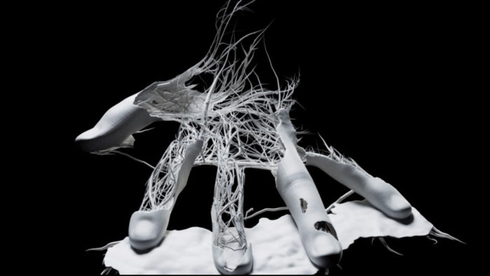
You can see how this thinking influenced the design and animation of the main title. Our learnings during the research period led me to the idea of revealing portions of images as you go, just as a blind person would feel their way through the space that’s in front of them before moving on to the next. I wanted moments where the ground plane and visuals revealed themselves just ahead of the traveling camera, just ahead of what the viewer sees.
The Pitch
Like almost all of the title sequences I’ve worked on, SEE Season 2 began with a pitch to the show-runners and producers. Something you learn quickly doing this work is: show-runners love to see options. They will bring in multiple companies to put forth their best creative concepts and approaches, then select the best idea from a plethora of possibilities. During this process, my team and I designed a few visual directions, presented fresh concepts, and showed various technical approaches that we thought would best suit the series.
The Process
My approach to projects like these starts with gathering as much insight into the film or series as possible. This usually involves in-depth conversations with the filmmakers, reading through all the scripts, doing independent research, and collecting a library of visual references along the way. I love being hands-on with all my projects. I know some directors prefer to delegate all the various tasks required, but I find I can get closer to the vision in my head if I can show my team what I’m trying to achieve.
I animate my own camera moves and characters, design the style frames, set up the compositions, and assemble complex transitions in early animatic form. To do this work, I operate primarily in C4D and After Effects. I find with the new GPU render engines available to us like Octane and Redshift, even our greyscale animatics (which are meant to be more of a sketch of the overall shot) can feature things like depth of field and motion blur while still being able to output playblast renders at lightning speeds. Basically, I like to set the foundation for the overall sequence and then pass all that off to my team members to experiment with, refine, and ultimately bring to final quality.
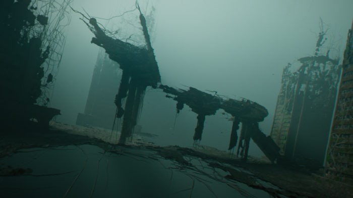
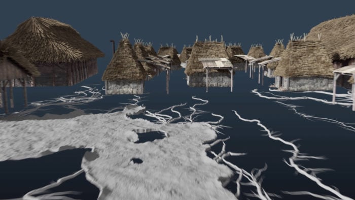
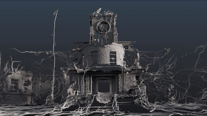
This title sequence was likely the most ambitious and technically complex project for me to date. There were so many different pieces that all had to fit together perfectly: It had to communicate the overall concept and still feel cohesive as a set of visuals. I wanted every aspect of every shot to reveal itself as the camera passes through, utilizing a system of growing tendril-like forms. Whether it’s a mountain range, empty skyscrapers, or blind soldiers fighting for their lives, every object gets the VFX reveal treatment. And to make things harder, I wanted the camera to flow seamlessly through all of the shots, making it feel like an epic journey.
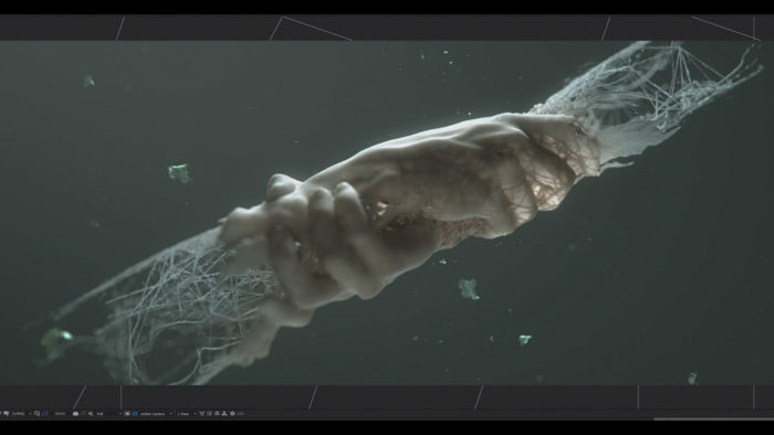
To develop the initial art direction of the tendril growth system, I worked closely with Danil Krivoruchko. Running test growth simulations, passing assets back and forth from C4D to Houdini, we dialed in exactly how the tendrils could grow on small objects like hands and revealed large-scale structures like a bridge or highway overpass. Once we got into full shot production, Method FX supervisor Tomas Slancik, alongside FX artists Tomas Zaveckas and David Derwin, refined and crafted the behavior of the growth/reveal system. This team of extremely talented artists brought this sequence to life in ways I could have never done on my own, and it’s a true testament to the power of collaboration, especially since we all did this project remotely from different locations all over the world.
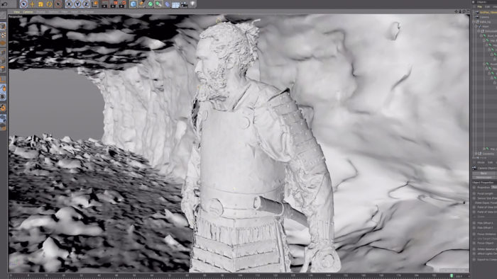
C4D was the central hub for all the shots in the main title. It started with me setting up the 3D scenes, importing various assets from the production team like motion capture data, character models, and 3D scanned photogrammetry of set pieces like the bus being used as a gate to the city. I’d then animate the camera moves through the environments and export the elements out to other packages like Houdini and Maya to refine and apply the custom FX growth system.
Once we rendered our CG out of Redshift, we imported the passes into Nuke. In Nuke, our compositors could adjust the visibility and atmosphere from shot to shot, make the transitions feel seamless, and assemble the final look and color grade. After that, it’s about conforming in Adobe After Effects to stitch the sequence together and apply the typography. 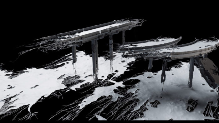
Challenges and rewards
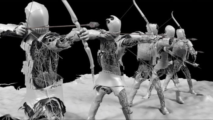
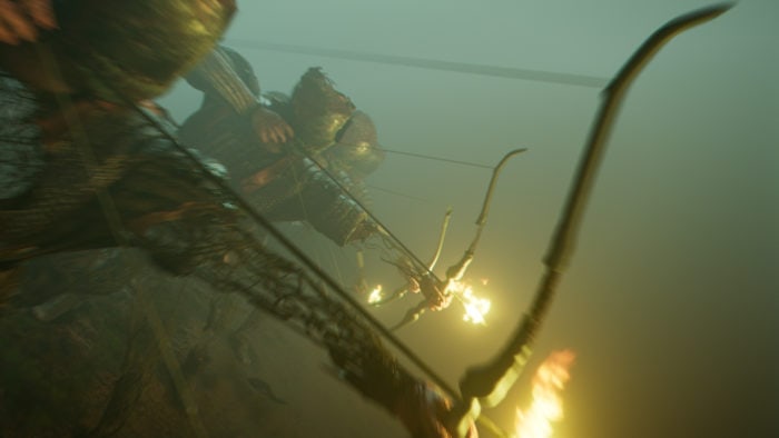
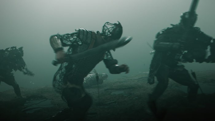
One of the more challenging shots to figure out was the fight sequence. Not too many main titles can feature a full CG battle between warriors because of the complexity that goes into pulling it off in a decent manner while staying within the budget. I was lucky enough to get the go-ahead and the right team to see it through. Utilizing motion capture data of the two blind fighters, we were able to assemble a scene that felt like a larger battleground. The tricky part was allowing the revealing growth FX to be noticeable and effective at the same time as the fighters tried to kill each other.
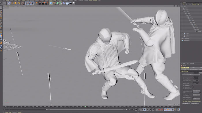
We found the movement of the mocap actors made it rather challenging to get a good look at the tendrils growing. We also found if we removed too much of the body shape of the fighters, you couldn’t quite tell what was happening in the action of the fight. So we did a lot of back and forth in C4D and Houdini to find the right balance of the tendril-to-soldier ratio.
This project was unique in the sense that a lot of the visual language and animation direction had to be more or less described in writing and communicated verbally to the clients before they could actually see how it was going to work together as a sequence. Often I can show clients how things will work in a motion test, but due to a challenging schedule, we needed to get right into shot production to hit the fast-approaching deadline. This required a massive amount of trust from the show-runners and producers on the client-side to know that my team and I could execute this ambitious, animated journey.
The accelerated production timeline would also require expert levels of planning and organization from Method producers Emily Schaeberle and Adrienne Mitchell, to ensure that we could deliver, on time, what we promised. Luckily, we had a bit of history with the clients as we had all worked together previously on the Emmy nominated title sequence for WARRIOR. They are awesome to work with, giving us creative freedom and allowing us the space to create the best work we can. I’m extremely grateful to them for putting enough faith in us to come up with something special once again.