


Before we jump into how we created our title three times, let’s rewind to how we got the project. Presenting four different ideas to the show runner, we had everything from a live-action Chicago-centric show open to a trippy abstract title with interconnected hands. We even developed a painterly look inspired by the show’s wild multiverse. But you know what really clicked with Blake Crouch? The immersive puzzle box idea. He saw the symbolism behind ‘the box’ in the story and thought it would hit home with the audience.
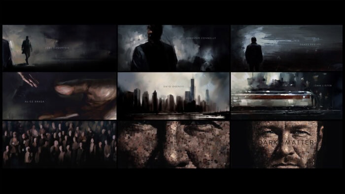
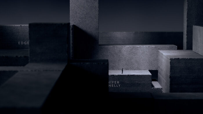
This is an infinite puzzle box, always changing with new barriers, obstacles, and hidden paths. We showcased lead characters Jason and Daniella, moving like ships in the night, trying to connect but never quite making it. This all seen through a single camera, exploring unexpected points of view and an eerie feeling of not quite knowing where you are in space.
Often title sequences evolve, however, this one was created three times:
- At the initial pitch.
- When adapting the concept into a 60-80 second edit.
- When we got the final music.
The Pitch:
We took a cue from the show runner and started with Lana Del Rey’s “Blue Jeans” for the initial conversation. The idea was to create a sequence that felt choppy, artistic, and more impressionistic. We believed the editing style would bring out the emotion, particularly in the puzzle box scenes. A boardomatic with still frames was put together initially, and it sort of worked. However, when the previz of the changing puzzle pieces was added, it didn’t quite mesh. The music, being dreamy and emotional, lacked the punchy beat needed to sync up with the animations. So we were faced with the question: Do we rethink all of the puzzle box animations? Or do we suggest to the studio that the track, which was our Northstar for this entire endeavor, doesn’t really work?
The Edit:
Luckily, after hearing and seeing the edit, the studio was also not feeling the vibe of “Blue Jeans.” They enlisted the show’s composer to come up with a new score. The first attempt was pretty cool; however, it was the exact opposite in tone, BPM, and attitude of where we were. It was musically interesting, but it didn’t fit the choppy or impressionistic vibe we were going for. I remember thinking…Fuck. We had to completely reedit the sequence, adjust all the animations, and create something far slower-paced and less cutty. The music did, however, have a nice cadence that worked well with the puzzle box animations. I would say, compared to the final track, the only thing it lacked was a more ominous and mysterious tone.
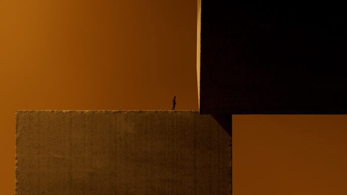
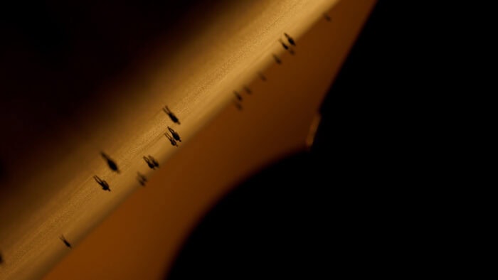
While we were sorting out the audio, another concern popped up: how do we keep the audience interested in gray concrete for a full 70 seconds? I feel like title sequences in general, often fall into the trap of having to repeat a device so often that it becomes boring—even for someone like me, who wouldn’t dare click the skip button. So how do you grab people’s attention before it wanes? How about flipping the color palette to bright orange? From a storytelling standpoint, the introduction of color indicates a sense of hope and transformation: very much in the vein of Joseph Campbell’s ‘The Hero’s Journey’. So we’re now in a good place, right?

The Music:
As we delved into animation, the show’s team once again wasn’t liking this new track. Really!? Really!? They wanted to switch gears. Composer Jason Hill developed a different track altogether (which, I gotta admit, was pretty damn good), but once again, it had a different style, BPM, and mood. We gave it a try, wondering how it would play with our existing edit—but honestly it wasn’t working. Listening to the music, it felt like the editorial style needed a shake-up.
That’s when our editor, Lexi Gunvaldson, threw out an idea: simplify everything. She suggested ditching all the cuts and turning it into one big camera move. And she was right. There’s something about this track that didn’t really motivate any edits in the visual. If you give it a good listen, there aren’t strong enough percussive hits to feel like a real indicator of where a cut should be. I don’t think it was, by any means, bad by having edits in it. It just didn’t bring value to it.
Oy vey, now I had to tell the animators that we’re scrapping everything we’ve done, for a single (with 26 perfectly timed credits) camera move for around :60-:70. Luckily, our animation lead, Charlie Proctor, was well up for the challenge and was only interested in making this the best it could be—regardless of the challenges ahead.
Now, keep in mind that we already pre-visualized tons of shots and had a completed edit—so three weeks in, we decided to scrap everything we’ve done and start over. And you know what? It was well worth it. With the new music in place, we mapped out this single-camera journey, circling the box while it’s morphing and shifting. We even plotted out each credit in 3D space. So it’s smooth sailing ahead. Mostly, however, every small timing change meant re-rendering, and potentially reanimating, the entire sequence. Which kept both the late nights and antacid flowing. But it totally paid off in the end.
What are some of the influences here?
The original Twilight Zone really shaped what we wanted the audience to feel from our title sequence. To capture that eerie, unsettling tone you’d get from watching the show. I remember a specific episode where a man wakes up to find everyone he knows is missing. Turns out, he’s just living in a giant train set, and this massive hand of a child is placing pieces down. That image of the giant hand always stuck with me since I was a kid.
I also love the golden hour vibe in Star Trek: The Original Series, specifically in the episode “Amok Time”. The orange-hued light and palette brought a warmth that was clearly staged to look outdoors.
What are some technical achievements here?
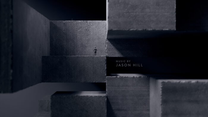
Firstly, there was minimal compositing involved in this project. The majority of the work was done in 3D within two Cinema4D scenes. These scenes were divided so that two artists could simultaneously work on each half. Secondly, we developed an impressive concrete texture that procedurally erodes the edges and corners of any primitive cube it’s applied to.
Main Title Credits:
Creative Director: Ronnie Koff
Designer: Ronnie Koff
Animators: Ronnie Koff, Charlie Proctor, Alex Braddock
Editor: Lexi Gunvaldson
Producer: Jackson Kerr
Coordinator: Nic Luong
Imaginary Forces was founded in 1996 in Los Angeles and is an award-winning creative company specializing in design-based visual communications. First known for designing iconic film titles, Imaginary Forces has brought Motion Design into the worlds of advertising, architecture, gaming, and documentary film production.