Ben Berman is a veteran comedy director and writer, he got his start editing for Tim & Eric before directing Comedy Bang! Bang!, Jon Benjamin Has a Van, Lady Dynamite, and Man Seeking Woman. He honed his craft under Oscar-winning filmmaker Errol Morris, contributing visual effects to feature films and creating digital interactives for The New York Times. His short films I’m a Mitzvah (starring Ben Schwartz) and How to Lose Weight in 4 Easy Steps (starring Beck Bennett) premiered at Sundance, as did his acclaimed 2019 documentary The Amazing Johnathan Documentary, later acquired by Hulu.
With a Harvard degree in Visual Art and Computer Science, Berman’s work thrives at the intersection of comedy, technology, and storytelling—often brilliantly, sometimes awkwardly, but always with a wink. His animations have even slipped into his brother Alex Berman’s films like cinematic Easter eggs. If there’s a fine line between absurdity and genius, Berman dances on it.
Visual Style & Intent: We winged it in a hallway—turns out, it’s cinema
- The film’s aesthetic feels like a collision of whimsy and unease. How did you develop this visual language to mirror Jack Cox’s art and psyche?
- What inspired the use of austere, head-on framing in scenes like the static interview of Cox speaking in a cramped hallway space?
Well, to be honest, I’m not entirely sure. A lot of it was kind of on the fly— especially the interview. Like you said, it took place in a cramped hallway, which we only discovered that day and ended up using out of necessity. Jack’s apartment in Brooklyn is pretty small, as most New York apartments are. But actually, I realized I find it interesting to interview someone in a hallway, a space that’s not traditionally meant for that. Hallways are usually just places of transition, not somewhere you sit, stay, and have a conversation. So I started thinking… maybe I want to explore that more—interviewing people in spaces that are typically just for passing through, not for sitting, thinking, and talking at length. In a way, I guess that mirrors Jack’s art—its overall conceit or ethos, or whatever you want to call it. It’s imperfect, a kind of subversion of what we usually expect.

Surrealism & Symbolism: Big ego? Nah, but his head sure floats
- How did you translate Cox’s surreal, often grotesque works into cinematic metaphors without losing their visceral impact?
- The recurring motif of talking floating heads seems central. What does this represent about Cox’s creative process?
I’m happy the film has a visceral impact—that was definitely the goal—but whether they’re cinematic metaphors or just, you know, regular metaphors, I’m not sure. The idea of an artist feeling worthless, their anxieties and doubts spilling into their work—I can certainly relate to that. As for the recurring motif of the floating heads and what that says about Jack’s creative process… honestly, I don’t know. I knew I wanted to explore ego, so I asked Jack if he thinks he has a big head— meaning a big ego—and he said, “No, I have a small head.” And, well, he literally makes small heads. So I just ran with that—quite literally giving him a tiny head. It was meant to be playful, but also very literal. That said, it is interesting that his tiny head floats above his body, disconnected to anything. I’m sure that means something—a floating head, detached from the body… that speaks to Jack’s and my own tendency for overthinking, our restless, anxious minds.

Humor & Tone: Awkward laughter: House specialty
- The documentary balances dark humor with existential dread. How did you navigate this tonal tightrope, especially in scenes like Cox talking to his own artworks or the absurd dialogue in the middle of a bucolic landscape featuring a replication of himself??
- Cox’s art often walks a line between absurdity and profundity. How did you ensure the film’s humor didn’t undermine the gravity of his themes?
Balancing humor and darkness is something I always strive for. Dark humor is definitely my instinct, and existential dread is never far behind. Without speaking for Jack, I’d guess that resonates with him too. Walking that tonal tightrope— between humor and dread—is at the core of both my narrative and documentary work. To me, that’s just life. Not to get too pretentious about it. Jack’s work is both absurd and profound, and as for ensuring the film’s humor didn’t undercut its weight—I honestly didn’t overthink it. It’s all about balance, and I have a decent amount of experience navigating that space between levity, pathos, and real emotion. You put it well: the goal is to bring humor to something serious while also treating something inherently funny with artistic integrity. Not to undermine the gravity of these serious themes, but to bolster them.

Animation & Technique: Jack’s heads could speak, here’s the tea
- The animated sequences feel like extensions of Cox’s sketchbook. What tools or techniques did you use to emulate his hand-drawn style digitally?
- Why did you choose to animate certain moments instead of using real-life footage of the portrayed characters or archival material?
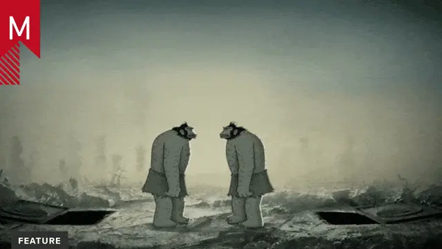
The idea from the start was simple: document Jack’s work and animate his heads speaking. I’ve used this animation style in one or two of my past projects. But Jack’s heads—his art, his sculptures—were so striking and intriguing that I wanted to bring them to life. Maybe even take them to another level, though they certainly don’t need it.

Narrative Structure: Time jumps > boring bios
- The film’s nonlinear structure mirrors Cox’s fragmented imagination. How did you decide which aspects of his life or work to prioritize visually?
- Scenes transition abruptly between reality and fantasy. Was this disorienting pacing intentional, and how does it reflect Cox’s worldview?
That’s a really good question. The short is eight minutes long, fairly non-linear, and doesn’t answer all the questions a traditional artist profile might—and that was intentional. For this short, I don’t have much interest in where Jack was born or why he got into art. To be honest, I don’t really care. What interests me is his philosophical musings, his personal story in the now, and his creative process. It’s much more of a vérité, in-the-moment film rather than a retrospective. I’m more about emotion and philosophy than straight-up information—though that could change in the future. As for the pacing and transitions—it’s interesting that you found it disorienting. Was that intentional? I hope so. Some of it probably wasn’t. But if you’re referring to those quick jump cuts, the layered soundscapes, the chaotic energy of New York—that was definitely deliberate. That came later in the edit to reflect Jack’s worldview, the way he experiences the city as overwhelming, even anxiety-inducing. And of course, that feeds into the film’s resolution.
Collaboration & Perspective: Jack + Me: Collab or group therapy?
- How involved was Jack Cox in shaping the film’s visual direction? Did his own artistic sensibilities clash with or enhance your vision?
- The documentary sometimes feels like a dialogue between artist and filmmaker. How did you avoid making a purely “explanatory” portrait and instead create something more subjective?
I reached out to Jack, and we quickly decided a short, two-minute documentary made the most sense. That way, we could showcase his sculptures and animate them. That was the plan from the start. I saw Jack more as the subject of the film, while I, as the filmmaker, was exploring and exhibiting him as an artist. So in a way, there’s this artist-on-artist dynamic at play. His worldview resonates with mine, so our sensibilities didn’t clash—we worked well together, at least from my perspective. But you’d have to ask Jack; he might see it differently. As the editor, I intentionally kept things that felt representative of both him and me. A more traditional, explanatory portrait wouldn’t have interested me as much. I just follow what excites me—the elements I can shape into something compelling, using sound, atmosphere, and rhythm. The jump cuts and layered audio became part of the film’s identity, reflecting Jack’s experience in a way that felt true.

Sound & Atmosphere: New York sounds like jump cuts & Talking Heads
- How did you use audio elements to heighten the surreal visuals, particularly in your approach to voice casting or vocal texture?
- The score often feels deliberately off-kilter. What role did music play in grounding (or destabilizing) the film’s tone?
Voice casting was easy—that’s just Jack. As for the score feeling off-kilter, that’s interesting. I wouldn’t necessarily call it destabilizing, but it definitely has a unique identity. The playfulness was intentional, helping signal to the audience that this isn’t a typical artist portrait.

Challenges & Constraints: Tiny apartment + locked door = docu gold
- What logistical hurdles arose when recreating Cox’s densely detailed art for the screen? Were there ideas you had to abandon for technical or budgetary reasons?
- How did the short film format influence your approach to condensing Cox’s sprawling body of work into a cohesive visual narrative?
The first constraint that comes to mind is the size of Jack’s apartment, which led to the hallway interview. Then at one point, we all stepped out for a cigarette or something, and when we got back, Jack’s door was locked. We had to wait for his girlfriend to return and let us in—just one of those little production hiccups. If you see a cohesive visual narrative, I appreciate that. Cohesion, when intentional, is great. But sometimes subverting it is just as powerful. As for making Jack’s art accessible while keeping its raw edges—accessible is an interesting word. I think his work already is accessible. That’s why so many people connect with it; he has a strong following and success. Honestly, just pointing a camera at Jack’s work was enough—it speaks for itself.
Audience & Impact: Art shouldn’t hurt. Period
- The film doesn’t shy away from the uncomfortable or grotesque. How do you balance making Cox’s art accessible while preserving its challenging edges?
- What do you hope viewers take away about the relationship between an artist’s inner chaos and their creative output?
That’s a great question. What I don’t want people to take away is the idea that you have to be mentally hurting up or anxious to create good work—that’s just not true. But there is often a correlation. Anxious people might tend to make unique, interesting work, though, we can move beyond that mindset, and the next generation won’t feel like they have to suffer or be in turmoil to create meaningful art.
Legacy & Context: Cox vs. Dalí: Surrealism deathmatch
- Cox’s work exists in a tradition of surrealist provocateurs. How did you visually situate him within (or against) that lineage?
- If Jack Cox’s art is a reflection of societal anxieties, how does your film’s visual style amplify or interrogate that message?
I bet Jack would really appreciate that—placing his work in the tradition of surrealist provocateurs. As for how the film’s visual style amplifies his reflection on societal anxieties, I think we’ve covered that—the jump cuts, layered soundscapes, and chaotic New York moments all heighten his sense of being overwhelmed by the city. And then, of course, when we shift to the Poconos, there’s a more serene, grounding presence.
Credits: Shoutout to David Byrne for not suing us!
I really appreciate you taking the time to watch Heads and engage with it. It was a pleasure working with Jack, becoming friends, and making this short together. Also, a big shoutout to Alex Bliss—a fantastic cinematographer in New York. If you get the chance, work with him. And to Zach Wright for contributing original music.
And to David Byrne of Talking Heads, who watched the film, had kind words, and gave us permission to use a Talking Heads song.
Thank you—goodbye!


