


Maira Kalman in her studio. Photo by Kimisa H.
Maira Kalman, NYC artist and Art Directors Club Hall of Fame inductee, transforms the mundane into poignant narratives. Her whimsical, introspective work spans The New Yorker covers, MoMA exhibitions, and collaborations with icons like Talking Heads and Isaac Mizrahi. Acclaimed books—The Principles of Uncertainty and Looking at Lincoln—merge philosophy and observation. Recent projects include Netflix’s The Residence titles and the Met’s 2025 Metamorphosis exhibition, redefining still lifes. Her NYC walks inspire empathy for “objects with souls,” from chairs to sardines. A multidisciplinary creator, she bridges design, theater, and dance, collaborating with institutions and her son, Alex Kalman, affirming art’s role in daily life.
The Unscripted Art of The Residence Titles
- How did the episodic structure of The Residence shape your approach to designing distinct, hand-drawn title sequences for each episode?
- Were the title sequences’ Easter eggs pre-planned or discovered during the improvisational drawing process?
- How did your analog, collage-based techniques translate to the technical demands of animated opening credits for television?
- What unplanned visual motifs emerged while sketching the titles, and how did they inform the show’s overarching mystery?
- What compromises or adjustments occurred when integrating your handmade art into Netflix’s digital production pipeline?
- How did you determine when a title sequence achieved the balance between standalone intrigue and cohesion with the episode’s narrative?
–
I was approached by Paul William Davies, the writer and Holden Chang the producer. They sent me the episodes and i started sketching.
–
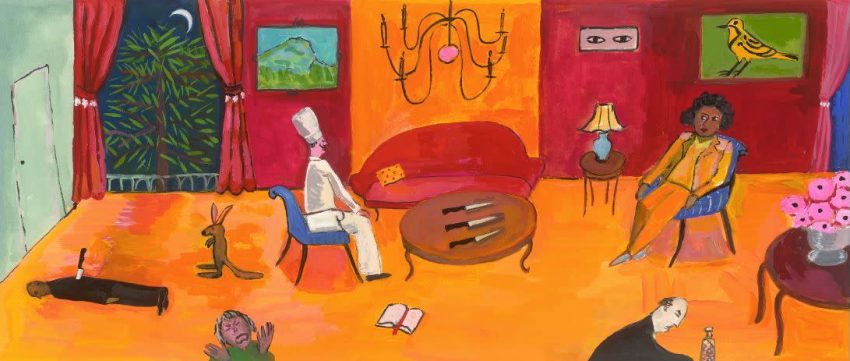
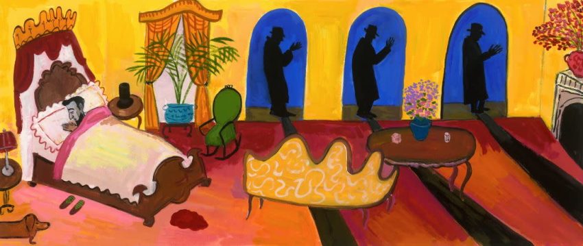
All of the imagery was in reference to the title of the episode. A tongue in cheek approach to the murder mystery.
–
Backlit art is a wonderful thing. I was able to do the paintings (gouache on paper) and have them scanned by a wonderful print studio in NYC, Laumont Photographics.
–
Nothing was planned in that sense. I was free to draw what i liked and went by my instinct. Paul and I would discuss the sketches and adjust as needed. It was a great collaboration.
I always had a sense of freedom and authority, but knew that i would be happy to listen to Paul as well.
–
Really none. The collaborative process was one that was fun. Paul and I share a love of murder mysteries in general and the screwball comedies. So i relished having a chance to refer to those things with lightness. And humor of course.
That is how i approach all of my work. Wimsy and pathos together.
–
That was something that the studio worked out. We discussed what kind of animation there might be. What the typography would be. But the rest was up to them once i sent in the work.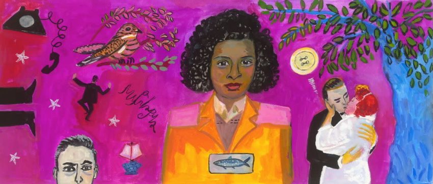
The Mundane Mystique of The Residence
- How do the title sequences use color (e.g., hot pinks, cobalt blues) to set the show’s tone as both playful and ominous?
- Why do mundane objects (teacups, chandeliers) in the titles feel eerily significant despite their everyday origins?
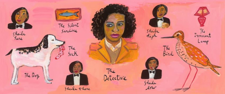
- What role does the Detective’s orange suit play in visually anchoring the chaos of the title sequences?
- Which recurring symbols were deliberately placed as clues, and which arose spontaneously?
- How did you condense her illustrative storytelling into brief, episodic openings without losing emotional depth?
–
That is exactly the feeling i was going for. It is a narrative. With fragments and clues. Some funny. Some mysterious.
–
As Virgil wrote “There are tears in the nature of things.” We look at the objects around us. Some can kill!
–
Cordelia is the moral center of the show. She does not waver. Her self-confidence is an anchor for us all. So she wears a down to earth, functional but slightly sunny suit.
–
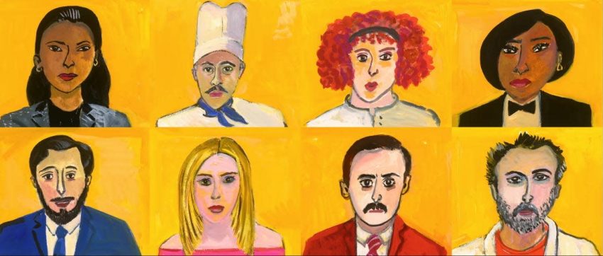
I watched the episodes and decided which images would suit the particular painting.
–
As a writer and illustrator of books for adults and children, i am very aware of making an emotional connection while keeping things moving.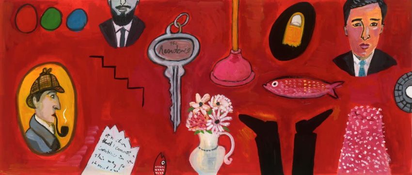
From Kafka to Kitsch: The Absurdist Heart of The Residence
- How do the title sequences reflect influences from classic murder-mystery tropes or absurdist theater?
- Did your daily walks or personal collections of ephemera directly inspire specific title sequence details?
- How did studying rough cuts of The Residence episodes inform the pacing and symbolism of the titles?
- Do the titles subtly critique modern surveillance culture through motifs like peering eyes or obscured faces?
- How do the titles channel Edward Gorey’s macabre whimsy or Saul Steinberg’s linework in their visual language?
–
Paul placed references in his titles. And i followed suit. We are fans of Hitchcock and Kafka. We were in a happy strange world.
–
I love the objects that i have in my home. And i pay attention to them. My latest book is Still Life with Remorse. So i know how to combine seemingly normal objects with great emotion.
My daily walks are also the key to all of my work. I fall in love with objects i see. A broken chair on the street. I fall in love with trees and dogs and people that i see. And I also (usually) have a sense of empathy with people. Hopefully that comes across.
–
I thought that my title paintings would run as long as the episode itself. So much for hubris. There ARE time constraints in a show. So I adjusted my expectations!
–
NO. Every era has it’s sense of danger and fear. We are all human after all.
_
I adore both Gorey and Steinberg. They are part of my landscape.
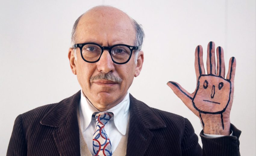
Saul Steinberg, 1978. Photo by Evelyn Hofer
Kalman & Davies: Forever Partners in Crime
- As a first-time collaborator in television, what drew you to The Residence project? How did the opportunity to define the show’s visual identity through its opening titles align with your artistic goals?
- How did the production team—writers, directors, or showrunners—shape your vision for the title sequences? Were there specific narrative themes or tonal guidelines they asked you to emphasize?
- Did you work directly with the writers to embed plot points or character arcs into the title art? Can you share an example of how a subtle visual clue (e.g., a key, a shadow) reflects the show’s larger mystery?
- Were there moments where your preference for ambiguity conflicted with the show’s need for clarity? How did you negotiate those creative boundaries while staying true to your style?
- How has this experience designing The Residence titles influenced your approach to future projects? Would you explore serialized storytelling or animation again?
–
When Holden and Paul got in touch, i said yes immediately. I don’t believe in limitations. Just solutions to problems. As Hercule Poirot’s, Miss Felicity Lemon says “Difficulties are made to be overcome.”
Fortunately, this was not difficult. The opposite. Just total utter interesting fun.
–
Paul gave me a free hand. I sent sketches and we discussed what might be adjusted. There were not too many things that we needed to change. A dream situation.
–
The shadow, for example, came from Paul’s reference of The Third Man. We both love that movie. All of the references were inspiring. It was wonderful to work on this, because it was not created by a committee. Paul’s wonderful writing leading the way. Heaven.
_
I can’t emphasize how respectful they all were of my ideas and process. There were no creative differences! How amazing is that?
_
I would work with Paul forever. I love seeing my work on the screen. And it would be great to work on more animation.
Kalman hand wrote all the text that is in the main title sequence