


Superexpresso, Just Another Afternoon
Italian-born designer and art director Michele Angelo, aka Superexpresso, seamlessly merges European elegance with Texan boldness from his dual bases in Barcelona and Austin. Celebrated for bold branding and spatial storytelling, his portfolio spans luxury (Bacardí, Grey Goose), automotive (Audi, Ford), and cultural icons (Rolling Stone, MTV). His latest creative venture, BAR SUPER, distills 1960s Italian modernism, Memphis Group attitude, and Mediterranean energy into a vivid blend of Brutalist concrete, holographic grids, and animated identities. Angelo’s practice thrives on materiality and cultural fusion, shaping bold yet elegant narratives. He loves natural wine like a sommelier, plays tennis like Federer, techno is his church and Autechre his ‘Dio’. Lives with his lovers Vivienne, Pigwee, and Rachel—two cats and one wife, to be clear.
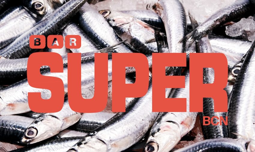
Super Branding, Bold Type, Fresh Sardines
Let’s begin with the essentials—what defines BAR SUPER?
- Can you distill BAR SUPER‘s DNA in a sentence or two? What does it stand for, aesthetically and culturally? What was the initial conceptual seed that set everything in motion?
–
BAR SUPER is a new restaurant and project that recently opened in Barcelona, launched by the Italian power duo Stefano and Max Colombo—the twin brothers behind Bar Brutal and Xemei. We’ve known each other for many years, ever since I lived in Barcelona in the early 2000s. Like me, they’re Italian expats and travelers, and I’d say we share many cultural values and life perspectives. So when I was invited to be part of the project, it felt completely natural.
–
The concept behind BAR SUPER is a high-quality dining experience with a refined yet essential approach—rooted in the unpretentious tradition of classic Italian comfort food, reimagined and elevated through modern techniques. That same spirit guided the aesthetic and visual direction I created for the space. Fresh ingredients from the market, honest food for both locals and visitors, a design that’s minimal but thoughtful and fun, and an atmosphere that feels warm, playful, and alive—these are the core elements of Super.
SUPER’s Type Studio
Italian Modernism Meets Mediterranean Energy: PINTEREST FREE ZONE
- Your moodboards lean heavily on 60s–70s Italian design. What is it about that era that resonated so deeply with this project? Miró, Memphis, Castiglioni… it’s a dream team of references. How did you mix all those into one cohesive (and very stylish) space? The logotype development seems particularly detailed. What story were you trying to tell through typography?
–
The design culture of the 1960s and ’70s has always been a crucial source of inspiration for me. The moodboards I created for this project came straight from my own books—no Pinterest. I studied architecture in Milan before focusing on industrial design, and later, graphic design. Stefano and Max also spent time living in Milan. The cultural wave that swept through the city during those decades was powerful and left a lasting legacy—not just in terms of aesthetics and ideas, but politically and socially as well, which is something I care deeply about.
–
Figures like Enzo Mari, Ettore Sottsass, and Bruno Munari brought a wonderfully honest and inquisitive spirit to their work. They embraced experimentation and thrived on cross-disciplinary exploration. I wanted that same energy to flow through this project—a structure that felt solid and intentional, yet grounded in craft and a deeply human, spontaneous attitude. Almost naive, but in the most sincere and deliberate way. When I shared this vision with Stefano, it resonated immediately. That design philosophy became the thread running through everything—from the kitchen to the visual identity, from the interior design to the way we tell our story.
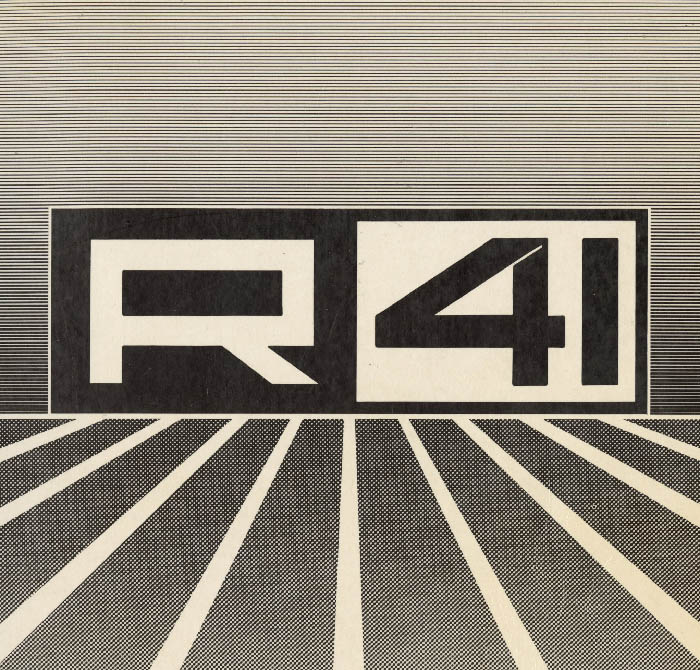
Aldo Novarese, R41 Logo, 1960
–
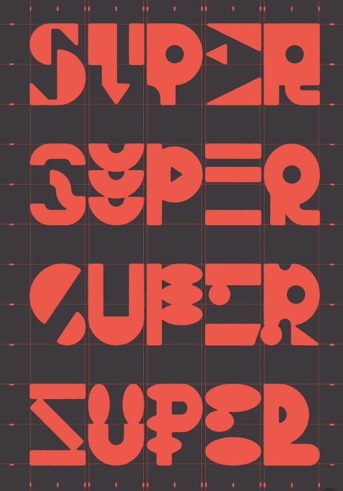
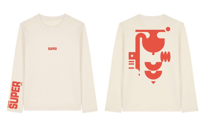
The logo was the starting point—the anchor of the whole identity. Typography often plays a central role in my projects, and I design custom letterforms whenever I can, even though I’m not a type designer by trade. In this case, I began with the work of legendary Italian typographer Aldo Novarese. His typefaces—Microgramma and Eurostile—are iconic: bold, futuristic, and beautifully structured. I used them as a foundation to create a new hybrid, a bold variant that didn’t exist yet—so I made it myself. The result is a logo that’s entirely unique, yet deeply connected to a specific design lineage. And then came this small, perfect coincidence: Novarese’s foundry was named Nebiolo—which, for a new Bar Brutal venture, felt like destiny.
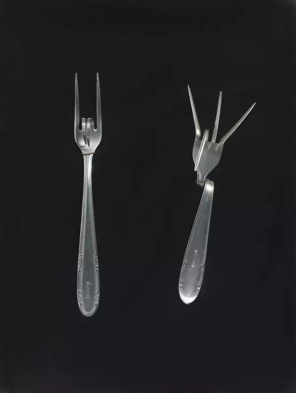
Bruno Munari, Forchette parlanti, 1972
–
After completing the main logo, I expanded the identity with a more playful touch. I designed a grid based on the logo’s proportions and created a series of geometric shapes that became part of the visual system. Some of those shapes eventually inspired elements of the restaurant’s interiors—bringing the whole concept full circle, and making it not only cohesive, but genuinely fun.
Spatial Identity & Material Expression
- “Traditional trattoria modernist” is a bold combo. What does that mean in practice? Pasta meets plywood? Your selection of cutlery ranges from Gio Ponti icons to anonymous Japanese flatware. What role does this kind of detail play in crafting atmosphere? Brutalism, holographic grids, terrazzo, neon—how did you strike a balance between eclecticism and clarity?
–
The Bar Brutal natural wine concept has been tried, tested, and exported successfully for more than ten years now. BAR SUPER is meant to be an evolution of that idea—carrying the same spirit and quality, but from a different angle, almost like a glance back. It’s more of an daytime place, closely tied to the rhythm of its neighborhood—Santa Caterina. The restaurant sits right across from the local market, and the ingredients are as fresh and seasonal as it gets.
The Colombo twins, Jordi, the chef, and I are all proudly :) Italian, each from different parts of the North. We talked a lot about bringing back the culture of the trattoria, simple, honest, seasonal cooking, but with a modern sensibility. That said, it’s not only Italian. Catalan culture plays a big role in the mix too. David, the wine wizard behind both Brutal and now SUPER, is Catalan. Modernism is something both our cultures share deeply, and it felt important to bring that into BAR SUPER, a kind of meeting point between two design lineages. And there’s definitely a bit of Japanese soul in the mix, too. Stefano lived in Japan for a while, and the opening of BAR SUPER was actually a beautiful collaboration between SUPER, Bar Brutal, and the incredible Kabi—a Michelin-starred restaurant based in Meguro, Tokyo.
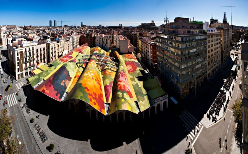
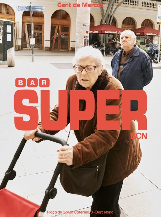
Santa Caterina Market: Barcelona from a Seagull’s-Eye View © Fradera, Martí
–
Design plays a role in every corner of this project—from the typography to the shape and color of the long bar, to the lighting, the cutlery, and beyond. The space itself is a work in progress, intentionally. It will keep growing over time, through small details in the room and evolving decisions in the kitchen. We want it to feel alive, layered, fun, and warm. My wife is an amazing interior designer and provided a great perspective and ideas.
–
I started with a very structured, organized foundation—but I wanted it to have a spontaneous, almost naive energy that could take on a life of its own. I just lit the spark. From there, everyone brought something to the fire: Charlotte, David, the girls at the studio—Eugenia, Anna, Joojoo—Brenda and Ambra at the front of house, Ramon shaping the interiors. It’s a shared project that reflects a collective intention, a kind of community effort brought to life.
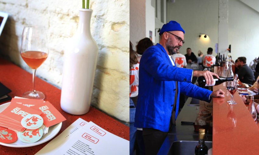
An Italian Entrepreneur in Blue
Locating BAR SUPER in Time & Place: Cultural mash-up
- BAR SUPER feels very “Barcelona now” with a twist. How does the city influence your palette and personality? The global references—from Milanese beer halls to Copenhagen bars—are distinct yet complementary. What drew you to these particular spaces?
–
I’m not even sure what “Barcelona now” really means, to be honest—but I do know that when we talked about the ‘Super’ concept, Stefano and the team and I all agreed: we didn’t want to repeat a formula we’ve seen pop up everywhere else. Having lived in Barcelona for many years before moving to the U.S., I wanted to bring back that vibrant, spontaneous joy of life that’s so deeply rooted here.
In a world that feels increasingly flat—where sameness, repetition, and digital stand-ins are becoming the norm—I feel a strong need to return to the human touch. To craft. To the kind of imperfection that creates a beautiful crack in the surface.
–
Living in different cities and continents, and traveling a lot over the years, I think that mix of influences came together naturally. And the whole team behind Xemei, Brutal, and SUPER is made up of people who are deeply tuned in to that way of thinking—trained in it, even.
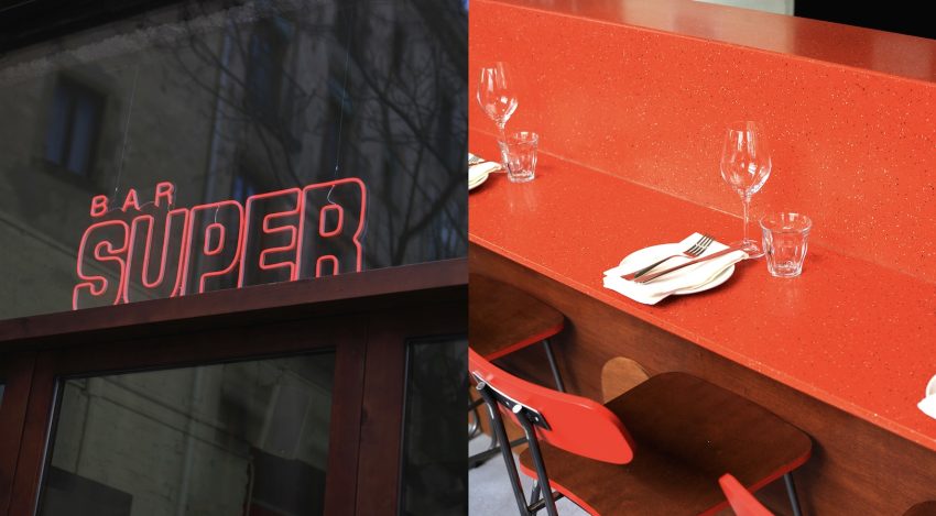
Loud Letters, Loud Colors, Louder Style
Logo in motion
- The logo has a strong static presence, but in motion, it becomes something else entirely. What was the thinking behind animating the logotype? What did you want it to say that a static version couldn’t? There’s a kind of vintage screen-saver meets kinetic typography vibe in the animation—playful, but controlled. What were the key visual or technical references when building its motion language? Do you see Motion Design becoming a core part of hospitality branding now, especially in how places exist across social media and screens?
–
From the start, I imagined the logo as a system. So after designing the main static version, I wanted—once again—to break my own rules and find the playful side. I asked the very talented Stefano Meazza to create a slot machine-style animation using the grid I had built for the logo and its geometric variations. He came up with this gummy, scrolling movement that felt weird and fun in the best way—and we all loved it. It’s unpredictable, and it adds a whole new layer of spontaneity.
Do Logos Dream of Natural Wine?
–
When I created the alternate logos, I wasn’t aiming for perfect digital shapes. I wanted something a little odd—something that reminded me of Munari and Sottsass sketches, with that unmistakable vintage flavor. Something with rhythm. I drew them by hand first, and I think you can still see that, especially in the animation.
It’s kind of like the main logo went out for lunch at BAR SUPER and got drunk—lol. Stefano really nailed it.
I honestly think Motion Design can be an incredible part of a brand’s personality—if it’s done with intention, not just as another visual formula.
Building a Brand Ecosystem
- The visual identity extends far beyond the logo—into uniforms, signage, applications. How did you approach brand cohesion without becoming too rigid? The color palette is sophisticated yet expressive. How did those tones emerge, and how do they function across mediums?
–
The whole visual identity really took shape from the initial concept. It started with a conversation about the kind of food we love and the places we enjoy around the world—which somehow led to talking about favorite colors and lamp shapes. That was the beginning. I find that when the core idea is strong and rooted in something real, the design process becomes this joyful, intuitive journey.
Of course, along the way you realize that mistakes and detours often lead to unexpected solutions—and those can end up being the most interesting parts. But that’s very different from the “let’s search the internet for inspiration and keep tweaking until something sticks” approach you see a lot in advertising. This was something else—more instinctive, more grounded.
–
The SUPER identity is built around a main logotype with several variations, three type families for headlines and text, a color trio, and a grid system. The idea of “programmed spontaneity” is baked into the logo shapes and variants—it gives us room to go a little wild with applications while still staying on brand.
–
The color palette came from the same instinct: we wanted to bring back natural, slightly nostalgic tones that still feel fresh and relevant across both traditional and modern media. The light green, for instance, reminds me of early Prada—and also my grandma’s ceramics. The red and the black are lighter, a bit desaturated—warm and gentle. And from those three base colors, we play with subtle variations to build a more layered, living visual world. We used slightly different reds on the walls, the bar, the website, the neon signage, the stickers, and the business cards—but they all feel like they’re from the same story.
Fashion Take-a-Way
Process, Friction & Serendipity: MORE REAL, MORE HUMAN
- Every design journey has its friction points. What was the most unexpected challenge, and how did you resolve it? Was there a specific visual or material detail that surprised you and ultimately became essential?
–
After the initial conversations with Charlotte and Stefano, I envisioned the project on almost a metaphysical level. I tried to translate those feelings into visuals—hoping the path would reveal itself and that it would all make sense once it landed. When I finally applied the identity to the first photographs, I realized that the brand was alive. I love collaborating with Leonardo Ventura a photographer friend from my hometown. I really admire his style and the way he interprets and weaves in my ideas.
We created a communication campaign based on the essential, fresh ingredients—and the people from the market just across the street. We called it Gent de Mercat. We then called it “Gent de Mercat”. It was wildly fun to pair the photos and these “crazy” logo variations with photos of elderly folks wandering the market. It felt real and human. Just like BAR SUPER—and the food and wines that are served there.
From ‘Mercat’ to SUPERstars
PACIENCE, DEDICATION & CRAFT: Playing the Long Game in Hospitality Design
- BAR SUPER feels like the beginning of a broader visual language. Do you see this identity evolving—or expanding into other spaces or cities? Finally, if you could introduce one audacious design element—without constraints—what would it be?
–
BAR SUPER is a journey. Like Bar Brutal, it will evolve over time—layers and details added slowly, with care. That’s part of the concept: in an era where everything needs to be fast, entertaining, and instantly gratifying—prepackaged and familiar—BAR SUPER chooses a different pace. It will grow patiently, through dedication and craft.
–
I don’t know yet what the next audacious design element will be—but I trust that when the time comes, we’ll know exactly what it needs to be.