There’s a lot to like in the sumptuous graphics package that Imaginary Forces created for ESPN’s coverage of the 2016 Euro Cup.
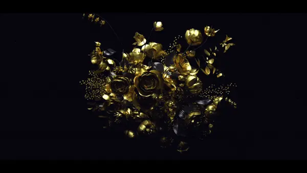
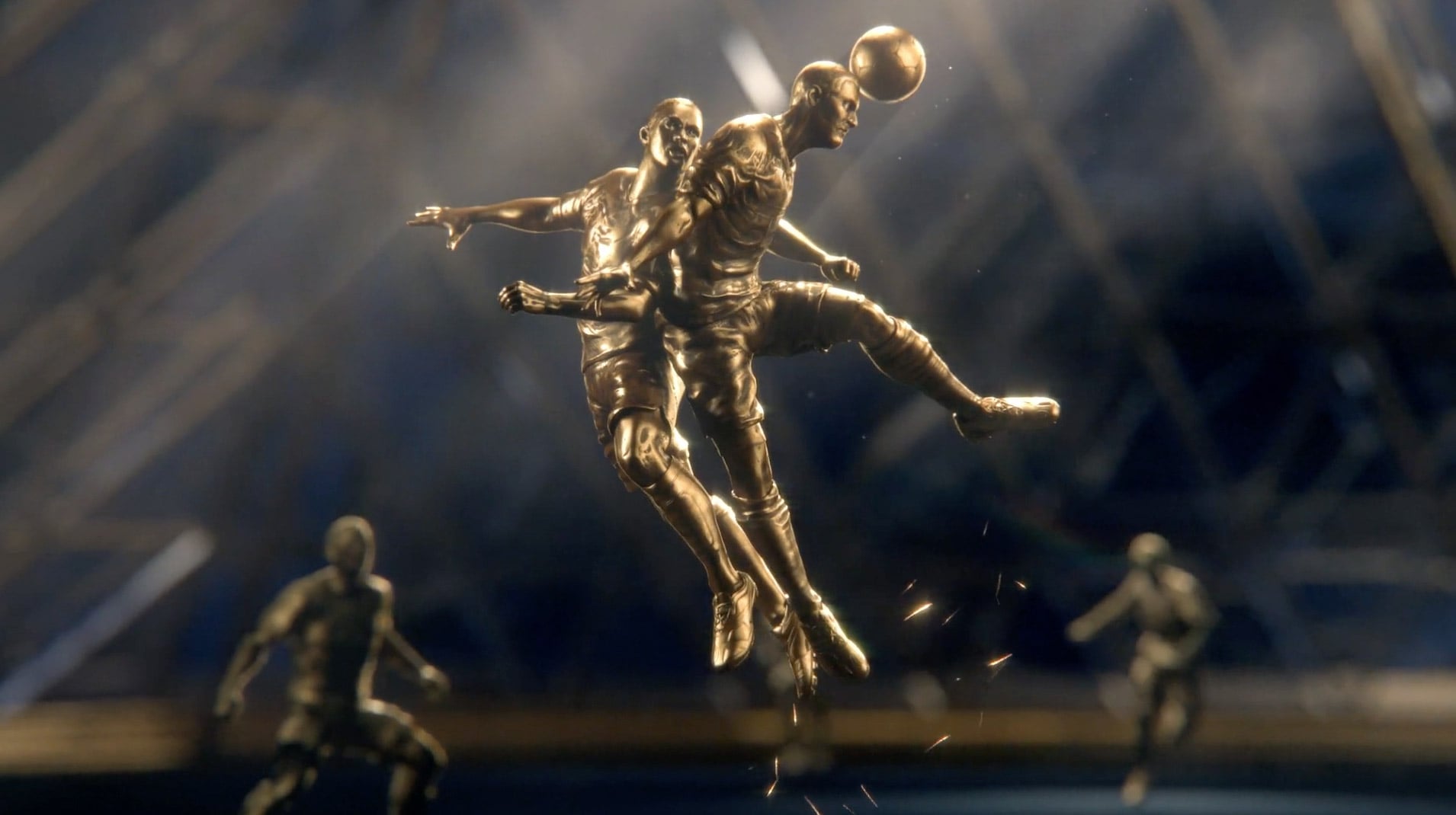
Physics-defying trophies; lovingly crafted homages to the artistic heritage of France; and the unifying palette of jewel-tones shot through with gold — all wonderfully conceived.
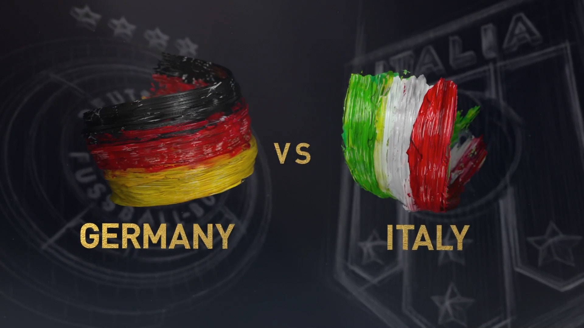
But the real star? Those dead sexy paint strokes.
There’s something immensely satisfying about seeing smears of paint unfurl to form the Eiffel tower or encircle a national crest.
We asked IF about the process behind the package, including details about bringing the dimensional paint elements to life. (See the making-of video below.)
Q&A with Jeremy Cox, IF Creative Director
How did this job come about?
Imaginary Forces had been on ESPN’s radar for a while; they were attracted to our cinematic aesthetic and high level of craft.
This feels like a big graphics package, even for sports. How big was it?
By the end of the project, we had created nearly 200 elements for the month-long soccer tournament.
Was there a push/pull between the design and production aspects of things?
ESPN was a great partner, and it was a very collaborative process. From the get-go, ESPN knew they wanted to try something unlike their usual sports packages.
ESPN Creative Director Tim O’Shaughnessy sent us a deck to kick off the process with a number of ideas they were interested in exploring, as well as areas they’d like to avoid.
I knew we’d get along when the “True Detective effect” was listed in the “things to avoid” section. Nothing against True Detective, but that made it clear they were aware of the design landscape and didn’t want to jump on existing trends.
Have you directed a sports package before?
This was my first time working on a sizable sports package, so it was a pretty steep learning curve. Tim and the rest of the ESPN team were very patient in educating us on the specifics of what they needed.
My somewhat naive perspective wasn’t necessarily a bad thing, though. ESPN wanted to try something different than what they’ve done in the past, so our role in the process was to push them out of their comfort zone.
What technical challenges did you guys have to tackle?
One of the bigger challenges was simply the number of elements. I’m coming from the world of title sequences and commercials where you have one final deliverable, or maybe a couple at most.
Suddenly looking at hundreds of deliverables, I wasn’t able to spend as much time individually finessing as I’m used to. Picking my battles of when to push further verses saying it is good enough was tough.
Tell us about the development of the paint strokes.
Figuring out how to achieve the dimensional paint was a fun challenge. We started out by shooting footage of paint being spread over paper using various methods.
What we discovered, which seems obvious in retrospect, is that the leading edge is really just a blob of paint, and once it is deposited, it might as well be a still photograph. So we ended up shooting high res stills of the paint and building a rig in Cinema 4D to mimic the leading edge blob of paint.
I also wanted the paint to have some life to it after being written on, so we added a bit of secondary animation to add a fluid quality, and a little momentum pulling the paint in the direction it was written on.
What other hurdles did you encounter?
We also ran into some geopolitical challenges.
Maps are an important part of the design language, and that forced us to decide things like whether Crimea should be a part of Ukraine or Russia. And one day we arrived at work to discover that the Czech Republic had decided to change its name to Czechia.
Everyone thought we were joking until we pulled up the news articles.
Credits
Designed & Produced by: Imaginary Forces (IF)
Creative Director: Jeremy Cox
Art Director: Theo Daley
Executive Producer: Jon Hassell
Producer: Will Arnold
Coordinator: Krista Templeton
PA: Christine Hernandez
Designers: Theo Daley, Maggie Tsao, Henry Chang, Patty Wong, Hannah
Sung, Jan Nygren, Michael Cina
Animators: Henry Chang, Sekani Solomon, Seth Minnich, Adam Tanner,
Nathan Goodell, Ned Piyadarakorn, Patty Wong, Hannah Sung, Dave Rogers, Cyp
Sadlon, Mark Thompson, Vinny Vincola, Pat Arrington
Paint Wrangler: Max Strizich
Open Designer: Theo Daley
Open 3D: Scott Hubbard, Pete Hamilton, John Karian, Joe Pistono
Open Compositors: Chris West, Eric Concepcion, Jeremy Cox
Open Sculpting: Meats Meier
Open Rigging: Lee Wolland
Open Editor: Jason Yantz, Jessica Ledoux, Will Arnold
Open Storyboard: Wes Simpkins
Systems Management/Render Wrangler: Matt Carroll
Client: ESPN Creative Services
Senior Coordinating Producer: Amy Rosenfeld
Creative Director: Timothy O’Shaughnessy
Sr. Animator: Dale Harney
Sr. Designer: Renata Sedzimir
Coordinating Designer: Greg Morton
Producer: Sue Cassidy
Post Producer: Tara Baker
Behind the Scenes Music by Parov Stela


