


Founders & Partners
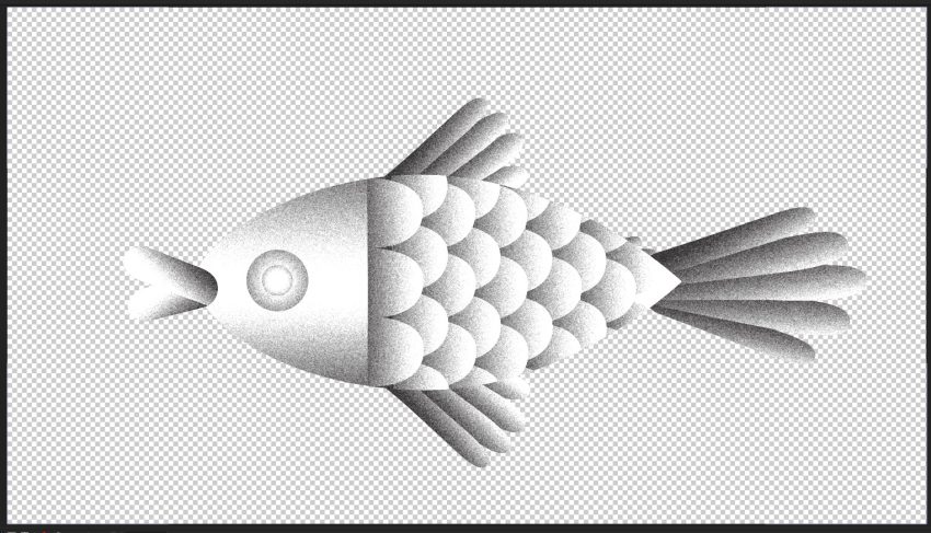
Since launching Wednesday in 2013, Dani and Iria have animated more than just pixels—they’ve animated a shared vision shaped by contrast and chemistry. Their latest film, crafted in Houdini with vectors, ink, and vivid brushstrokes, is a sensory ode to duality: a bird and a fish—sun and moon—glide through abstract realms to Northern Telekom’s Lush, embodying the Yin & Yang spirit at the heart of their 11-year collaboration. Whether illustrating for Netflix or shaping stories for Huffington Post, their projects balance playfulness and purpose with flair—philosophy in motion, emotion in every frame. Two creative forces, always better as one.
How Two Forces Shaped a Decade+ of Design
- How did the duality of Yin & Yang evolve from a philosophical concept into a narrative framework for reflecting the studio’s 11-year journey?
–
We’ve always been aware of our differences, and how they complement each other so well. It was our little in joke, that these contrasting forces balanced each other out to make us better as one. Naturally, this made us think of Yin & Yang, with Dani being the more reflective Yin and Iria the energetic Yang. What better way to embody our 11 year journey than through an animated poem about that balance in our partnership? We chose the 11 year anniversary because it felt more symbolic than 10; 11 is made of two number 1’s, which would also symbolise each of us.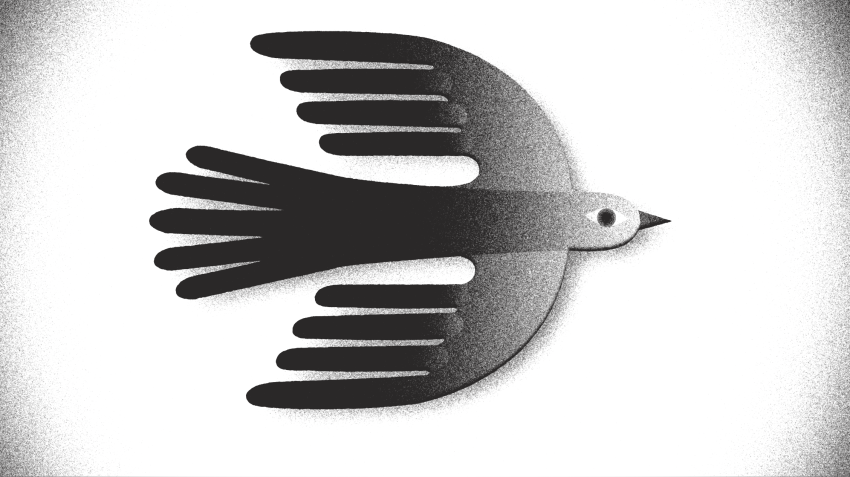
Clashing Ideas, Unified Visions
- What unique challenges arose in balancing individual creative voices (designers, animators) with the project’s unified theme of harmony vs. chaos?
–
Having had 11 years under our belt of listening to each other’s creative voices, we often work as one, to the point that we struggle to remember who’s idea was whom’s. Striking a balance between our creative voices has been quite natural from the start and we’re aware how rare a find that is. We met at film school and collaborated in each other’s grad films, so knew then that our styles were compatible. We both admired each other’s work.
Iria is the more naturally adventurous risk taker, pushing us creatively (the Yang), whilst Dani is the feet on the ground problem solver- a combo that has positively influenced each other.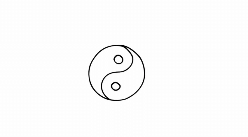
Black/White + Blood/Sweat/Tears = A Motion POEM
- Were there pivotal moments where technical constraints (e.g., time, tools) led to unexpectedly elegant solutions, like minimalist transitions or abstract geometry?
–
The idea was to create an ode to us as partners, so the entire piece was made by only the two of us. This meant that to make it achievable, the film needed to be a balance of shots that we put more time and love into, and shots that we were happy to be quicker with. Originally the film was fully black and white… but after seeing it we couldn’t resist the temptation of colour. Improvising, we did a second pass of straight-ahead hand-drawn animation with rough, bright brush strokes on top of the black and white animation. This made the film feel more ‘us’.
The ‘Done’ Dilemma
- How did the team navigate the tension between symbolic abstraction and clarity to determine the project’s endpoint?
–
We did a lot of research into the symbolism of Yin & Yang. Once we established the fish and bird characters, we chose imagery to complement these opposites – water/sky, sun/moon, circles/squares.
How Vectors and Brushstrokes Became a Studio’s Signature
- What Motion Design techniques (e.g., kinetic typography, fluid morphing) were used to translate the studio’s ethos into visceral, emotional storytelling?
–
We wanted to experiment with a look that we never tried before, whilst blending techniques we love; hand drawn animation, vectors for clean up and After Effects motion graphics. We’ve always loved using transitions to flow from scene to scene in a seamless way, and this technique felt ideal to enhance the feeling of flow and harmony.
Ying, Yang, & YOLO
- Why pair stark black/white contrasts with sudden chromatic bursts, and how do these choices mirror the studio’s creative identity?
–
Although keeping the film in black and white grainy shapes was the original plan, it was feeling too serious and polished for our taste. Something that we have always loved about 2d animation is tactile nature of hand drawn lines and textures, so we decided that since this is a film to celebrate our work, we needed to make it feel more like US. We did a u-turn and painted over all of it roughly with bursts of colour. It felt true to the concept of Yin & Yang opposites; rough animation over polished animation, colour over black and white, organic vs graphic.

Numbers on Paper, Freedom in Paint
- Did recurring symbols (e.g., circular forms, the “11” motif) emerge organically through iteration, or were they meticulously pre-planned?
–
Almost everything was planned in the animatic, we just embellished the rough animatic sketches during the design process. The only drawings that were completely improvised and unplanned where the colour brushstrokes, which we made up as we went along.
Designing for Love in a Billable-Hour World
- How does the project subtly engage with Modern Design industry tensions—commercial demands vs. artistic experimentation—without overtly stating them?
–
For us as much as this project was an anniversary gift to ourselves, it was also celebration of craft, of making purely for the love if it. Commercial demands make it hard to set aside time for projects like these, it almost feels like a luxury to be able to experiment. It was an utter joy.
How Northern Telekom’s Soundtrack Became the Project’s Third Director
- Which non-design influences (e.g., Taoist rituals, musical rhythm) most directly shaped the project’s pacing and symbolic vocabulary?
–
Naturally, the Taoist Yin & Yang concept itself influenced us heavily. Once we had settled on that concept, we chose the music before storyboarding. We were drawn to the entrancing flow of the song ‘Lush’ by Northern Telekom, which felt abstract and ethereal. We let the music guide the pacing, tone, and transitions.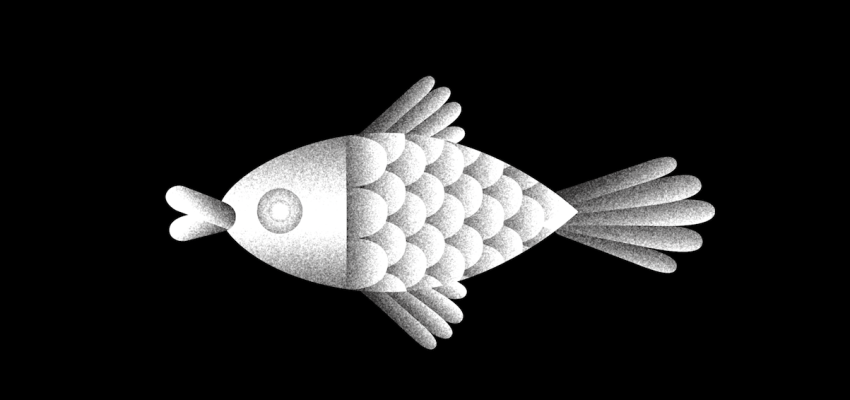 New Forms, Same Soul
- What past studio works were reimagined in the sequence, and how do they bridge the studio’s history with its future aspirations?
–
There’s nothing in this piece that specifically comes from work we’ve done before, except for more broadly speaking, our general love of bold colour, rough texture and graphic shapes. We’ve haven’t previously done straight ahead abstract animation either- the point was to make something different and new, but that still feels like us. All about finding that balance.