


It all starts with a video. A cool video with a fresh new look or a unique approach. Blog posts and tweets follow. It blows up Vimeo. Soon enough, similar styles begin to show up in promos and commercials.
Everyone wants a piece of it. Ambitious freelancers toil in off-hours trying to imitate the look. It’s everywhere. Tutorials pop up on YouTube, attempting to break it down. Maybe someone develops a plug-in to ape it.
Within three years, nobody would be surprised to see a watered-down version at 3am in a tragic infomercial for off-brand dog food.
The cycle of trends. In short, it swings from Buck to … yuck.
As an armchair design historian with an opinion about everything, I enjoy thinking about this kind of thing. For example, how do these trends start? Are new styles the product of large cultural forces, or are they spurred on by technological advances? Or both?
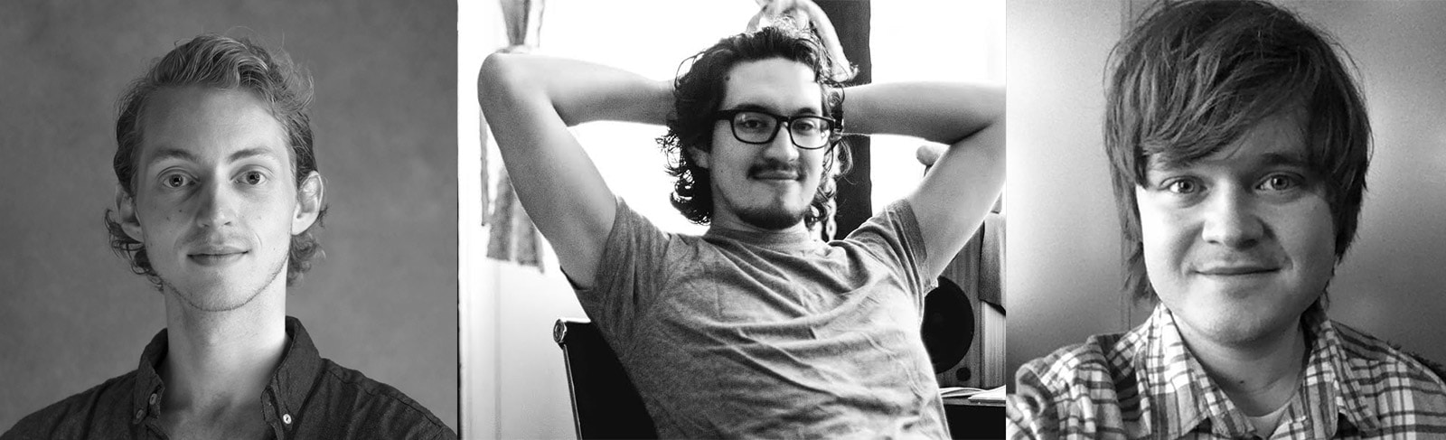
Recently, I was curious enough that I contacted some of the industry’s trendsetters, thinking they could share their own opinions about all this with me. I’m happy to say that three of my favorite animators actually got back to me: Jorge Estrada (aka JR Canest), Sander van Dijk, and Phil Borst.
For me, all three of these gentlemen were early pioneers of the flat, geometric style that rose to prominence a few years ago. Specifically, these three all brought a fresh elasticity to geometrics, helping blow away the stiffness of previous graphics with a snappy new style seemingly influenced both by traditional animation principles and elegant print design strategies. Bugs Bunny meets the Bauhaus, you might say.
While they all share a similar aesthetic, all three have totally different personalities and perspectives. Jorge is a philosopher. He is humorous, patient and comfortable looking at the big picture. Phil is one of the humblest people I’ve ever talked to. Honest, earnest, and completely down-to-earth. Sander is a friendly laser beam — intense, focused and sharp. Simultaneously confident and enthusiastic.
Clearly they all share a genuine love for motion graphics, and could talk about animation and design all day. I was very lucky that they each gave me an hour of their time to ask a few questions.
Trending Now: Q&A with Sander, Jorge and Phil
“What do you consider to be the dominant trends of today?”
When I asked this question, I thought I knew what answers I would get. But instead of just rattling off a list of popular styles, these three guys showed a more nuanced view of trends than I had considered.
Jorge explained that he sees two trends running parallel. “One of them is the style, the actual look and design of things.” But what interests him just as much is “to see what kind of videos are popular, and which kind of videos studios are making.” In other words, style trends vs. storytelling trends.
Phil was also quick to mention that trends are driven by more than just visual style. Nowadays he sees a lot of “companies trying to tell a more cinematic story about themselves and different topics, using animation as a medium.”
He cites Moth’s recent work as an example, and also Buck’s “Doors” project for Alcoholics Anonymous — which is a great example of cel animation being used to tackle serious topics in motion design.
Sander is deeply immersed in motion graphics, but he didn’t really want to talk about specific visual trends at all.
“To be really honest — I have no idea what style is ‘The Style’ right now. What I pay attention to in my work is what style communicates the concept in the best way.” He does this by looking beyond the trends to the underlying structure of the animation, and then applying the best style for the concept.
“Styles evoke feelings,” he pointed out, “and that informs what style goes with what concept.”
“Is your work influenced by current trends, either by choice or because clients have asked you to make work in specific popular styles?”
Jorge points out that nobody can truly say, “‘I’m not influenced by trends’ or ‘I don’t follow trends’. Because by the very nature that you’re creating something means that you’re influenced by other creations.”
The immensely popular “Waiting for Superman” animation that put Jorge on the map for many people
He continues, “We’re all following the trends, even if we don’t like to.”
Phil said that he gets some “requests to do futuristic, glitchy stuff … because clients are so big into technology now.” He chuckles and mentions that “even clients you wouldn’t think would go for that — like a random client, like, a company that makes tires or something.”
In terms of the trend-setters in that glitchy UI style, Phil lists Gmunk, Ash Thorp, and Patrick Clair as inspirations. “What’s cool about that style is that it just takes a lot of hard work and patience. You can’t just go out and buy a plugin.”
In my mind, there is a cultural fascination today for time-consuming, hand-made crafts — probably because so much of our work is made on computers. This explains some of the popularity right now of any work that involves a painstaking amount of detailed effort. In motion design, this helps explain the rise of hand-drawn cel animation as a giant trend of the day.
Sander continues with this thought. “Hand-made stuff is really popular now, because artists look at it and know how much work it took to create. If every frame was hand-drawn, animated, printed, hand-colored, scanned back into the computer, put into an image sequence and then stabilized — you get a lot of respect.”
However, Sander likes to focus on what the client is trying to communicate, and make all other decisions based on that. His method is to “start by asking what medium and graphic style will communicate the concept in the best way.”
He brought up a theoretical example of a client who is “trying to sell a really soft skin cream, but they want you to use the texture of a cactus. I don’t think that’s going to be a very good match,” he laughed.
“How do you think trends start?”
Jorge considers the case of hand-drawn animation, and tries to break it down. “Buck has been doing cel animation in motion graphics for a long time. They were one of the first studios making amazing cel for commercial work.” Once other studios saw Buck’s work, they “realized that ‘cel is cool’, let’s just go back into Photoshop and do frame-by-frame. And a bunch of studios started doing it at the same time.”
Soon, every video he saw “had little celly, sperm-like liquid things. Everyone was doing that.” But then people realized that cel is “even cooler when you use it for characters.” In no time “every video out there had a well-developed character with a well-developed story.”
He sums this up beautifully. “Once everyone discovers it’s doable, it opens a whole new world.”
Design today needs to be simpler in part because "our lives are more and more cluttered" with data.
Of course, new technology helps create the playing field for these trends to develop. How much of the rise of cel animation in motion graphics is based on software advances in Photoshop, ToonBoom or other applications?
Sander considers how cultural shifts also play a large role in the creation of trends. In his view, design today needs to be simpler in part because “our lives are more and more cluttered” with data. He brings up a recent trip where he lived on a farm for two weeks “with nothing around for miles.”
That experience made him reconsider how information overload is a big factor in why there is “a need to simplify a lot of the things that we use daily — the UI on our phones, and all that stuff that we constantly interact with. It needs to be simplified for us to feel like it’s not cluttering up our lives so much.”
Finally, Phil brings up Ash Thorp’s FITC Tokyo titles as an example of a piece that combined different styles to create something we haven’t seen before. “That seemed fresh to me, even though that glitchy style” has been around for a while. “Something about that was new.”
He points out that trends can be born by smart designers combining two or more older styles and mixing them together in a way that feels refreshing and revolutionary. In the case of those FITC titles, that team pulled bright, hyper-saturated colors together with glitchy textures and disjointed letterforms to create a new design landscape unlike any other.
Old becomes new, and new becomes old. The cycle of trends. Sounds so simple, right?
As to the future of motion graphics, Sander points out that “there’s lots still to discover. Styles are always changing. I wonder what makes it all go around. Nobody knows, really.”
Shoot, I was hoping that one of these guys could tell me.