Elegantly executed piece by Heebok Lee
Check out this short film by Heebok Lee, based on a sad story of unrequited love. Visually it is beautiful and emotionally it delivers. I…
Read more
John Cranston • 19 years ago
Shilo Posts a New Cingular Spot
Following up on the success of the Cingular BlackJack spot, Shilo has created a slick new Cingular ad, this time featuring two phones. Because they…
Read more
Justin Cone • 19 years ago
Transistor makes some shapes.
I love 100 ft. tall robots crashing through cities as much as the next guy, but sometimes the old eyeballs want something more graphic. Transistor…
Read more
Bran Dougherty-Johnson • 19 years ago
Daniel Garcia updates
You may remember recently Daniel Garcia, the dark master of motion graphics, directed videos for MF Doom and the late, legendary J. Dilla. He’s back…
Read more
Justin Cone • 19 years ago
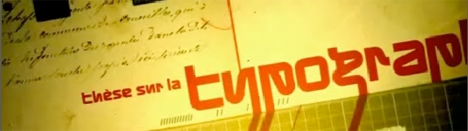
Stop-motion typography piece from Montreal based Julien Vallee
Based on Kurt Shwitters “Thesis on Typography”, Julien Vallee has created this meld of stop-motion and motion-graphic typography all with influences pouring in from the…
Read more
John Cranston • 19 years ago
Universal Everything: S4C
Universal Everything and Proud Creative collaborated on this intriguing series of IDs for Welsh channel S4C directed by Simon Ratigan. Each spot centers around concepts…
Read more
Justin Cone • 19 years ago
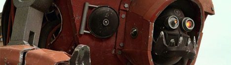
Kaktus Film Presents a Tale of Robot Hubris
I know, I know: Robots stomping through cities is soooo 2006, but this cute little short from a few guys at Swedish agency Kaktus Film…
Read more
Justin Cone • 19 years ago
UVPH Updates
UVPH updates with a slick new reel full of work in a staggering array of styles.
Justin Cone • 19 years ago
Jeff Han’s Version of the Bud Select Spot
NYU’s Jeff Han has proven himself to be the master of multi-touch displays. This latest video shows some amazing interface work that reminds me of…
Read more
Justin Cone • 19 years ago
LA AIGA presents The Pentagram Papers
The Los Angeles chapter of AIGA, the professional association of design, will be hosting an open-to-the-public event on Thursday, March 15th at the Pacific Design…
Read more
Justin Cone • 19 years ago
PSST! 2 Trailer is up.
PSST! 2 Trailer is up.
Bran Dougherty-Johnson • 19 years ago
Contest: Wallpaper for Vector Packs
The folks at Go Media and I came up with an idea for a simple contest: Make a 1280×1024 wallpaper (.jpg or .gif) using at…
Read more
Justin Cone • 19 years ago
Getting Caught Up With Motion Theory
In the flurry of activity surrounding Inspire (not to mention this ramshackle mess I call my life), a couple new projects from Motion Theory slipped…
Read more
Justin Cone • 19 years ago
Free (Legal) Vintage Video Loops
Free (Legal) Vintage Video Loops
Justin Cone • 19 years ago
Say What Again
SCAD student Jarratt Moody is in Time-based Typography I here at SCAD (a course for which I’m currently the teaching assistant), and he recently finished…
Read more
Justin Cone • 19 years ago
Inspire 07: The Aftermath
Thank you all so much for the kind emails asking about Inspire 07. From my perspective, it went really well, especially for our first time…
Read more
Justin Cone • 19 years ago
Blacklist updates
Blacklist updates
Bran Dougherty-Johnson • 19 years ago
Sneaux by PES
Sneaux “Human Skateboard”, a new spot by PES!
Babe Baker • 19 years ago
Ryan Larkin {RIP}
Canadian animation legend Ryan Larkin passed away on February 14 from brain cancer. {RIP}
Babe Baker • 19 years ago
Stylish IDs for ABC1 from zpsace
Sydney-based zspace did a beautiful job on these ABC1 IDs. The CG elements are elegantly simple, the type is understated and the live action is…
Read more
Justin Cone • 19 years ago
Luminescene interviews Psyop
Luminescene interviews Psyop
Babe Baker • 19 years ago
Meet PandaPanther
PandaPanther is a new studio launched by Jonathin Garin and Naomi Nishimura with Executive Producer Lydia Holness and they are NOT messin’ around.
Justin Cone • 19 years ago
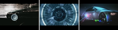
Wow! That’s pretty …
Warren Du- Preez and Nick Thornton Jones of Wanted Films direct this stunningly trippy spot for BMW that is full of amazing visual moments. Lasers,…
Read more
Bran Dougherty-Johnson • 19 years ago
Leftchannel Does East and West
Leftchannel has recently posted a couple very different projects for two very different markets. The first is an insane :30 spot for Japanese beverage-maker Kirin.…
Read more
Justin Cone • 19 years ago