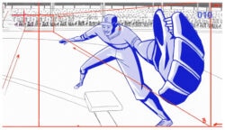
Parasol Island for Sony Ericsson
This new Sony Ericsson advert from Parasol Island directed by Steve Scott is a colorful romp through a buffet of typography and illustration styles. The…
Read more
Justin Cone • 16 years ago
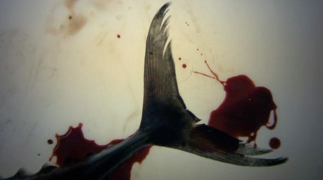
Jonas Odell: Lies
Filmtecknarna’s Jonas Odell has been a distinctive voice in the world of motion design ever since his 2004 hit video for Franz Ferdinand’s “Take Me…
Read more
Justin Cone • 16 years ago
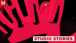
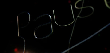
BTRY : Pause NYC Main Title
The Pause NYC opening titles, created by Battery, deliver an ambient and organic design flare that ends up being high on my inspiration list for…
Read more
Staff • 15 years ago
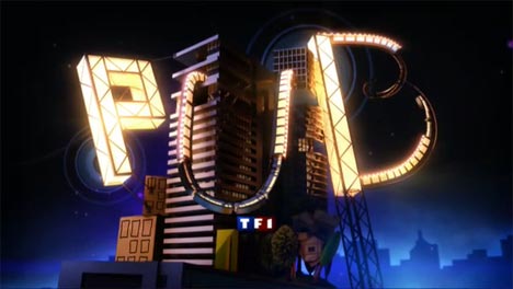
nobrain: TF1 IDs
Paris-based nobrain created a staggering number of beautifully crafted idents for TF1, France’s biggest network. Each five-second clip is jam-packed with detail and fluid animation…
Read more
Justin Cone • 15 years ago
Serial Cut
Serial Cut has a slick new update: gorgeous typography and great work.
Bran Dougherty-Johnson • 15 years ago
Mighty Nice: Melbourne Writers Festival
Typographic animation, it’s everywhere. You now get a free typographic animation with a box of breakfast cereal, and word has it that there’s an iPhone…
Read more
Justin Cone • 15 years ago
The Animated Life & Work of Jeff Scher
Jeff Scher: I Got My Job Through the NY Times. Short Documentary by Reid Rosefelt. Jeffery Noyes Scher was born in 1954 and graduated from…
Read more
Mark Webster • 15 years ago
Stephen Panicara’s DPTV Rebrand
I came across this project by Steve Panicara over at the Motion Exchange and was very impressed by it. Immediately by the tight and energetic…
Read more
Bran Dougherty-Johnson • 14 years ago
Sagmeister for Standard Chartered Bank
Stefan Sagmeister harnesses his signature move of naturally constructed typography for this impressive spot for Standard Chartered Bank. (+Behind the scene) [via YWFT]
Yotam Hadar • 14 years ago
Prologue for Robin Hood
Prologue’s treatment for Robin Hood is a study in patient analogue work. Ridley Scott called on the studio create Legends to open the film as…
Read more
Jon Saunders • 14 years ago
The Alphabet 2
Allesandro Novelli (of n9ve) directs a “developmental spelling” of the alphabet – an experimental typography video “where each character visually represents the meaning of the…
Read more
Matt Hunter Ross • 13 years ago
Plenty for AXN LatinAmerica
I recently stumbled upon “Criminal Minds,” Plenty’s latest addition to their repertoire. I love the way they united analog and digital by using a 3d…
Read more
Ivan Cruz • 12 years ago
1 Typeface. 110 Animators.
Purveyors of animated typography, Animography, have released their latest project Franchise Animated: For this specific animated typeface we have round up 110 talented animators from…
Read more
Staff • 11 years ago
Patrick Clair + Elastic: HBO’s True Detective
One of our favorite projects from 2013 was Patrick Clair’s launch trailer for Tom Clancy’s The Division, a global conspiracy theory rendered in elegant typography…
Read more
Justin Cone • 10 years ago
DIA relaunch
DIA relaunches and leans hard into branding work anchored by strong typography and clean design.
Justin Cone • 10 years ago
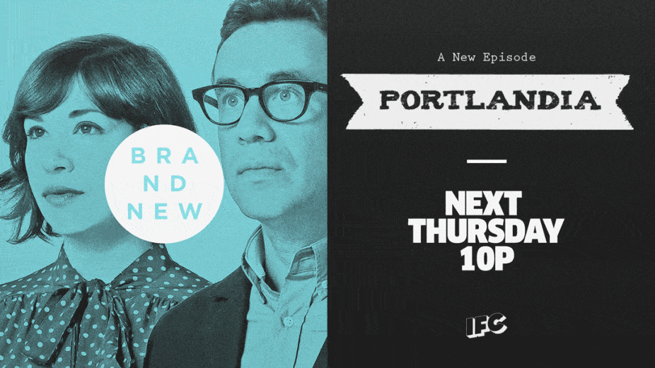
Gretel: IFC Rebrand
We dive deep with Gretel's Ryan Moore into the process behind the IFC rebrand.
Brandon Lori • 10 years ago
Motion design in games with Ubisoft’s Wylie Robinson
Motion design in games? It's more important than you think. Our interview with Wylie explains why.
Justin Cone • 10 years ago
Superteam proves power of collaboration in title sequence for FITC Tokyo
To kick off the FITC Tokyo 2015 conference, a superteam of artists working around the world (and sometimes around the clock) created a sublimely glitchy…
Read more
Justin Cone • 9 years ago
Not to Scale relaunch
Not to Scale’s elegant new web presence is brimming with subtle animation and elegant typography befitting their nearly 10 years of existence as an international…
Read more
Justin Cone • 9 years ago
Tomorrow’s World BBC titles 1978
There has been a few postings recently taking a trip down memory lane with the more practical approach of yester-year, so here’s one more! This…
Read more
James Wignall • 16 years ago
Breathtaking Typographic Posters at SMASHING Magazine
Breathtaking Typographic Posters at SMASHING Magazine
Boca Ceravolo • 16 years ago
Portugal vs The Netherlands
A visualization of a football match between Portugal vs The Netherlands. Created by Pfadfinderei & Modeselektor.
James Wignall • 16 years ago
Devoid Of Yesterday: OFFF Lisbon Titles
Devoid Of Yesterday is at it again, this time with the Lisbon OFFF main titles. Rob Chiu and Chris Hewitt nail this piece out of…
Read more
Staff • 16 years ago
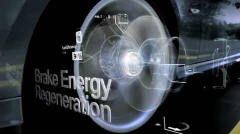
Minority Report meets Stranger Than Fiction in this BMW “Efficient Dynamics” spot by Eight VFX (via RagingArtists)
Minority Report meets Stranger Than Fiction in this BMW “Efficient Dynamics” spot by Eight VFX
Boca Ceravolo • 16 years ago