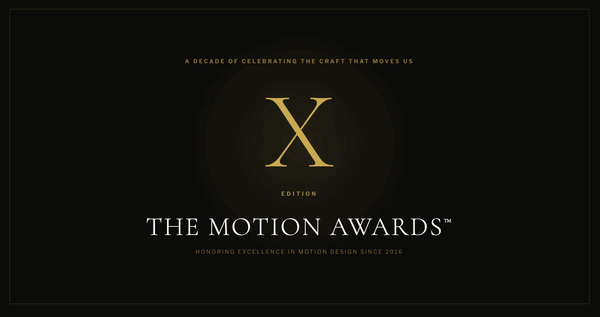
A while back, we made a post about the Bonaroo line-up animation, the basic concept of which was taken from Javan Ivey’s My Paper Mind. Despite not being involved with the Bonaroo project, Javan was honored to have his work sampled and taken further. In his words: “It looks great. I mean, I’m kinda bummed I wasn’t invited to the party, but I really enjoy seeing what they’ve done.”
The ensuing Motionographer comments raised questions about involving the originators of a particular technique in commercial applications of that technique. People wondered why Javan wasn’t brought on as a collaborator or consultant by Ghost Robot (who had, it turns out, contacted Javan about the Bonaroo project).
A couple days before the awards opening was released, we saw an engaging experimental film created by Parson’s student Varathit “Tu” Uthaisri. Surface bore an uncanny resemblance to the Favorite Color project, and the inevitable cries of “rip-off” came from some of us here at Motionographer HQ (me included).
But then we looked closer, and we discovered that Tu was actually listed as an art director on the Favorite Color project.
The latest short film from Directing-duo, Terri Timely (Ian Kibbey and Corey Creasey), is a portrait of two brother’s and their surreal experiences as they explore their Synesthesia.
Synethesia (the ability associate sounds with tastes, colors, letters, numbers or even people) is a phenomenon that easily sets the stage for a visually rich piece. However, it’s Terri’s refined storytelling abilities and aesthetic that really make this piece stand out for me.
Terri Timely’s growing body of work creates an intimate portraiture of humanity. They also posses an impressionistic disconnect that seems to thrust them into a realm of hyper-reality and oftentimes parody. This is in-part to Timely’s acute sensibilities in art direction, painterly cinematography and appropriate use of effects (both in and out of camera) to create their worlds. From there, their observation for detail — both in characters and subtle visual elements — makes their work the immersive experience that it is.
Speaking of POV’s and interesting twists — Minneapolis’ design/animation powerhouse, Make, goes all out in almost every medium for their new Palm Springs Short Fest Program Opener.
A seemingly happy couple is doing everything in their grasp to have a moment of peace when we quickly realize that they are on set and about to be transformed into a barrage of animated likenesses.
The characters are willed by the indecisive hand of their director, who seamlessly shifts them from worlds of live-action, 3d, 2d, cel and claymation. This gets very messy for all involved, resulting in a stylistic mash-up. This piece’s flawless execution and transitions push it the next level.
Although some of the compositing doesn’t quite hold up throughout, there are still some great moments. I see a pretty wide viral appeal in the life of this piece with definite YouTube responses in the very near future. Keep your eyes out for the first agency to repeat this one as well…
It’s with great pleasure that I share another batch of films created for the F5 RE:PLAY Film Festival. This time around, we’re proud to present work from Sehsucht, Crush and Bearfight. Enjoy!
Emilio Gomariz, a Madrid-based art director, created and colored 22,655 empty folders in OS X to create an engaging type-based animation.
This video adds to the tradition of using the OS and/or software applications as media for animation. For other works in the same spirit, continue past the jump.
Imaginary Forces got inside the heads of the killer cyborgs in Warner Bros’ Terminator Salvation to develop “machine vision,” making their contribution to the fascinating field of screen design.
Check it out, along with a making-of video and some great screen design work from others. Read on…
2nd-year Gobelins students created five jaw-dropping shorts to introduce each day of screenings at this year’s Annecy festival. All of the films except Jelly Sunday are presented in the YouTube montage above. You can check out each film individually here:
Some of you may remember Fresh Paint’s stunning promo for TCM’s 31 Days of Oscar event from last year. This year’s reprise uses the same basic structure but manages to top the original somehow.
Both promos “star” a masterfully cut montage, which on its own would be an achievement. But the real magic is in the interplay between the screen and the set, a metaphorical armature that works brilliantly for a promo built around the Academy Awards.
I’m glad that TCM and Fresh Paint both found the courage and energy to take on this project again. Whille I’m not sure it’ll work for a third year, this encore is a welcome gift.
Warning: This video contains strong language, simulated sex and violence. Might not be suitable for some environments.
For the NASA (North America South America) Project’s “A Volta,” Santa Monica-based Logan built a dim lit nightmarish world of isometric madness and ultraviolence inspired by the artwork of The Date Farmers.
It wasn’t meant to be a great “story” but just another structural device to keep the viewer occupied. It’s a music track with a “plot” thinly stretched over it. I thought it might be clever to turn this video into a mini-film with a semblance of a plot. A plot that has the same level of strategically naive incompetence and misdirected energy that is implied in the work of Date Farmers.
If you’ve been following Motionographer for a while, you’re no stranger to Logan’s work. While they’re capable of producing consistently slick commercials for clients like Apple and Lexus, they refuse to be easily pigeonholed.
Projects like Toyota “Meet” and their Metal Gear Solid 4 interstitials defy categorization and challenge rational thinking. Skewing towards post-modern modes of presentation that leverage dissonance, juxtaposition and suspension of resolution, these works show that Logan is as interested in exploring formal qualities of storytelling as they are in straightforward narrative.
Case in point: The “making of” featurette Logan created for “A Volta” does little to reveal technical details, opting instead for an obtusely entertaining mockumentary:
Forget the Film, Watch the Titles interviews Karin Fong about her recent main title and the making of “machine vision” for Terminator Salvation, her animated title sequence for The Pink Panther 2, and her favorite title sequences.
Flaunting a magnetic portfolio that’s chock-full of slick and polished works, London-based Carlo De Agostini flexes his directorial muscle to a swooning freelance market.
One of those make-you-smile pieces, from Ringan Ledwidge of Rattling Stick, London.
Check out the rest of his back-catalogue, here. Heartwarmingly gorgeous.